by Frank | Jun 5, 2015 | doodles, illustration, thoughts
I’m a bit conservative when it comes to trying new methods. My job is often limited by time so I tend to do the things that work. But that gets boring after a while.
When I was in art college I tried lots of different things but my butterfly brain would not persist with any of them – “can’t do that – too hard” *throws toys out of pram*
Now, with a little age and experience under my belt, I’m looking at new ways of doing things – ways I’d rejected before but remained curious about.
Last winter I signed up for a botanical illustration course – hoping to apply some discipline to my splishy-splashy style, and also to learn how to paint with watercolours, one of the most difficult mediums to master.
The Very Precise Style isn’t really me, but I’m enjoying it anyhow…
 ...and learning about watercolour has enabled me to use those skills to work out how to represent things in a more expressive way…
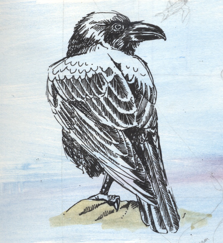
All this has prompted me to try other new ways of doing things. One of the materials we were asked to buy for the botanical course was a black fineliner artists’ pen. I have never liked such things, finding them clumsy and limited and difficult to use with subtlety, preferring a Bic fine biro for such tasks *cue singing of hosts of heavenly angels – best pen ever*
However, I’ve been using it more and more, and just now I created this raven. I would have been able to create something very accurate with a Bic pen – shaded and shiny and the filaments of all the feathers present and correct. However, the fineliner adds a character, an expressiveness, that I might not have been able to capture if I’d used a more subtle pen. There’s a solidity about her – her hulking form, her strength, the shine of her feathers. I’ve had to think much more carefully about how to represent her to get around the limitations of the pen, and it’s taught me a lot. I remember reading about a champion surfer who’d learned to ride waves on her brother’s broken board – if you can make something special out of whatever materials you have to hand then you’re on your way.
by Frank | Jun 25, 2014 | branding, thoughts
 Newsletters – whether of the almost-dodo-like paper kind or the increasingly-popular email kind – are a great way of keeping in touch with your customers – potential or current. If you’re selling a high-value product or service they give people an opportunity to get to know you and your work before committing to buy, and you can share exclusive offers, and news about exciting new services, with people who are already interested in your stuff.
However, if you make a bad impression you can really put people off your business. Here are six things I’ve seen people do that are pretty much the marketing equivalent of approaching someone you fancy while sporting nothing more than ugg boots, bad breath and a lime-green mankini. Some are design-related and some are more general. Read on!
1) Send people a newsletter without their permission
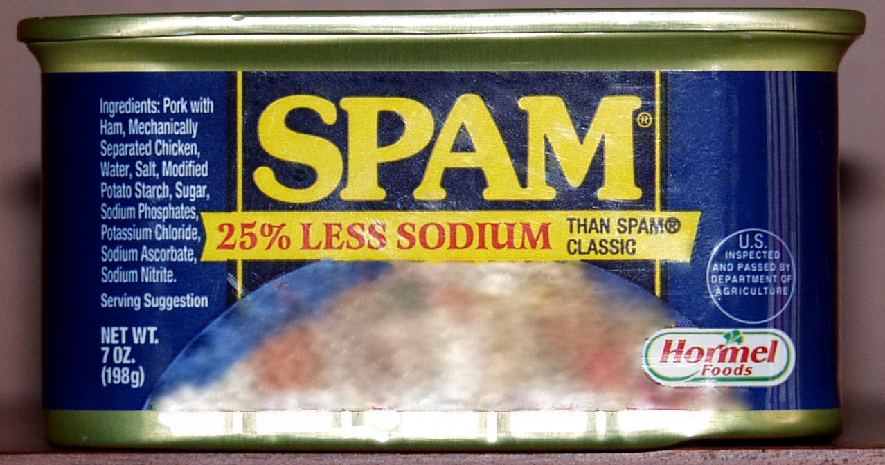
mmm…”mechanically-separated chicken”
This is basically spam, and how do we feel about spammers dear boys, girls and those who identify as neither? I make a note of anyone who does this to me and vow never to buy from them. I usually send them a curt email telling them that I have vowed never to buy from them specifically because they have spammed me. Hate hate hate.
Instead, promote your newsletter in email signatures, on your website, on social media, and give people the opportunity to read previous examples before they sign up.
Perhaps offer something in exchange for an email sign up – I offer my 24-page “Guide to creating awesome briefs”.
Also, make it really easy for people to unsubscribe – and tell them you’ve done this before they sign up.
2) Email out the newsletter without using your email client’s “BCC” function
obligatory Star Trek facepalm image
so that the recipient can see everyone else who’s been sent this particular email and, if they’re particularly nefarious, harvest their contact details for their own egregious purposes. What’s really fun is when people “reply-all” to these mails, thus sinking the inboxes of all concerned into a mire of abject clusterfuckery. Ugh. Set up email groups and use the blind-copy address box to avoid this hell – basic stuff, I know, but some people still haven’t figured it out. Or just use MailChimp or Mad Mimi or another newsletter-creation service to avoid the risk of doing this accidentally altogether. Which leads me to…
3) Poor or non-existent HTML skills
If your newsletter design is ropey your clients will most likely think that you are too. If your coding is less fluent than your English then consider using Mad Mimi, MailChimp, or similar services, that will help you create an appropriate style for your audience. In my experience you’re also less likely to end up in people’s junk mail folders by using these, as compared with sending an email directly.
4) Not designed with the reader in mind
By this I actually mean two things:
a) not aimed at the audience
A communication from a purveyor of fine Swiss watches sending out mail with text in bright pink Comic Sans, for example. Either get a designer to help create a theme for you, or research your audience fully and observe how other companies marketing at the same sector produce their stuff. If you sell bridal wear have a look at bridal magazines and design similarly.
b) not designed in a way that makes someone actually want to read the damn thing
I’m thinking great big wodges of text. Reams and reams of times new roman – a glut of words impenetrable enough to embarrass Derrida – which only the most bored or the most desperately procrastinating can be bothered to tackle.
Break your text up:
- headings
- sub headings
- paragraph breaks
- pull-quotes, box-outs
- bullet-pointed lists
- photos
- gifs of kittens in sinks
All of these things draw the reader in, pique their interest and get them, well, reading.
Your writing style is obviously important, too. You need to be entertaining. I attempt to draw my readers in through swearing, poorly-thought-through metaphors and gifs of kittens in sinks but you might want to consider some sort of level of professionalism instead. Personally I save professionalism for the actual work I do – being my rather silly self in communications seems to elicit more positive responses than when I’m attempting to be polite or some such. Whatever works for you and your audience is the thing to do.
5) not sent out at the right frequency
For me, weekly newsletters are too much. It’s a bit like running into someone every other day that you don’t really know but aren’t quite friends with – gets pretty awkward rather quickly. Monthly is good and I’ll generally not unsubscribe from those. I did know of someone who created options for receiving different frequencies of newsletters – there was even a daily one, but you had to pay for that service! Also, creating a newsletter takes quite a bit of time – a few hours for me, generally – so don’t commit yourself to more work than you can realistically handle. Make it clear on your sign-up form how often you intend to infiltrate inboxes so people know what they’re getting into right from the start.
6) Poor choice of content
I get one newsletter that basically just features photos of new lines of vegan shoes and how much they are. Job done – perfect for what I want from them. Other newsletters I love to receive are long, rambling, beautifully-researched, written and illustrated affairs that require jasmine green tea in a bone-china cup and all of the use of my brain (highly recommended SIGN UP FOR NOREEN’S EMAILS THEY ARE SIMPLY DELIGHTFUL). I try to break things up by having:
a) an intro describing what’s in the newsletter
b) a brief paragraph about what I’ve been up to – work I’ve had printed, illustrations I’m half-way through, blog posts I’ve written
c) a longer piece about something design-wise I’ve been chewing over
d) (sometimes) the month’s special offer
e) things that have inspired me that month – art exhibitions, photos of snails etc
f) a little suggested activity to get your creative juices flowing
g) a brief look forward to goings on in the next month
I try to keep things short and sweet but you do what works for you, your audience, and the service you are selling.
Well, I think that’s everything I can think of right now. Most of the time I find it pretty fun writing my newsletter – it’s a wonderful way to talk about what I’m up to and how I can help people’s businesses without being to in-your-face and salesy. Hope this list was of some use – do let me know if you can think of any other bug-bears that you have with newsletters and verily I shall add them!
by Frank | Jun 18, 2014 | ethics, thoughts
or, why ethics and design must go hand-in-hand if we aren’t all to score a massive own goal
Disclaimer: I’m pretty sure that everyone who knows me knows that I am not a watcher of most sport, especially football. This is mostly because of its ubiquity; the behaviour of some Cardiff City fans on match days in my locale also comes into consideration. That is not to say that I have not enjoyed a match on occasion, and the edited highlights of football games that my ex would watch on Match of the Day were tolerable and sometimes funny. However if he dragged me out to experience a whole Ireland international I would spend most of the time split between watching the condensation on my pint glass gather into droplets and stumble down to the coaster, and wishing everyone bibbling around on that stupid grassy rectangle would suffer from sudden acute narcolepsy, thus ending my suffering.
TL;DR: I find it for the most part very dull.
Nevertheless I am aware that a lot of people are very excited about the World Cup, and some of these people are my friends. And this upsets me – whether it should or not, who knows. But here is a little piece about *why* this upsets me and what design has to do with this.
Brazilians aren’t in favour of it.
It’s a thing that many Brazilians asked that we did not attend the World Cup – citing corruption by the Brazilian government and FiFA and summary executions and revenge killings OF CHILDREN in the favelas by state police as some of their reasons.
Fifa is awful awful AWFUL
It is also a thing that FIFA is a horrible monstrous beast exploiting people’s love of the “beautiful” game, and that conservative estimates state that 4,000 SLAVE LABOURERS WILL DIE in the building of the stadiums of 2022’s World Cup host, Qatar.
Now, I am a person who is for the most part pretty careful about the things they buy. I like to give money to nice fluffy organisations who look after their workers and the planet (Fairphone) and begrudge giving it to organisations who, shall we say, do not appear to prioritise these things (Apple). I boycott a lot of corporations – Nestlé, Asda, Tesco, Esso, BP, Coca-Cola, McDonalds, the meat and dairy industries, etc etc., because putting my hard-earned cashmoney into the bulging moneysacks of companies who do things that are contrary to my values seems silly.
Watching events sponsored by said companies – especially when all of the sponsors AND the organising body AND the local government have joined together in an unholy trinity of überbastardness to see who can be the most Dr Evil seems positively jawdroppingly discombobulatingly WTF.
Which is why I did not watch the London 2012 Olympics.
But of course, we’re conditioned to only care about entertainment and the immediate gratification of our desires. Who cares where those little plastic microbeads end up after we exfoliate our skin, or what happens to our watercourses after we flush bleach down the loo?
We are also told that we are just tiny little insignificant protozoa in the great Ocean of Capitalism and that nothing we do could possibly make a blind bit of difference to what the great white sharks are doing.
Well, no. Firstly because boycotts and protests work. They worked against Barclays Bank during Apartheid South Africa, they worked against Marks and Spencer who were selling intensively-reared duck meat and they have worked against Lego responded to complaints about their stupid gendered toys by bringing out a range about female scientists.
And even Apple seem to be improving their workers’ conditions.
And secondly, why would you want to partake in something where people, ACTUAL HUMANS, have been enslaved or murdered as part of the process of bringing that something to you? I just don’t get it. But then I don’t really get the point of football either, so perhaps I’m not the one to talk about this.
Moving swiftly on to something which I am a bit more qualified to talk about: so what has this little rant have to do with design, being that that word was in the subheading at the top of this?
Design is a process.
It is a process of working out what is required and then considering the most effective way of manifesting that thing. The thing at the end of said process could be anything from a brochure to an international football tournament. And every part of that process can affect the lives of all sorts of people whom you will most likely never meet and yet who live, just as you do, working to pay the rent, put food in the mouths of their families, pay for an education and to ensure that they have access to healthcare.
That process (take a brochure, for example) can also involve the cutting down of virgin forest in developing countries, or not, the use of ozone-depleting Volatile Organic Compounds, or not, and the mining and disposal of heavy metals, or not.
Design decisions matter.
This is why the decisions made at every part of this design process should be evaluated not just on what they will do for you and your organisation, but what effect they will have on the everyone – and everything – else. It’s not enough any more to not actively be an Evil Bastard – we need to check that everyone involved also has no predilection for Evil Bastardness either. Preferably, the people who are helping us Manifest our Thing are pretty much against Evil Bastardness and go out of their way, in words AND actions, to replace it with Utter Loveliness.
A wonderful example of where I think we could aim is this mission statement by clothing company Continental. I actually had a little cry when I read it. Imagine if every corporation had designed these values into everything that they did? Seriously, just take a minute and imagine that. Imagine the impact that would have on every aspect of our lives.
Imagine what THEIR World Cup would look like.
FIFA, on the other hand, seem to have designed corruption and avarice into the process of setting up their tournament. Impressively diverse ways of getting money out of the taxpayer, away from schools and hospitals and in to FIFA’s $1billion of reserves have been utilised. You’ve really got to hand it to them.
Let’s shout OFFSIDE* at them, take them as an example of how not to do things, and design a more egalitarian, co-operative world for everyone.
*I actually do understand the offside rule in football. No, I don’t know how or why either.
by Frank | Jun 16, 2014 | thoughts, Uncategorized
how to not be *that* client and how to work with one if you have one
A lot of people like to laugh at stupid things other people’s clients say, for example, there are oft-shared hilarious experiences like this, this popular website and there is this series of posters created by an Irish graphic design studio.
Although I take a bit of a guilty pleasure in smirking to myself about such things, being that I have been known to exhibit teeny tiny signs of misanthropy, I also think that placing all the blame on the clients for these atrocities is often like blaming a badly-behaved dog for its actions – really, you need to be pointing your Finger Of Judgment at the people who have influenced that dog. Or client.
No one is born knowing how to write a brief or give feedback. Thus, us creative types need to hold our clients’ hands along the dark and twisting forest path of Lovely Design Making so that they end up at the Beautiful Gingerbread House of Successful Project Completion and not the Terrifying Skull-Bedecked Baba Yaga* House On Chicken Legs of Design That Really Doesn’t Work For Anyone At All.

Baba Yaga’s hut taken from https://geoffmead.wordpress.com/2012/06/
So, here are some problems that I have encountered along the way – mostly in just the one nightmarish client – and what I’d recommend doing to overcome them whether you’re the designer or the customer. I may well be teaching many of my grandmothers to suck eggs here – I prostrate myself at the feet of those who Have Been Through This Curious Hell Already.
1) Refusal to give any kind of coherent brief
“I want a logo with a dancing girl on it and I’m sending you a CD of the music the dancing girl would listen to and no you don’t need to know any more than that” “no, that one’s not right” “no, goddamn it, did you actually listen to the CD?”
Designers: does the client even know how to give a brief? Have you helped them do this? In this situation the graphic designer needs to ask a lot of questions, preferably by email, so that they are all written down and can be referred to later. I like to focus on finding out who the product is aimed at – what car would they drive, what hobbies and interests do they have, etc, and what kind of feeling the client wants to convey – happy, professional, sexy, competent, being chased by a bear etc.
I’m sure most designers do all this already; one thing I have found is that the more everyday you can make these questions the better clients’ imaginations will be fired up. Think those interminable Buzzfeed quizzes that everyone is doing on Facebook at the moment – “which Lord of the Rings character would your target customer be and why” will probably yield more useful information than “would you say that your selected demographic was in the ABC1s”.
(here is a funny youtube video to break up the text. I am not a LOTR fan FYI)

download this
For clients – well, handily, I have spent some time writing this “how to give briefs to graphic designers” guide which you may download for free. Hooray! Go me! In short, be as specific as you can. Think about the project in as much detail as possible, from the size and shape to the colours you do and do not like.
There might be a brand you see reflecting the things you want to espouse – Mercedes Benz or Innocent Drinks, for example. Give as much info as you can about how you want people to feel about the product.
Designers are usually intuitive lateral thinkers but they generally need more to go on than a CD of music that they have no connection with at all. If the music CD is a really big part of the brief then maybe you need to search around for a designer who’s really into bhangra or dancehall reggae or whatever it is that is on that magical shiny disc.
2) Daydreaming/being divorced from reality/having ambitions way beyond their budget
“I’m starting up this little business where I’ve bought a van and it makes coffee and I’m going to take the van to festivals and sell coffee there so I want a logo for the van and then also a set of business cards that look like tarot cards and I want the interior of my chain of coffee shops to look like a burlesque circus and and and…”
Suffice it to say that this client didn’t even have enough money to pay me for the logo I sweated blood** designing for her.
Newsflash: this shit costs money. Gif from https://gracefuldreamer.tumblr.com/
Designers: I have had the misfortune of working with two clients like this. They give you a list as long as your arm of all the wonderful things they want and then when you tell them the price they either accuse you of taking their dreams away or they pretend not to hear and then mysteriously run out of cash just as you’re finalising the logo.
If I had my time again I probably would have turned and run a mile from the client who told me that she had already been through twelve (TWELVE) graphic designers who just couldn’t get what she wanted and also she had £10,000 of debt and was struggling to pay her mortgage. I’m not entirely stupid – I can read warning signs – I’m just an incurable optimist. Now I’ve learned to look for the signs that a client is lying to themselves. Also, I ask for 50% up front with new clients, or payments in stages, and we don’t progress to the next stage until the previous one is paid for.
Clients: if you’re in this position you’re probably a start up – likely you’ve never briefed a designer before and have no idea how much time websites take to design or about the cost of printing. I really do recommend that start-ups approach several designers and tell them what your carefully considered budget is, and then ask them what you can get for that money, perhaps involving different options.
This isn’t what clients normally do, but it will save you asking for quotes for a bunch of things so extravagant that they would make Liberace blush.

Liberace: rumoured to not be a fan of careful budgeting. Photo by Alan White.
Here’s an example of how this could work – you might be able to get a logo and website designed and some business cards printed for your budget, and for the same price you could get a logo and a thousand beautifully-printed brochures. Do the research, find out what your competition does, what your own customers expect, and decide that way. Be realistic, and be prepared to cough up at least part of the money upfront to the right creative sort.
3) Clients who won’t give feedback other than “I don’t like it”.
Oh dear baby jesus in the manger with the donkeys designers know that this is perhaps the most frustrating thing of all. First of all you must be really careful to ensure that the client knows they can be frank with you without causing offence. It’s good to let them know that you learn just as much about them from the things they *don’t* like as you do from the things they do; that negative feedback is a very important part of the creative process and that they need to be as clear as possible about how they feel.
However, if you’ve said all this and the client is stubborn and refuses to elaborate, again you need to get canny with your questioning. How does it make them feel? What about it would not connect with their customers? What character out of Lord of the Rings would it be (OMG I asked for Gandalf and you’ve given me Sam Gamgee)? If the client gets all extra stubborn and really won’t tell you why then maybe you have to call it a day. Stabbing in the dark is not in our job description.
Clients: mostly just read the above. And if your designer reacts really badly to frank and fair negative feedback then maybe you need to part ways. Us designers have a bad reputation for having creative temperaments: from what I’ve heard it’s not entirely undeserved, but I genuinely believe that most of us just want our clients to be happy.
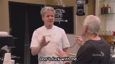
Thus it’s a good idea way in advance to get a personal recommendation for a designer, read testimonials and talk to people who’ve worked with them, just to make sure you don’t get landed with the Gordon Ramsay of InDesign.
from https://crystaweenie.tumblr.com/
*no disrespect to Baba Yaga the All Powerful whatsoever
** did you know that you can actually sweat blood? I didn’t actually do that though – I am using hyperbole.
by Frank | Jun 12, 2013 | ethics, thoughts
…or rather, how to print in a way that is less damaging to the environment.
Printing consumes resources – power, water, wood fibre, pigments, solvents. I spent a few hours with David Pealing of Severnprint in Gloucester, one of the UK’s leading environmental printers, finding out how we can print things so that they have the lowest possible impact on our planet.
In the small but airy meeting room adjoining Severnprint’s entrance foyer there are various framed examples of their work, just like in there are in every other printers. What’s different about Severnprint is that alongside the promotional magazines and greetings cards and what-not on the walls there is a certificate from the Gloucestershire Wildlife Trust confirming the company’s Platinum Corporate Membership for this year, and on the other side of the room a winning trophy for Environmental Excellence from the British Printing Industries Federation. There’s even a suggestions box where customers can recommend ways in which the printer can improve its ethics.
I first came to Severnprint 10 years ago as a newbie freelancer touting my wares. I was impressed then with the company’s environmental awareness and could tell that this really wasn’t some corporate sales gimmick – the company walks its talk – so when I rebranded as a designer and illustrator specialising in ethical practices they were the obvious people to go to expand my knowledge about doing my job in the best possible way. A huge thank you to David and everyone I met yesterday!
Many printers will claim environmental credentials; in David’s opinion there are fewer than a dozen in the UK who are as green as Severnprint and almost all of them have EMAS accreditation (The European Council’s Eco-Management and Audit Scheme). So look for this mark and beware the greenwash!
David says that there are several things that designers and their clients should consider if they want their publications be low-impact. They are:
Paper/Stock
There was a rumour started years ago by mills producing paper from trees that recycling paper uses more energy than paper made from virgin pulp. This is simply not true. Our recycling systems are so efficient that your first choice should always be recycled paper, and the second choice paper from virgin pulp. Always make sure the latter is from 100% FSC certified pulp, otherwise you have no idea what kind of forest was decimated to produce your fancy promotional brochure.
Also if you go for paper from virgin pulp, check whether the fibres have been chlorine bleached. This is a bad thing.
Different kinds of recycled
“Mill broke” is paper created from off-cuts at paper mills. This is the kind of paper that we are not talking about when we mention post consumer waste. Mills have always created paper from mill broke and labelling it as recycled could be viewed as a bit of a cynical ploy by people who are prone to that sort of cynicism (me).
There are big paper recycling bins in many big offices in places like the City of London. The paper from these bins has so little ink on it that it goes into making new paper, usually for office stationery (letterheads and what-not) and requires very little processing.
Then there is the kind of paper that you put in to your box or green bag for household recycling every week. This goes to make paper like Cyclus, which David reckons is one of the greenest papers available. It has a lovely unbleached organic feel and I would use it in every single job if my clients let me.
If you want to be überspecialextragreenylovely then you should consider buying your paper from Paperback who are just the nicest people (and you can get Cyclus from them too!). They are a workers’ co-operative and their range of 100% recycled paper and card is muchos sexy.
Paper weight
It’s important to consider the weight of the paper you really require. The lighter the paper the less resources are used to create it, though paper that is too light will be difficult to print and may cause wastage. Talk to your printer about an appropriate weight of stock for the job. Your brochure may feel wonderful at 130gsm but would 90gsm be better? Recycled papers tend to be fluffier and bulkier than their counterparts created from virgin pulp, so show-through, where you can see the ink on the other side of the page, is less of an issue. Also, thinner paper will save you money on postage.
Ink
David says that a lot of designers focus on ink when ink is just such a tiny part of the whole process that paper ought to be considered first.
Litho printing ink is oil-based – about 35% oil. It used to be mineral-oil based (ie, that black stuff that comes out of the ground that George W Bush likes so much) but now it’s mostly vegetable-oil based – even Pantone (special) inks. American inks tend to be based on soy bean oil because of soy industry lobbying over there; in Europe it makes more environmental sense for us to use linseed-oil inks because linseed is grown locally.
Consider carefully before deciding to use a Pantone special colour. Anything other than/more than CMYK process inks requires a wash-down of the printing presses which inevitably costs water and ink.
Most ink these days is created from organic dyes rather than the old heavy-metal pigments like cadmium and what-not. This is obviously a good thing.
Avoid metallic and fluorescent inks. Fluorescent inks are always mineral-oil based and metallic inks contain heavy metal pigments.
Coatings
Avoid laminates, which are plastic coatings added at the end of printing to give a matt or gloss effect – this makes recycling difficult. The same goes for spot varnishes – varnishes added to give a shiny appearance to only some of the printed area. Severnprint discourage their use, even though they have a range of laminates that is made from cellulose which is more sustainable and also biodegradable.
Foil-blocking effects don’t present this problem.
Printing method
Check for alcohol-free printing
Most printers use alcohol in the litho printing process to prevent the beading of water (litho printing works on the premise that water and oil repel each other, but when water meets oil it beads, so to avoid this you need to add a solvent to the mix and that solvent is alcohol – more on how litho printing works here). The alcohol is a volatile organic compound (VOC) which evaporates forming low-level pollution. Bad. Severnprint worked for years to reduce the alcohol used in their process to just a few percent of what your average printer uses, and even then they were using five or six tonnes of alcohol a year. Now they use no alcohol at all in the water, relying on a much kinder solvent.
Separately, in 2007 they switched to processing the plates on the press instead of a separate processing machine which used a lot of water, cutting their water usage by 40% – 400,000 litres!
An alternative – waterless printing
There is another kind of printing that uses no water at all. Instead of water on the plates they use a silicon coating (like the really shiny slippery backing that you peel away from labels). The print image is etched away from the silicone and reproduced that way. The problem with this method is when the friction caused by the printing heats everything up, the ink bleeds across the image. Thus the machines must be kept to a certain temperature, and this uses energy-intensive localised cooling.
Digital printing
More and more people are using digital printing for short runs because the quality of the finished product is now very high and the set-up costs are lower. Digital printing uses powder inks that are applied directly to the surface of the paper. It’s basically posh colour photocopying. It’s an important consideration because a) there are far fewer consumables – no aluminium plates, no water, etc and b) you only print what you need, whether that’s 10 copies or 1,000.
The downside of digital printing is that the kinds of paper that can be used are annoyingly limited, and there are very few recycled stocks that printers will use. Heavier-weight papers are a problem – it’s unusual to find a digital printer that will print anything heavier than 300gsm in my experience.
Binding method
Do you need any binding? I’ve seen some stunning promotional materials from Triodos Bank that use their loose-leaf design as a feature.
If you do need a binding, saddles-stitching (staples to the lay person) is the best option because it uses no glues and it easy to recycle.
Perfect or PUR binding (both of which result in pages glued to a flat spine – if you look at a heavy magazine like Vogue or GQ you’ll see what I mean) makes items less easy to recycle. However, if the item you’re designing is to last a long time, then these types of binding are more durable and thus actually better for the environment.
Obviously, the kind of binding you choose will largely be dictated by the number of pages you’re to be printing.
Size of publication
To make sure that waste is kept to a minimum in the making of your glorious design, check what sizes your chosen paper comes in and ask your printer’s advice about what document dimensions will get the most use out of every page. Most papers come in SRA sizes – SRA1, SRA2, etc – and are designed to work with the standard European A sizes – A4, A3, etc.
If you design a document without bleed (so you have a nice white margin around every page of at least 5mm – any less makes for difficult printing) you’ll save paper – sometimes significant amounts. Ask your printer’s advice on this.
Display boards and banners
Foam board is made from PVC. This is a bad thing. It is not sustainable, difficult to recycle and doesn’t biodegrade very well. When it does degrade it makes chlorine and other nasties.
You can get foam board that is partly recycled, but if you can, you should consider using aluminium for outdoor signs, which is fully recycled and recyclable. It’s hard to believe that a metal is better for the environment than foam board but there you go.
For indoor displays, instead of foam board consider using Ultraboard which has a similar rigidity created by using a honeycombed cardboard inner. It’s available in huge sizes and lots of different thicknesses.
Banners are also usually made from nasty PVC. You can get banners printed on HDPE which, although it is still made from petrol, is easily and widely recycled.
Even better, it is possible to get gorgeous banners printed on jute with a latex base – completely sustainable. Hooray!
Transport
Consider the transportation cost. I know a lot of large businesses go abroad for cheap printing, often to China. This is crazy, IMHO. Print as locally as possible, assuming you have an environmentally-aware printer near you, and ask about their delivery vehicles and things like cycle-to-work schemes for employees.
Aargh!
After all this, you may consider that printing is utterly evil and that we should host everything on the internets. Not so. When you consider the power it takes to run and cool the huge servers where stuff is hosted on the web, and the fact that a lot of people print web-based things (like bills) off at home, you’ll realise it’s a finely-balanced thing. Consideration is needed for each particular job at hand.
See also
FYI there is more technical info here from David Shorto, print buyer for Friends of the Earth and Greenpeace.
Severnprint has a guide for businesses and designers here
NB I’ve tried to make this as comprehensive as possible, but if you have any further info or advice on this matter I’d love to hear it!
In conclusion
The more we designers ask for evidence of sustainable practice the more seriously printers will take this issue. This is one area where individual choices really can make a difference. When you consider how much is manufactured on designers’ say-so you realise what a powerful voice we have. Let’s use it.
by Frank | Aug 23, 2012 | blog news, thoughts, web design

The Simple Grid Responsive wordpress theme design is free from Dessign.net and works equally well on tablets and mobile phones
This weekend I’ll be starting (and maybe even finishing!) a new design for this here (hare, here) website.
I want something a little cleaner, a little clearer, a little better organised. Alright, a lot better organised. I meant to finish this site off with a portfolio page but I never got round to it: as I removed my focus from the site and went back to regular client work I kept sort of forgetting that, y’know, a portfolio page might be A REALLY GOOD IDEA for a designer and illustrator to have. I also want to exploit RSS – something I’ve not bothered with before.
I decided not to bother updating this particular theme as technology has moved on since I designed it. The best websites are now responsive: they adapt to smartphones and tablets and massive desktop displays with equal ease. And there are some BEAUTIFUL ajax and j-query portfolio-ey sites to be had. Here are some of the best blogs I’ve found featuring new responsive free and premium wordpress themes:
https://creatiface.com/freebies/wordpress-responsive-themes
https://www.tripwiremagazine.com/2012/08/wordpress-portfolio-themes.html
https://designtuto.com/25-completely-free-responsive-wordpress-themes/
https://inspirationfeed.com/wordpress/themes-wordpress/40-premium-responsive-portfolio-wordpress-themes/
and a special mention has to be made for über theme designer dessign who creates just the MOST GORGEOUS minimalist themes, many of them free, many of them responsive.
These themes will work straight out of the zip-file for you (and me) but obviously I’mma gonna have me a good fiddle with CSS and what-not to make the theme completely unique. Why not start from scratch, you might ask? Well, the issue here is time. And I’m not very patient. I have never claimed to be a web developer – I have always been quite clear that what I do is I take a good solid free wordpress theme and hack it to bits until it looks how I want it to. This very website, and this one, and this one, and this one, and yes this one too, are all developed from the same favourite theme, believe it or not. I just use it as an interior decorator might use a building – I move some of the walls around, add a window here and there, change the colours and the wallpaper and the furniture and BISH BOSH a new website is born.
So that’s what I’m going to do here.
The other thing is that full-time web developers have invested a lot of time in learning complex code – php, j-query, ajax, html5, javascript etc. I, on the other hand, am mostly a print designer and illustrator and thus have spent most of my time learning Indesign and Photoshop and Illustrator and how to draw and paint and suchlike. I *could* learn said languages (I’m pretty handy with a bit of CSS, the code that prettifies WordPress, obviously) but I’d only use them rarely, and thus, my brain working as it does in that it only stores info that it’s using, that info would be flushed out of my head faster than you can say MySql.
The only thing that troubles me is the ethics of not designing your own website from scratch. That’s why I’m always completely open about the way I work – and how the the way I work makes things quicker and therefore cheaper for my clients. Obviously, in the footers of my web designs I credit the original theme design, but this time I’ll be going a little further and donating some money to the theme creator to thank them for all that time and effort and brain-mushing code-learning they’ve saved me.
It seems like the right thing to do.