by Frank | Aug 10, 2016 | illustration
 One of my followers on Twitter got in touch asking whether he could commission me for a tattoo design. He wanted the tattoo to honour a story told by his late grandmother about the waxing and waning of the moon, and had a very clear brief about what he wanted.
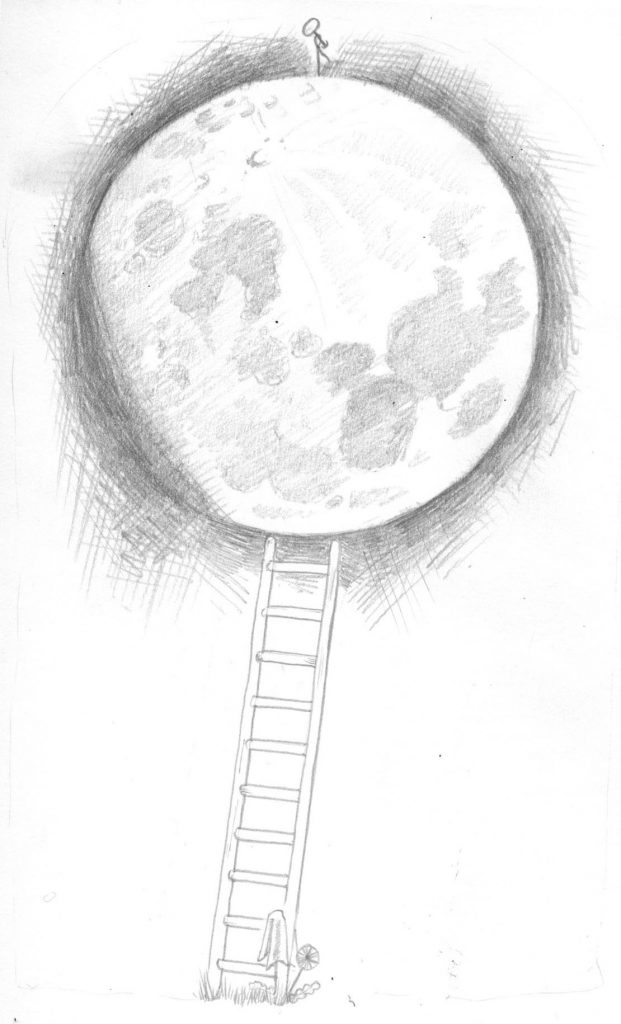
Initial pencil work
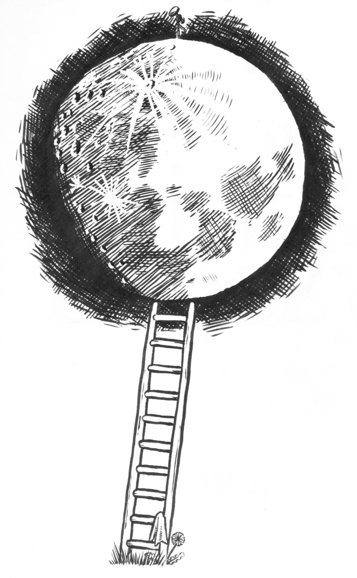
I created the work in pencil and sent it over. He requested a couple of small amends which I made for him, and once the drawing was approved I inked it. He wanted the drawing to be black and white inking, i.e. no shades of grey, so the craters of the moon had to be created with hatching.
Here’s the final ink work:
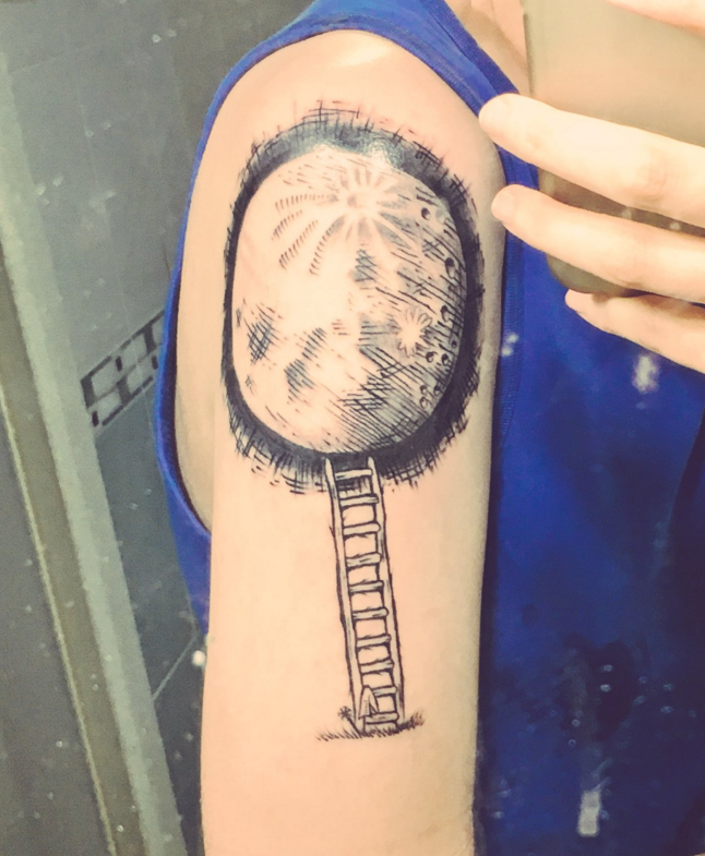
 And here is a photo (taken in a mirror) of the final tattoo. He’s going to send me another picture when it’s healed.
by Frank | Aug 9, 2016 | graphic design, illustration, interpretation
You may have seen me boasting about my beautiful new interpretation brochure on social media. Here’s a blog post sharing a bit more about it.
Showcasing interpretation work
Its aim is twofold – to showcase my work to potential clients and also to demonstrate what can be done when you decide to employ more unusual papers and printing techniques.
The brochure is printed on 100% recycled unbleached Cairn Kraft paper from Paperback. It’s been printed by Ashley House printers in Exeter using the HP Indigo – a fabulous new digital press that can print with white ink. WHITE INK. As any long-standing designer will tell you, the ability to print with white (other than through techniques like screen printing) has been something almost as long-desired and elusive as the Holy Grail so this new technology is very exciting indeed.
I used the white in three ways – to make my logo stand out, as white text on a coloured background, and as an underlayer for the regular cyan, magenta, yellow and black inks, to lift the colours as if they were printed on standard white stock. Where I used the coloured inks directly onto the stock the effect is subtle and muted and generally less in-your-face.
The brochure is 210mm square and also features white stitches.
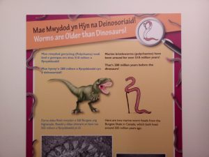
It’s focused on interpretation – work that I love, that I feel I’m good at and that I’d like more of. Mostly it’s just the work with some rather lovely testimonials from clients. It features everything from a quick fluid line drawing of an ant to huge 2 metre high display boards about plesiosaurs; from a children’s workshop illustration of a dinosaur to an exploded vector map of Wales’ most prestigious arts venue.
I’m really grateful to have been able to work with such a creative and ecologically-minded printers like Ashley House, and for all their help and encouragement with this project.
It’s my first ever promotional brochure, so I’m over the moon to hear that they are going to be entering it into several competitions. How exciting!
I’m initially only printing 100 of these, so if you commission interpretation work, or you know someone who does, and you’d like a copy, get in touch tout-suite!
Buy the print of the cover!
 After several requests I’ve decided to release a very limited edition numbered and signed print of the cover illustration. Click here if you’re interested in purchasing one of these rare beauties. At time of writing there’s only nine left…
by Frank | Jun 21, 2016 | illustration, interpretation
I’m writing this having just attended the opening of the family science exhibition Wriggle! at National Museum Cardiff. If you have small children this is a must-see – brilliantly curated, fantastic interpretation and a canny balance of information and fun. The centrepiece of the exhibition is the Wriggloo – a little room where you can learn what it feels like to be an earthworm!
You may well have seen this blog post I wrote a little while ago announcing that I’d been commissioned to create an earthworm character in a series of six poses, plus a Top Trumps-style activity, for the exhibition.
In this post I go into a little more detail about the process involved, which might shed a little light on an efficient and organised commissioning process.
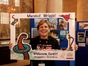
Kate Mortimer-Jones at the exhibition opening – she commissioned the illustrations
I was contacted by Katie Mortimer-Jones, worm expert and one of the curators of the exhibition. The team at Cardiff Museum had come up with a detailed and well-thought-through brief that described the personality of the worm character, including its likes and dislikes, its hobbies and its age.
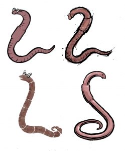
The four initial ideas
I find it useful to break down quotes into sections so clients have a good idea about what’s involved. In this case I quoted for the creation of the worm character, the pencil roughs of the poses, the inking, scanning and colouring, and the top trumps card design. I also provided a suggested timeframe that would give me enough time to complete the work well while meeting print deadlines for the exhibition opening. The quote and timeframe were accepted and we started straight away.
I drew four worm characters based on their brief with various features. We tweaked a little and came up with this one.
 Then I was given six poses or situations in which to draw the worm. They were:
- old worm (has a walking stick)
- super worm (has a cape)
- science worm (has a magnifying glass and white coat)
- digging worm (has a spade)
- swimming worm (has a floatation ring)
- awesome worm (is skateboarding)
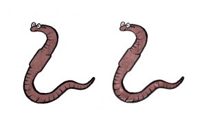
I drew these in pencil on A3 paper as they needed to be blown up very large for the exhibition. Once these were amended and approved I inked with brush pen, scanned in, cleaned up in photoshop, and then I coloured and added texture.
I then took these images into Illustrator and live traced them to turn them into vector images. This means that they could be enlarged to any size without a deterioration in image quality.
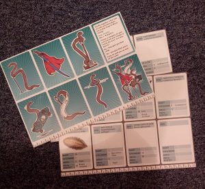 Top Trump Worms
Once the cartoons were signed off I created a series of Top Trump style cards (with the brand owner’s permission) for visitors to fill out and play together.
The final job was to cut out the Top Trumps very furry worm photos in photoshop so they sat well on a white background.
An example of my illustrations being used in the exhibition interpretation
It’s difficult to decide what the best part of this job was – being paid to draw cartoon worms or discovering that there is a creature called a Bone-Eating Snot Flower (like something out of Roald Dahl, no?). What I adore about the educational work I do is how much I learn!
I’ve given my permission for the cartoons to be used on promotional merchandise like mugs and t-shirts which look fantastic and I can’t wait to get my hands on some. The whole exhibition is a joy and if you’re in the area from June to late September, whether you have little ones or not, you should definitely check it out!
– The Wriggle! exhibition is at National Museum Cardiff, Cathays Park, is on until 30th September 2016 and is free to enter.
by Frank | May 23, 2016 | illustration
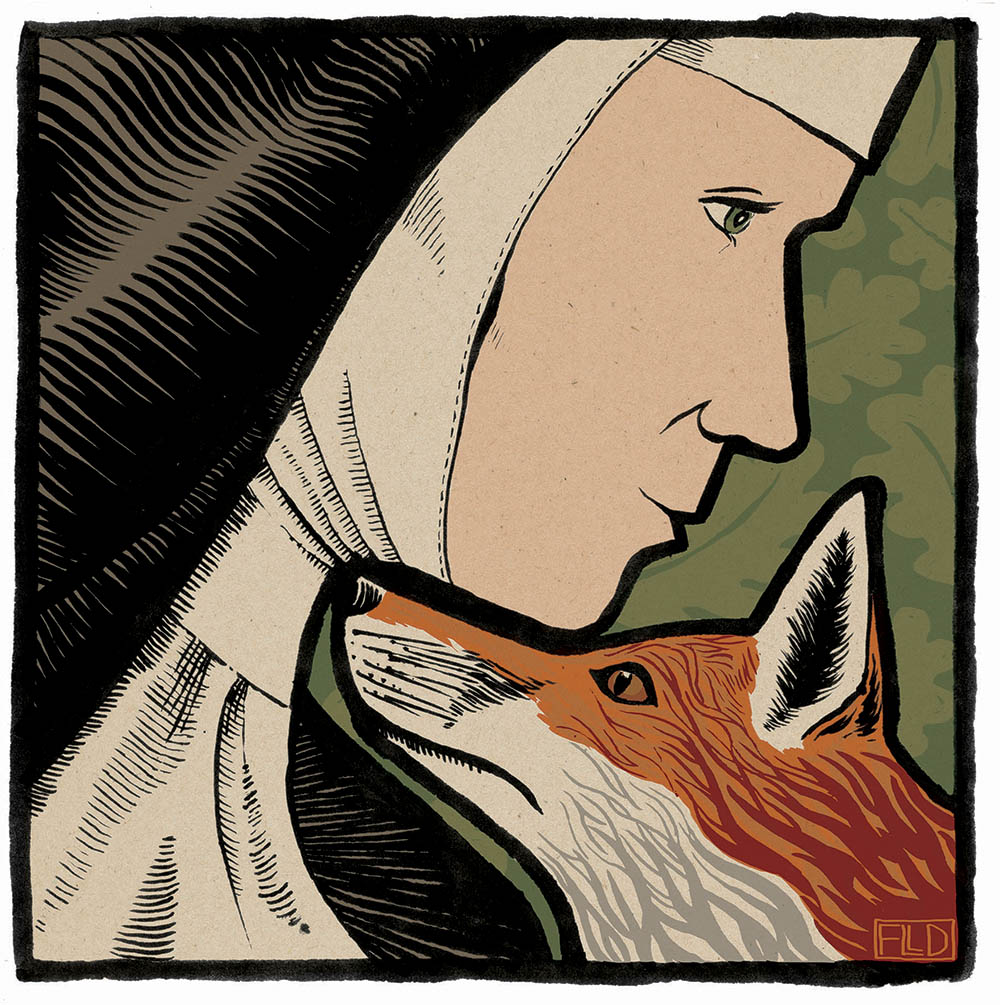
The finished work
Jane Russ is author of the upcoming Selkie story and thus commissioner of the book illustration work I’m currently beavering away on. She’s written a companion piece to The Hare Book (Graffeg, 2015) which will be published later this year and will be called The Fox Book.
She asked me to create an illustration for the new book based on the old folk tale of St Bridget and the Fox. The story is about how the canny animal-loving nun and a fox work together to save a condemned man’s life.
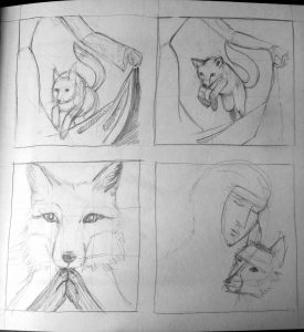
scribbled ideas for book illustration
Book illustration process
I came up with some rough scribbles – some of the fox performing tricks, as he does in the story, one of the fox praying and another of the faces of both. Jane and I decided that working on the fox and the nun together would make a powerful image.
I played with different ideas of having them together, initially positioning them in a rather mischievous “madonna and fox” pose, but let that go and worked out something a lot more interesting.
Red in tooth and claw
The commission came at an interesting time – just the day before, a young dog fox had killed half of our chickens in broad daylight. Naturally I found the deaths upsetting but still, part of the natural order of things. If we as a community wish to keep chickens then the risk of predation is one we must take and we have been very lucky – the last fox incident was four years ago. The chickens are well locked up at night and so it seems that May is the month when hungry young foxes take the easier, if riskier, option of plump free-range hens from a house with 16 humans and four dogs to contend with.
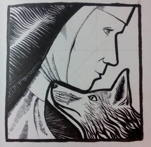
Inked-up version of book illustration
I have always loved nature and foxes have fascinated me since I was very small, but this incident reinforced my belief that to make these animals uniformly cute or cuddly is to deny their essential nature – yes, they are beautiful, intelligent, playful and adorable to our eyes and yes, they are killers. I wanted to show intelligence but also wildness in the fox – an uncompromising potential for ferocity. Here, the kindness and quiet wisdom of Bridget is poised with the fiery nature of the fox – both self-possessed and determined in their own ways and both capable of working together to an end; yet each is a very different animal from the other. Anthropomorphising animals does them no favours – nor us.
Thus, am very happy with this book illustration. Jane’s husband thought it “very Eric Gill” which is a compliment of the highest order!
- The Fox Book, by Jane Russ, published by Graffeg, will be published in October 2016.
by Frank | May 18, 2016 | illustration, interpretation
National Museum Wales asked me to create exhibition illustrations for their family-friendly Wriggle! event. They are designed to engage younger children and aid education and interpretation of the exhibition.

inking of Science Worm, replete with white coat and magnifying glass
Exhibition illustrations: the process
I’ll share a longer post about the actual creation of the illustrations on the opening of the exhibition – watch this space!
Suffice it to say that the curators at the museum gave me an excellent, well-thought through brief where they described their worm character, how old it was, what it liked to do and the impression they wanted it to give.
I came up with four different worm characters and we edited until we had one that worked. They then gave me the six poses they wanted the worm to be drawn as – superworm, scientist worm, old worm, swimming worm, awesome worm (on a skateboard, of course) and digging worm. I managed to create an image of a cartoon worm, with no limbs, digging with a garden spade. I am rather chuffed about that.
Once the worms were drawn in pencil, I inked them up using a Japanese brush pen. They needed to be fairly big, so they were created on A3 paper. They were then scanned, and then cleaned up and coloured in Photoshop.
Because the exhibition illustrations were to be huge, I then took the coloured-up worms into Illustrator. I live-traced them into highly-detailed vector images, meaning that they can now be used as big as the Museum needs them with no deterioration of quality.
The worms will appear on mugs and t-shirts and billboards across Cardiff. The exhibition will run from the 18th June to the 30th September 2016 and will be at National Museum Cardiff in Cathays Park in the city centre. I can’t wait to see it!
by Frank | May 5, 2016 | graphic design, illustration, interpretation
Interpretation is the name given for the content produced by museums, galleries and so forth which helps to explain what they have on display and why.
I’m currently working on an interpretation tender submission for a wonderful project which will involve creating a map-based family trail for a national heritage site.
I love educational interpretation!
 I’ve created a lot of interpretation-based work, especially for children and families, and my work is used to help engage with, inform and inspire younger people. I have a deep love for this educational work – nothing makes me happier than provoking curiosity and excitement in others, especially children, and encouraging them to learn, find out more, imagine. I am happiest when learning and it is a joy to have a job that encourages others to feel the same!
So anyway, as part of this tender submission I thought I’d ask one of my most important clients, Grace Todd who is Senior Learning, Participation and Interpretation Officer at National Museum Cardiff, whether she’d be able to write me a sentence or two as a recommendation for this tender.
I was blown away by what she wrote. Here it is in full:
“Frank has been contributing to the work of the Learning, Participation and Interpretation department at the National Museum Wales for several years on a range of projects. Frank is professional, efficient, and has an ability to understand and design what we require. Frank listens, and understands that our remit is engagement and thus their illustrations have to be engaging, they have to hook the reader in.
One of the most demanding projects that Frank worked on was developing illustrations for a children’s story book that we published about a dinosaur. Having written the story I had strong ideas about how the characters should look on the page. The story was an intrinsic part of one of our school’s workshops for 4-7 year olds, and as such needed to encourage engagement, and a sense of exploration and discovery for the pupils. Frank’s illustrations encourage children to go back to different pictures and to discover new things. They help children read characters’ emotions and interactions.
Recently Frank’s designed and illustrated learning and activity resources for a new high profile exhibition on archaeology. In keeping with the brief these were designed to increase the enjoyment and engagement of young visitors and their families. Frank’s playful, lively hand-inked drawings have really encouraged children to be creative, imaginative and spontaneous. They’ve also helped make big themes and topics conveyed in the exhibition accessible and easy to relate to for our younger visitors. Parents, teachers, and children have all embraced these resources, the feedback has been tremendously positive. The illustrations have encouraged visitors to look more closely at what’s being shown, prompted observation, discussion, curiosity and speculation. One of the archaeology curators said she’d never seen archaeology conveyed in such a fun way!
Frank has also contributed to a lot of ‘one off’ projects for the department over the years. Our audience is varied: families, school groups across the ages, adults, toddlers, teenagers. In each instance Frank has demonstrated sound understanding of the audience and how to engage with them. We’re always asking Frank’s illustrations to work hard, they have to engage visitors, convey ‘big stories’, encourage imaginative, exploration and creativity, and help make the museum experience fun. Frank has demonstrated an ability to do this on every project.”