by Frank | Jul 10, 2017 | prints
After a break of two years I’ve created another screen print – and o! how I loved it.
Falmouth University’s print room has some amazing equipment and I am delighted with how these prints have come out.
It’s an edition of 15, and as I write there are 10 left for sale.
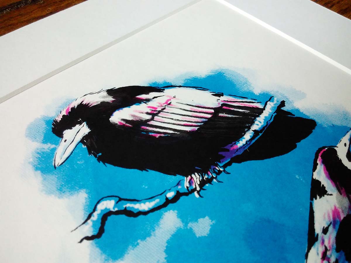
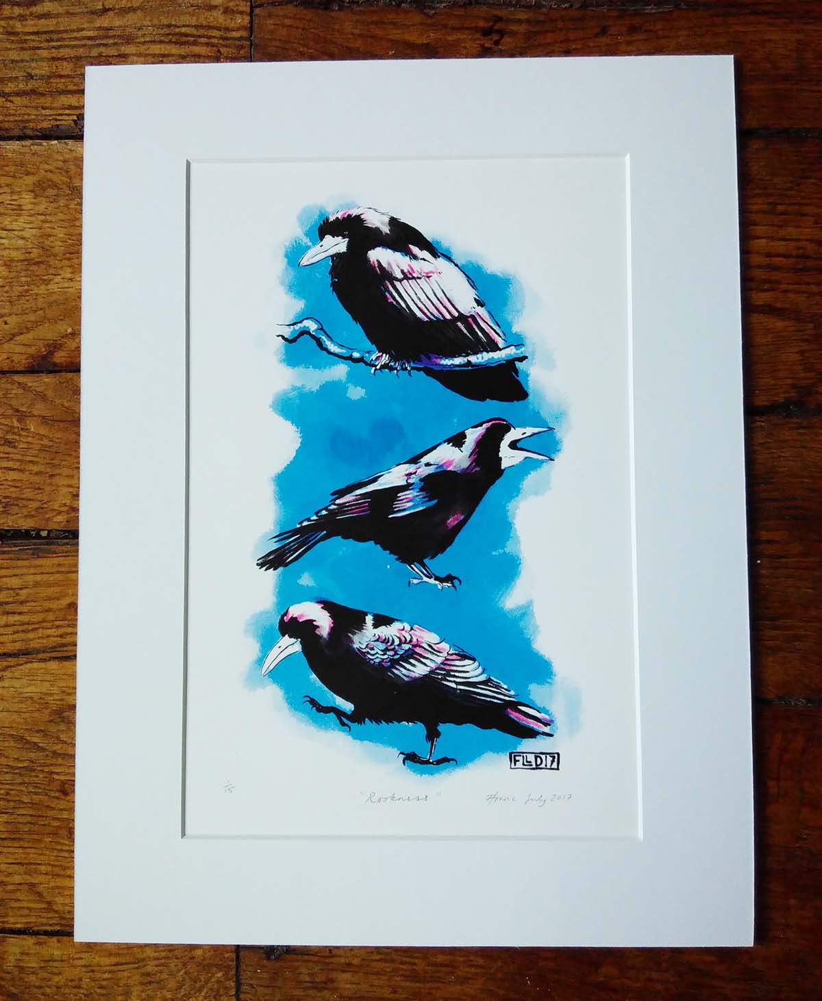
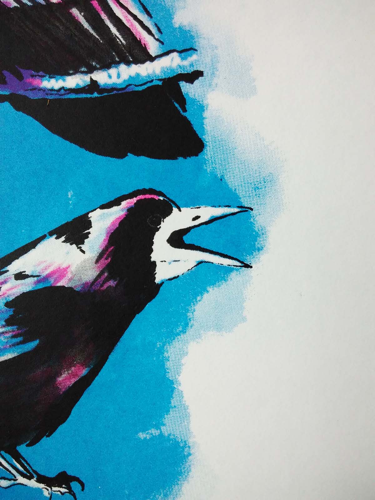
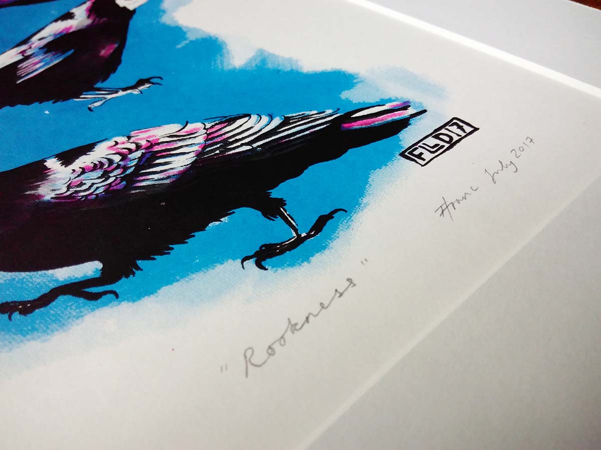 The rooks were hand drawn and inked, scanned into photoshop where the coloured layers were added, and then the three colour layers (black, pink and blue) were separated out, printed onto acetate and exposed onto screens with a photosensitive coating. Where the screens were exposed the coating can be washed out, and ink pushed through the tiny holes in the screen with a squeegee.
The prints are roughly A4 in size, and mounted onto 12″ x 16″ professionally-cut white mount board. They are £45 each including postage and packing to the UK.
You can click on this link to buy them. £10 from every sale goes towards my housing co-op’s fund to increase the family space we have available.
Thanks!
by Frank | Jun 26, 2017 | illustration
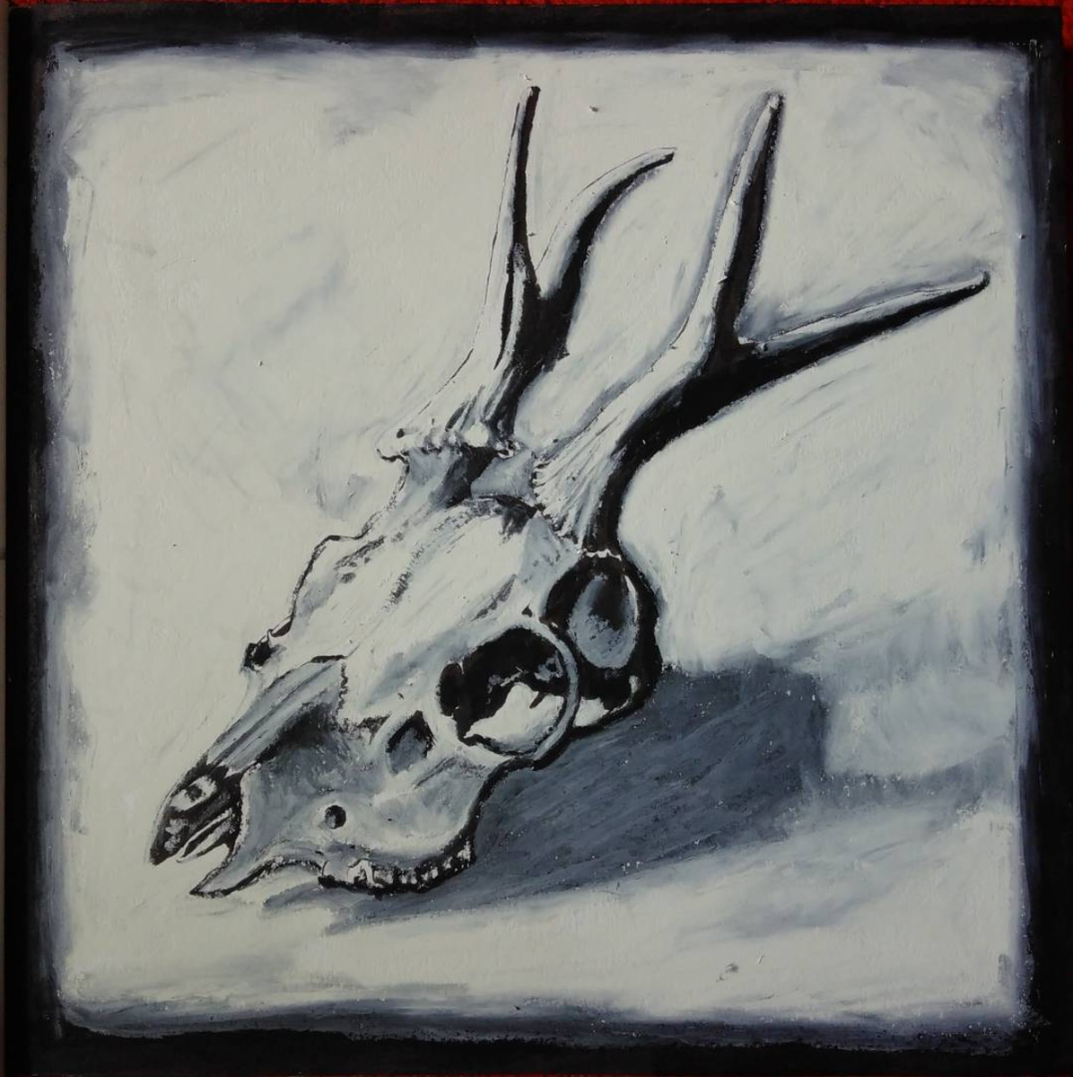
I had a few hours spare this afternoon so thought I’d play around with mixing brush pen and oil pastels to create this deer skull illustration, and I’m really pleased with the result.
I embarked on my Master’s in Illustration in order to improve my illustration style – I wanted to learn how I could impart more depth and feeling into my drawings.
I’ve been playing around with very quick drawings using oil pastels and other fairly crude media (by crude, I mean that which is difficult to work fine detail – the shadows and colours you can get with pastels are sublime). I’ve never really bothered with oil pastels before, but I’m using this part-time degree to experiment as much as I can and I’m loving it.
I’m particularly excited about this deer skull illustration because it uses the brush pen – a medium I use for commercial illustration all the time – for detail, and then over this I work in the pastel and it gives a kind of subtle viscerality (if that is a word). There’s a body to it, a meaty-ness, and the background has as much life as the subject.
I’m going to work this style with other pieces and see where it gets me.
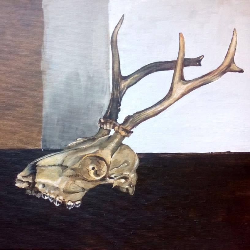
Here’s another painting I did of the same skull about a year ago:
by Frank | Jun 1, 2017 | graphic design, illustration, interpretation
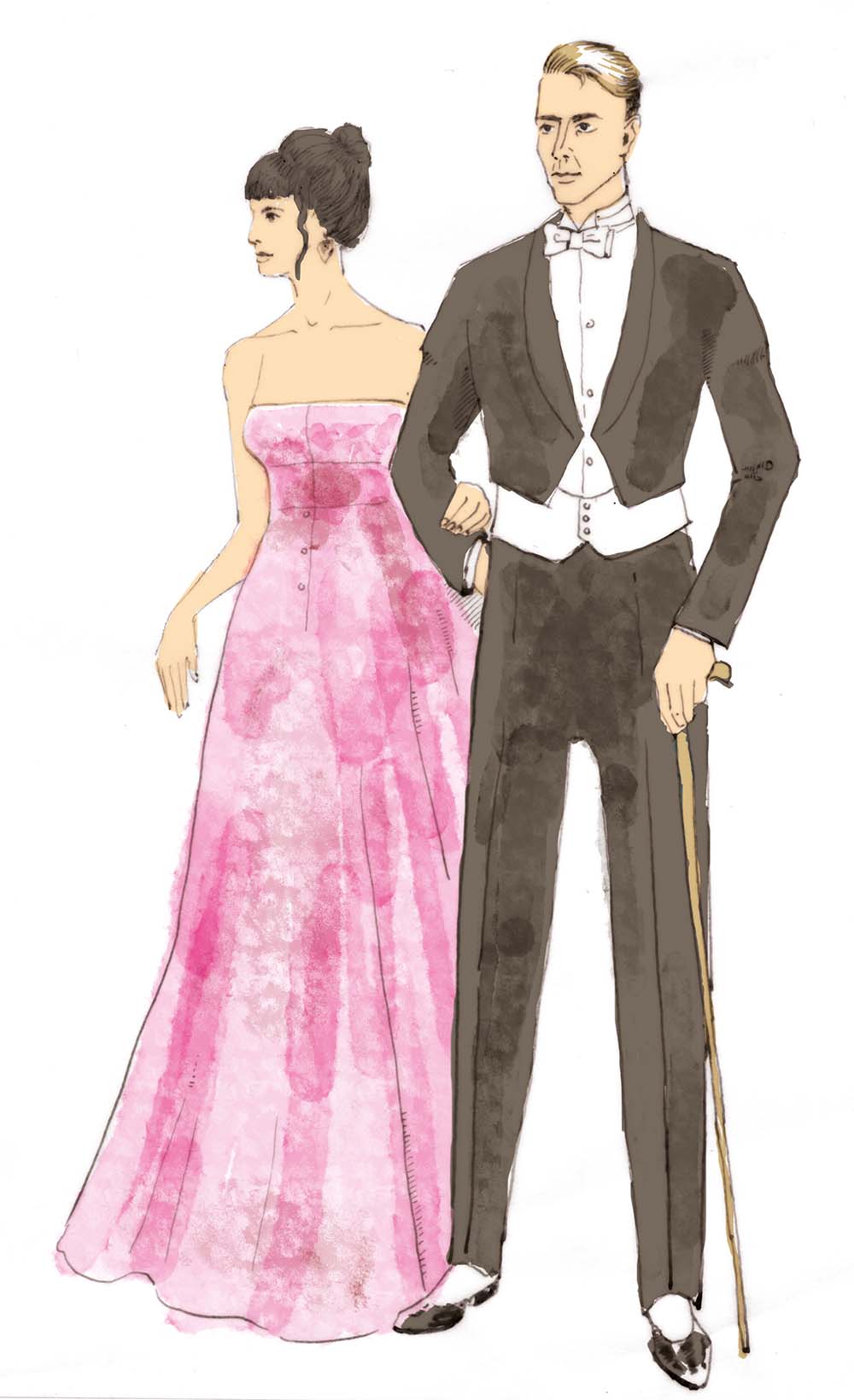
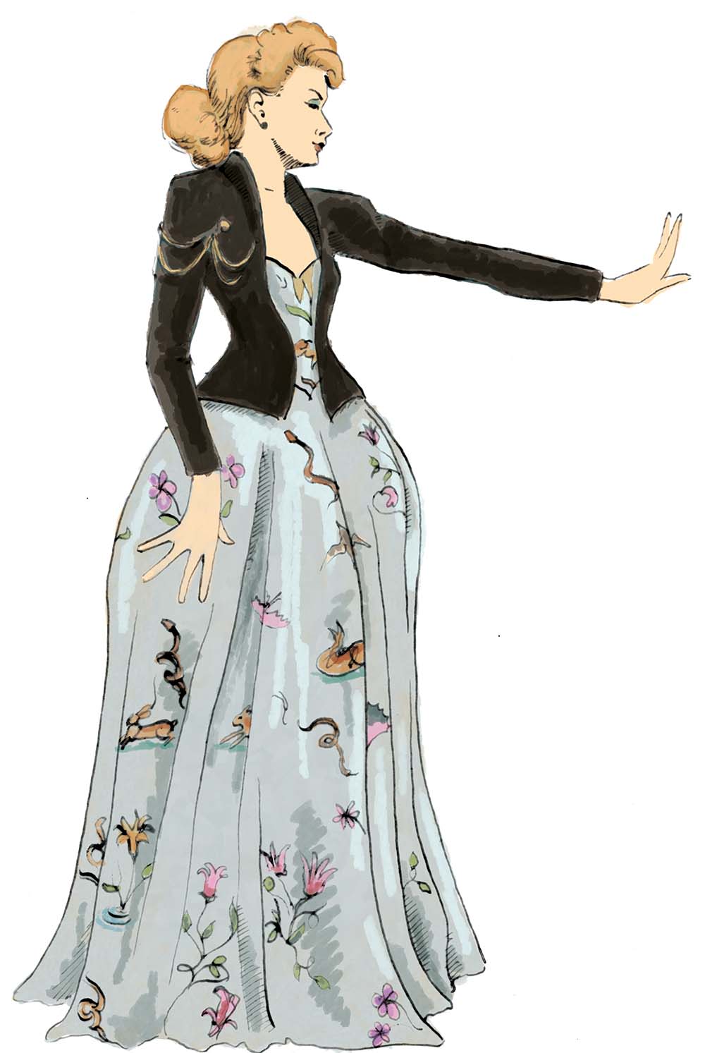
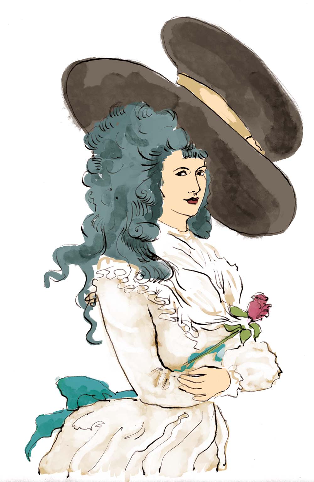
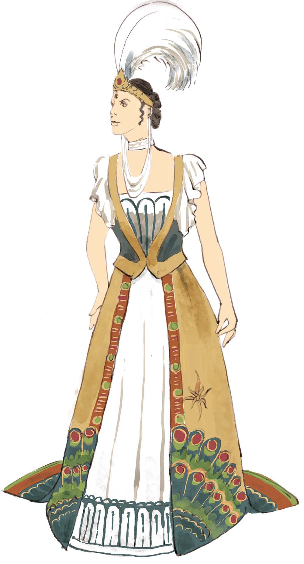
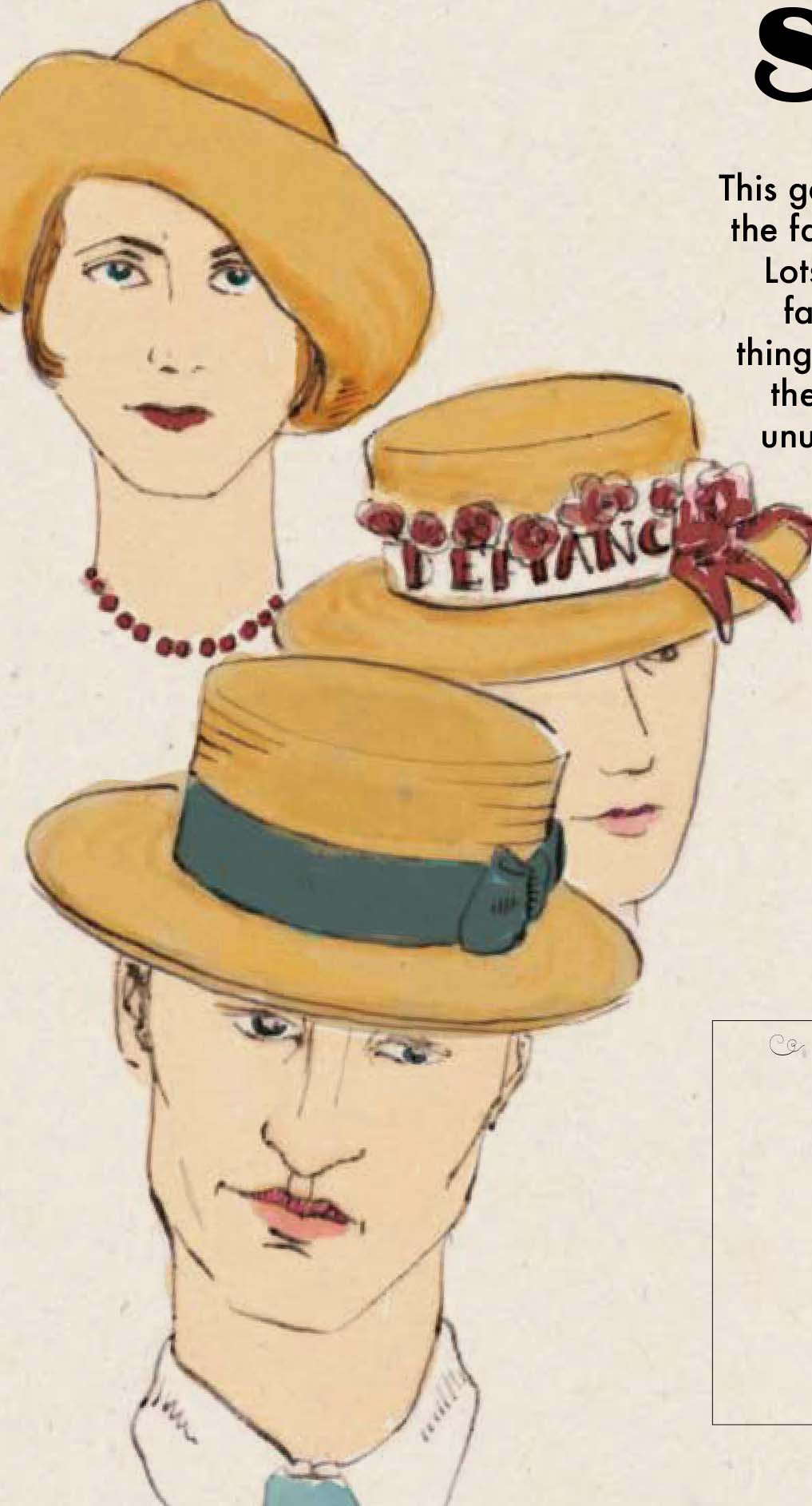
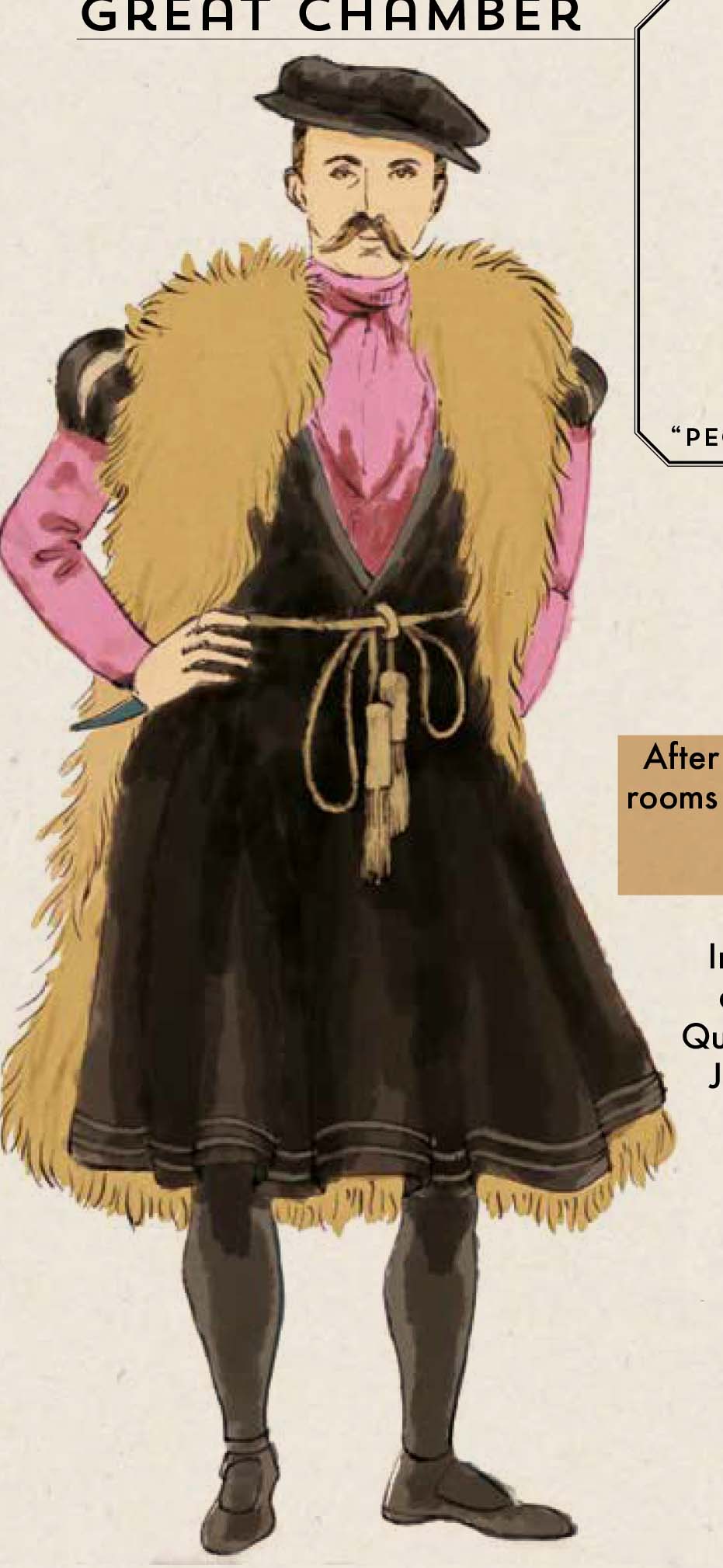
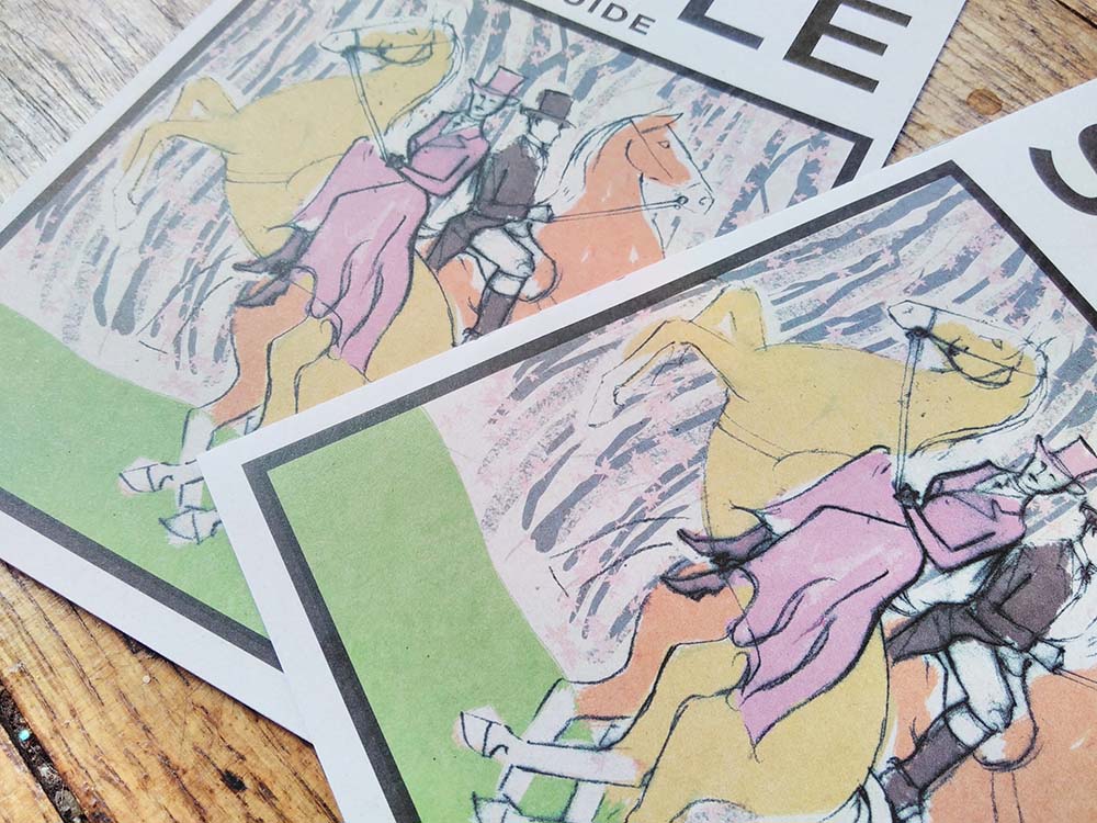
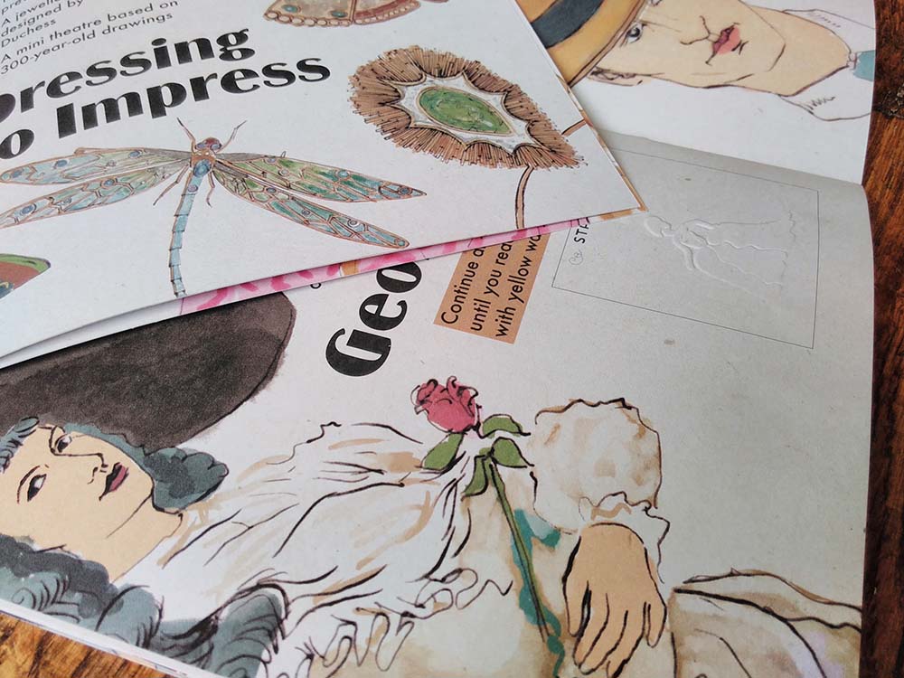 I recently completed this illustrated interpretation trail for a top heritage visitor attraction. I’ve done a lot of illustrated interpretation trails, like this, this and this. I’ve created them as single pages to bigger bilingual activity booklets, many for National Museums Wales. It was wonderful to be contacted by such a big name on the strength of my previous work.
Contractors aren’t allowed to mention the name of this client in their publicity material so I have to keep quiet about who it was created for, which I’m sad about because I am so chuffed to have worked with them!
I was asked to tender along with 6 other graphic designers and was delighted to have been selected. A wonderful thing the client did was to offer to pay people for submitting tender work – other buyers take note – you’ll get a much better quality of submissions.
The trail is 12 pages at A5 on uncoated paper. I used a different illustration technique from usual – dip pen and ink. I really like the effect – elegant and light – and am going to be using a lot more in future.
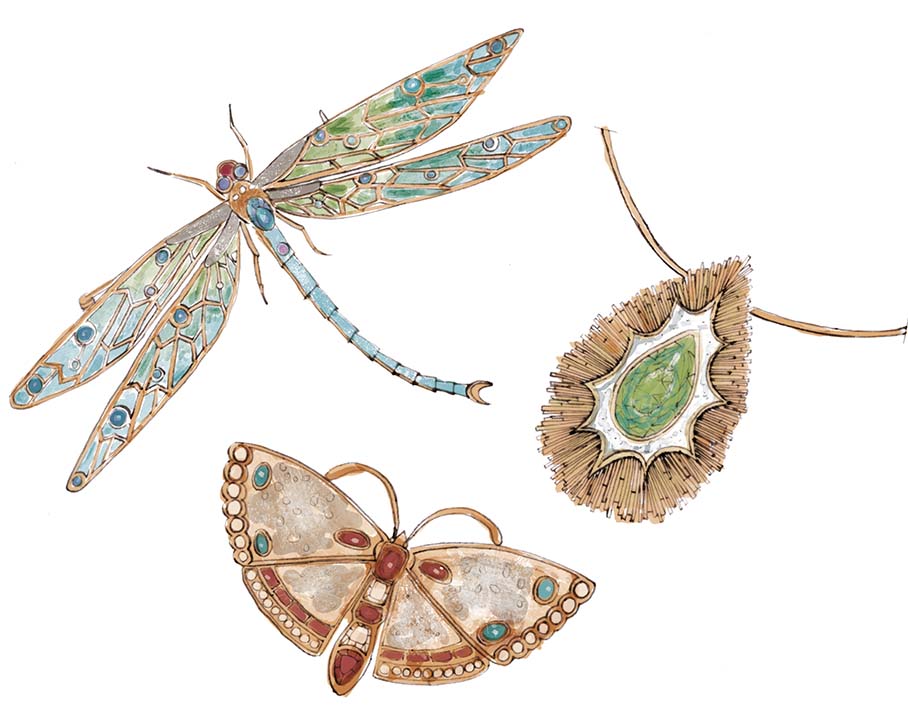
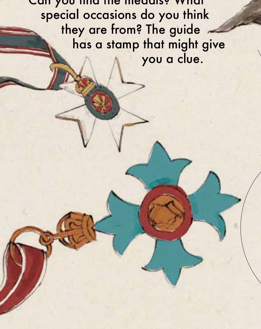
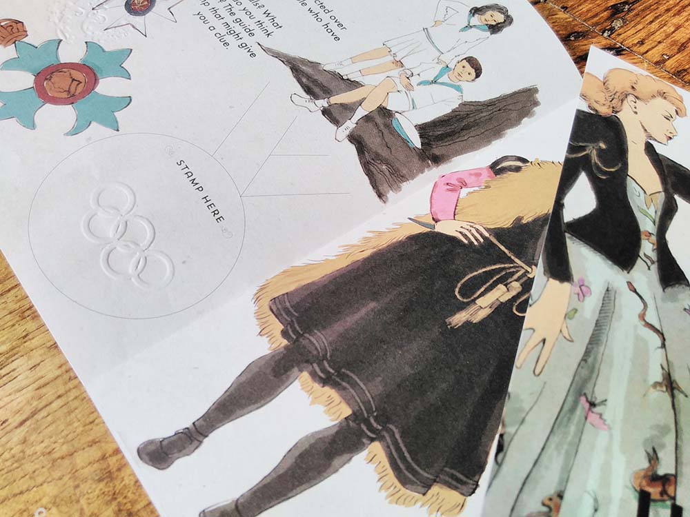
The exhibition the illustrated interpretation trail has been created for is one of fashion through the ages and so I drew some wonderful clothes – ball gowns, fancy dress, children’s clothes, along with accessories like jewellery and hats.
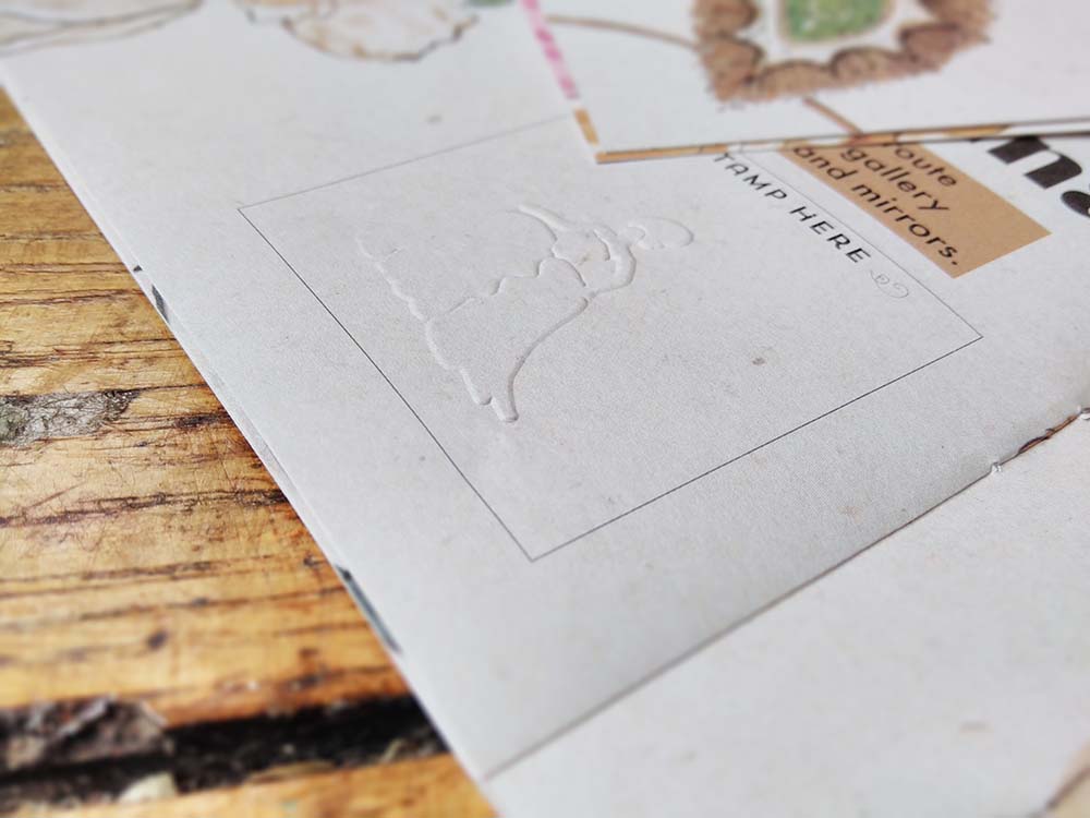
Because the client is a heritage site, ink can’t be used in the building, so where families complete the activities as they work their way around the exhibition they will be given an embossing stamp to mark their achievements. There’s a space on most pages for the stamp and each activity has a different stamp.
I really enjoy the creation of interpretation trails. They involve me blending my love of learning and encouraging learning, of explaining pictorially, and I get to draw some incredible things. But the best bit is watching families using and enjoying the trails – and seeing the way children often draw over the top of my work and make it their own.
This was a fabulous opportunity and I enjoyed every moment!
by Frank | May 23, 2017 | illustration, thoughts
 Some of you will know that I’m studying for a part-time Master’s degree in Illustration: Authorial Practice at Falmouth University. I can say, hand on heart, that the decision to do this is one of the best choices I’ve made. It’s pushed and shaped the ways I’ve thought about illustration and my own approach to it much further than I ever anticipated – and I’m only a quarter of the way in.
 I handed in my first essay recently – the first I’ve written in 17 years. I was really proud of it – it is definitely the best thing I’ve ever written, but most importantly it was the first time in the whole of my academic career – from GCSEs, A-level, Art Foundation and BA Hons, that I’ve written an essay and learnt and developed from it, rather than it just being an exercise where I jump through a hoop and get a grade reward.
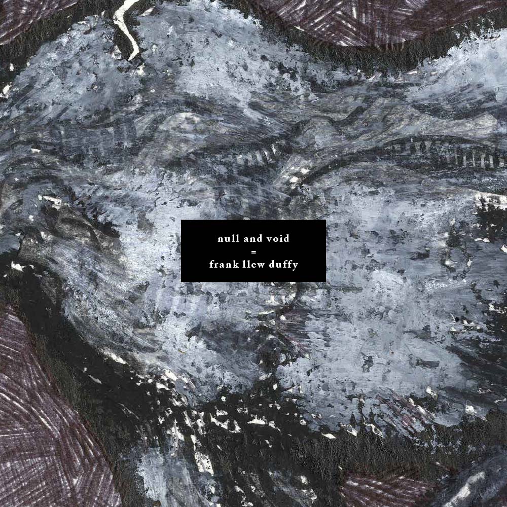
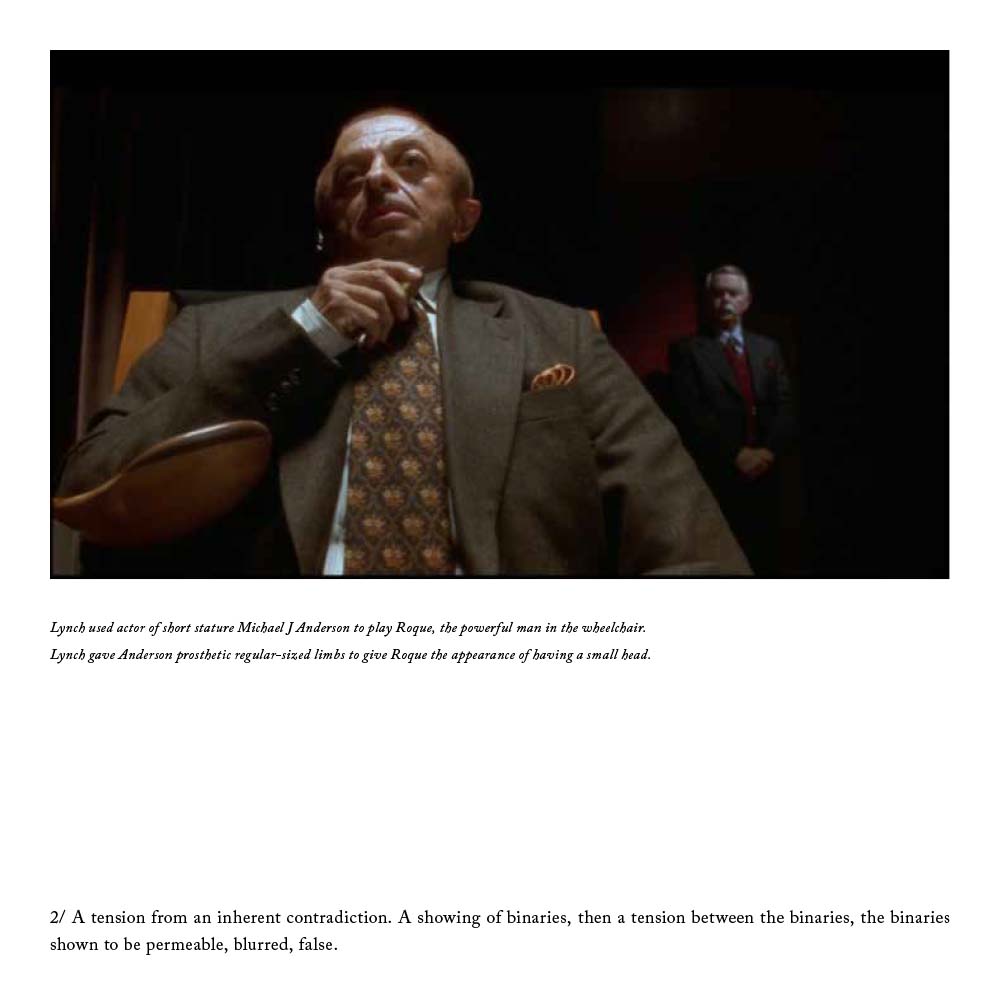
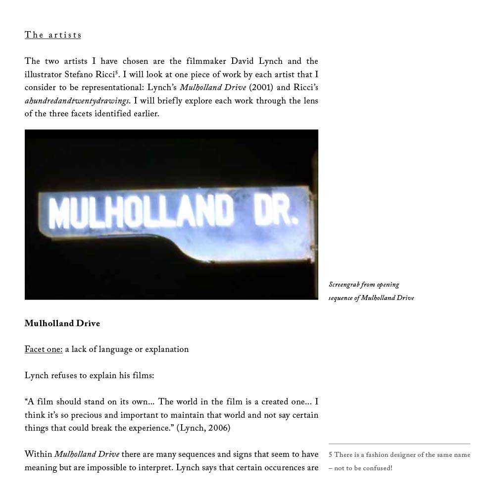
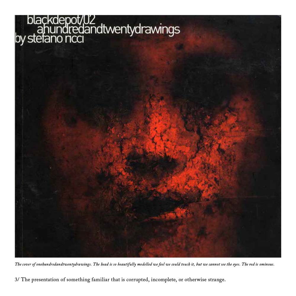 I wrote it about uncertainty in art, and took Twin Peaks director David Lynch’s Mulholland Drive and illustrator Stefano Ricci’s Depositonero as case studies. I looked at the use of uncertainty – something I’m fascinated with – through the lenses of queer theory, Jungian psychoanalysis and deconstructionism and showed how I was using it in my own practice. A percentage of the marks given were for the design and presentation of the essay – it was supposed to reflect the content. I printed it on tracing paper, cut it to loose-leaf squares and handed it in in a black hand-made cardboard box. I wish I’d taken some photos now!
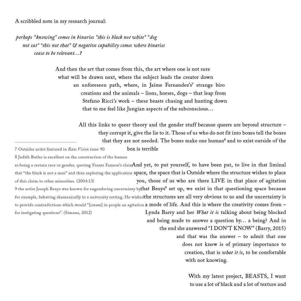
 I just got my marks back. 50% is a pass, 60% is a merit and 70% is a distinction. I got 80% which is the best mark I’ve got for anything since my GCSEs. It’s amazing what you can do when you’re passionate about something! We were encouraged to be creative with the essay-writing process, so while the first two chapters were fairly standard in their academic writing style, the third was fully-referenced stream-of-consciousness, and the layout reflected this, the main body text flowing through the page and the footnotes bashing up against it:
The word count was 3,000 which was torturous – I could have easily written 10,000 words. But it was a truly satisfying process and the discipline of editing is a vital one to develop.
If you’re interested in studying for an MA you can now get student loans to pay your tuition fees. I’m enjoying every moment of mine and I have noticed tangible improvements in the quality of my client work because of it. 
by Frank | May 23, 2017 | branding
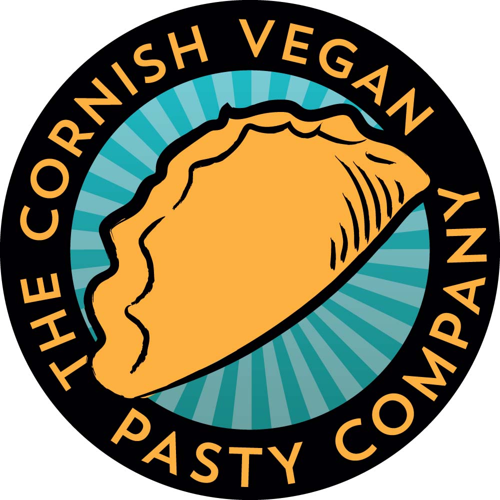 Nobody’s perfect and one of the things I am rubbish at is asking clients for feedback on the work I’ve done for them. I’ve only just got around to asking the amazing Sam Grady of The Cornish Vegan Pasty Company if she’d write me a testimonial for the logo design I did for her. Her response blew my mind so naturally I’m sharing it everywhere. So chuffed to have been asked to help out a fellow vegan business with their graphic design and even more chuffed that she should be so lovely about the process! She said:
“I feel extremely blessed to have found Frank! Frank took my rough idea, developed a handful of concepts (all of which would have actually been great) and worked with us to refine the logo, develop our product labels, and think about our brand. Ironically, when Frank first described one of the logo concepts I thought it would be my least favourite, but it’s now our logo! I love it and get so much positive feedback about it. Frank is extremely talented, the combination of graphic design & illustration means that Frank’s work can be corporate or creative or a combination.
“Choose Frank, trust Frank, and like me you’ll never need anyone else!”
Sam’s also bought one of my fox prints in support of the hunt ban and it’ll be on display at their new premises in St Agnes, which I’m over-the-moon about.