by Frank | Feb 3, 2014 | CIO Connect, graphic design, illustration, magazine design
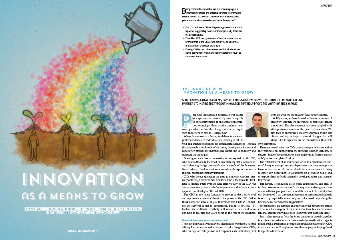
 This issue of CIO Connect magazine seems to be quite focused on growth. The economy (we are told) is improving, apparently, so a couple of the articles are about how to get the best out of that growth. Thus, two of my illustrations feature plants – a big tree with speech bubbles for leaves (showing how growth can be made more solid when everyone’s opinions are taken on board) and a watering can nourishing seedling employees and helping them be more creative.
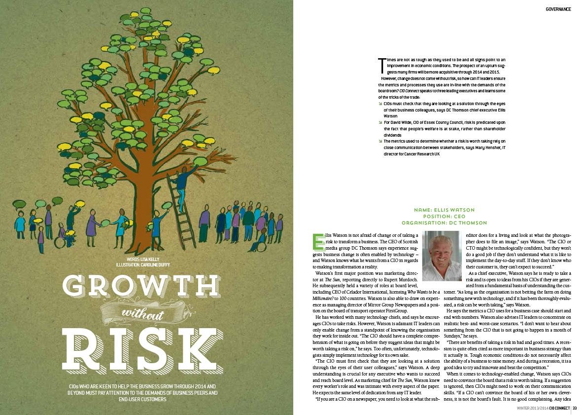
As ever there is some stunning photography from Martin Burton who makes my job so much easier.
You can view the whole issue digitally here
by Frank | May 14, 2013 | CIO Connect, graphic design, magazine design

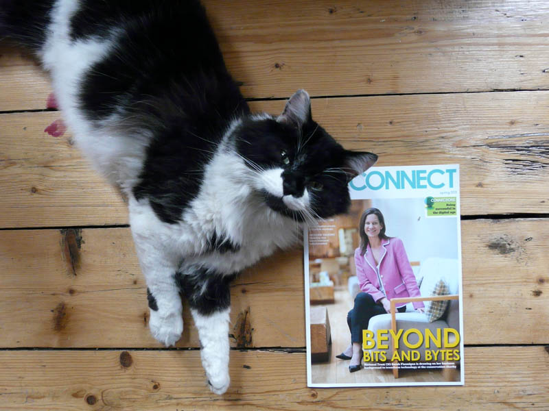
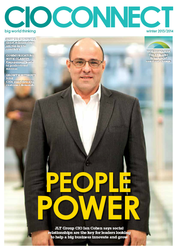
Henry the cat presents the latest issue of CIO Connect magazine
Well hello my lovelies! Now that it’s summer *looks out of window* I mean, now that it’s MAY, the latest issue of CIO Connect magazine is dropping on to doormats and desks across the world. And I designed it! Here is a picture of the magazine, with a cat.
I guess some people might think that designing a magazine about IT would be boring. It’s quite the opposite. It’s about IT leaders and how they solve problems (solving problems being one of my favourite things to do) and the editor Mark Samuels lets me have a bit of a free rein with the design. We want to keep it fresh and interesting and have the personalities of the people interviewed jump out at you. Because I’ve been designing it for so long I feel I know their readership quite well, so I have a lot of fun creating illustrations and spreads for the magazine.
I guess my best advice for those thinking of publishing a magazine is to invest as heavily in images as in copy – good photography and illustration make the world of difference. They bring life to the page and really draw the eye in. You can go the other extreme and have a periodical with few photos at all – and still have wonderful design – but bad photography is really worse than none.
More spreads below for your viewing pleasure (click on anything to make it bigger), and the full issue of the magazine can be read online here!


by Frank | Aug 15, 2012 | CIO Connect, graphic design, illustration, magazine design, slider
As I write, it’s raining. Plus ça change. But that doesn’t stop there being a fabulous new issue of CIO Connect magazine out! Hooray!
I designed it from front to back, and this issue, like the last one, I was asked to create some illustrations. Here are some of the purty pages for your eyes’ happiness!


by Frank | Jan 18, 2012 | CIO Connect, graphic design, magazine design

CIO Connect magazine cover design
Here’s a quick look at the Winter issue of CIO Connect. It’s a quarterly magazine for Chief Information Officers (top IT bods to you and me).
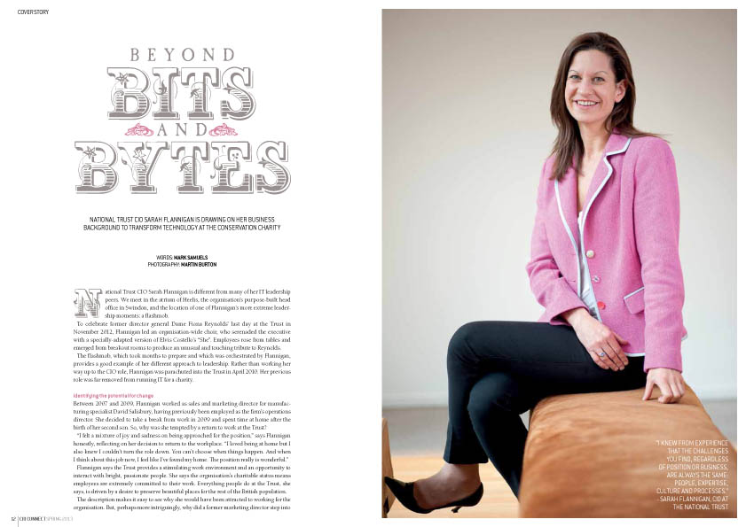
Normally the cover feature photos are taken by the talented Mr Martin Burton. Unfortunately this issue the interviewee didn’t have time for a photoshoot so we had to use supplied PR shots which, although passable, were not nearly as beautiful as Martin’s work.

cover feature
Usually we have a couple of features on the same subject that warrant being linked by a design device while still appearing to be part of the magazine as a whole. The background texture, use of road-sign symbols and similar layouts mark the features below as separate from the others, but the fonts, layout grid and page furniture are the same throughout the magazine.

security feature design

...and again
I learn something new from every project I work on and, though I’ve designed CIO Connect magazine for eight years, I’m still trying to up my game & improve on the previous issue. It’s one of the most satisfying parts of the job and I really enjoy it.
by Frank | Mar 14, 2011 | CIO Connect, graphic design, magazine design

Yes, I do. It’s possibly my favourite thing to do. It’s all about retaining a united look for the whole publication, but differentiating articles from each other. Tis a fine balance. My general rules of thumb would be:
• choose a few key fonts. I’ve cut down the amount I use for each publication over the years; at present I probably use three font families with CIO Connect magazine, and two with Pulse. Body fonts, header fonts, subheads, captions and general page-furniture should all fit nicely together. Contrast the old with the new; pay attention to the rhythm and shapes of combinations of typefaces.
• restrict the palette of colours used for each article. Echo or juxtapose with the main imagery.
• and while we talk about imagery – the better this is, the better your publication will look. It’s not impossible, but it is time-consuming, frustrating and demoralising to polish a turd. If you’re relying on other people to send photos to you, get them your specs early and remind them often. Request professional photography. Nevertheless, you will be sent blurred dark low-resolution images. It’s a fact of life, like aging and Jimmy Carr.
• never underestimate how much structure – and therefore beauty – one can add with clever page furniture. Page numbers and kickers might seem like dull must-haves but, if done well and used with elegant column and margin proportions, they really lift and frame a page. They are like the eyebrows of the magazine, if you like.
As ever, click on the pics for bigger versions. And if you’d like me to design your magazine to look this good, get in touch!