by Frank | Jul 3, 2012 | CIO Connect, graphic design, illustration, magazine design
is it really three sweet months since I have blogged? *slaps wrists* See the thing is that I know one should blog like maybe twice a week but sometimes life gets in the way a bit and I’m easily distracted and OOH LOOK KITTENS ON THE INTERNET
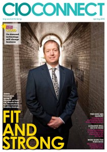
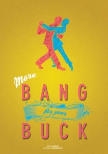
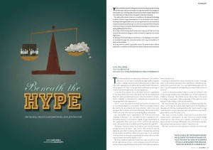
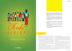
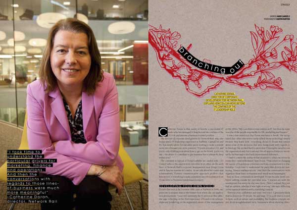
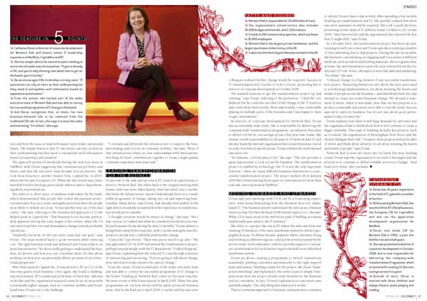
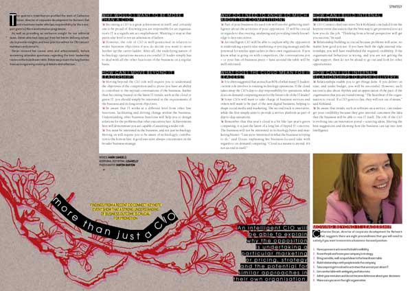
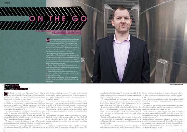
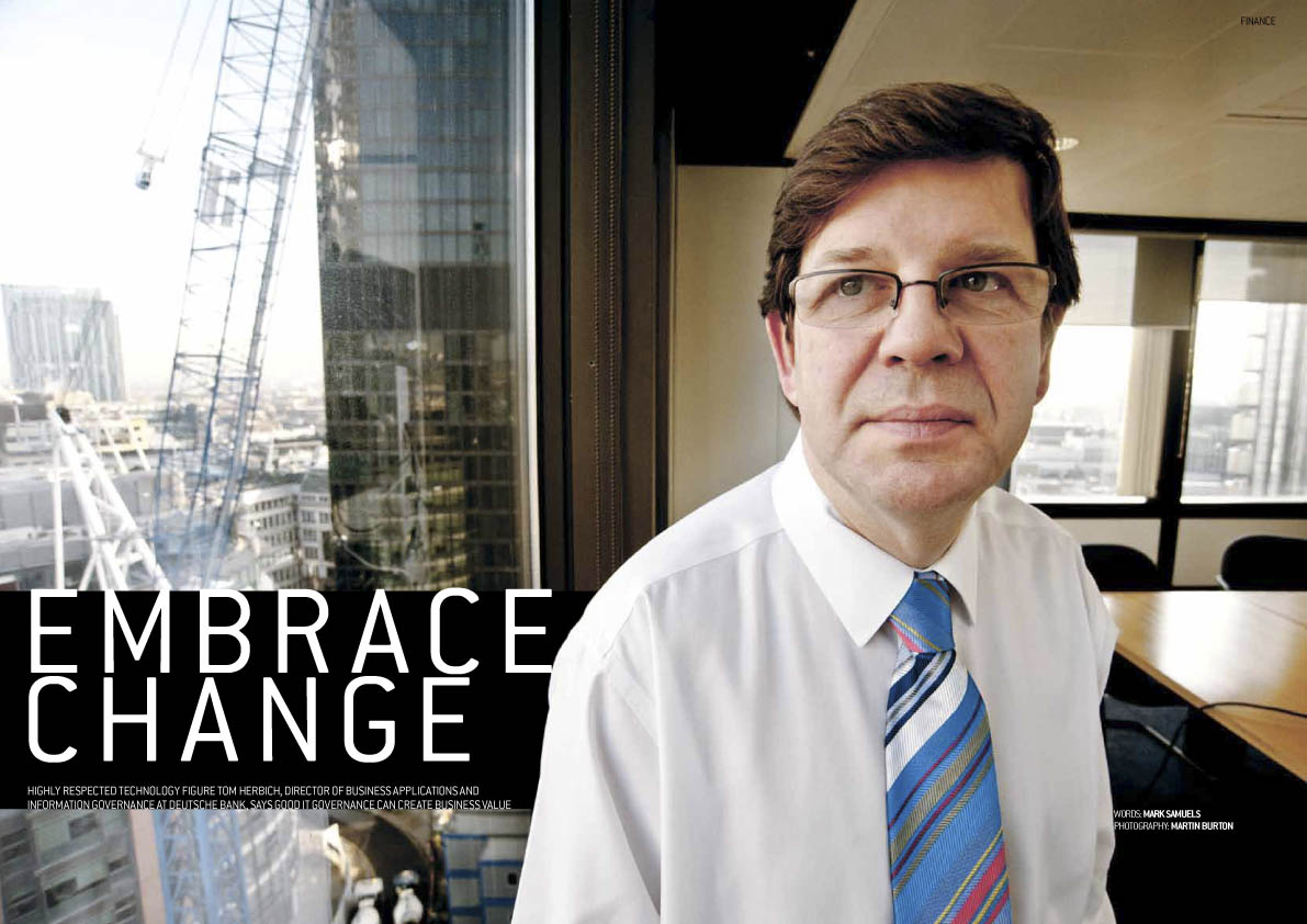
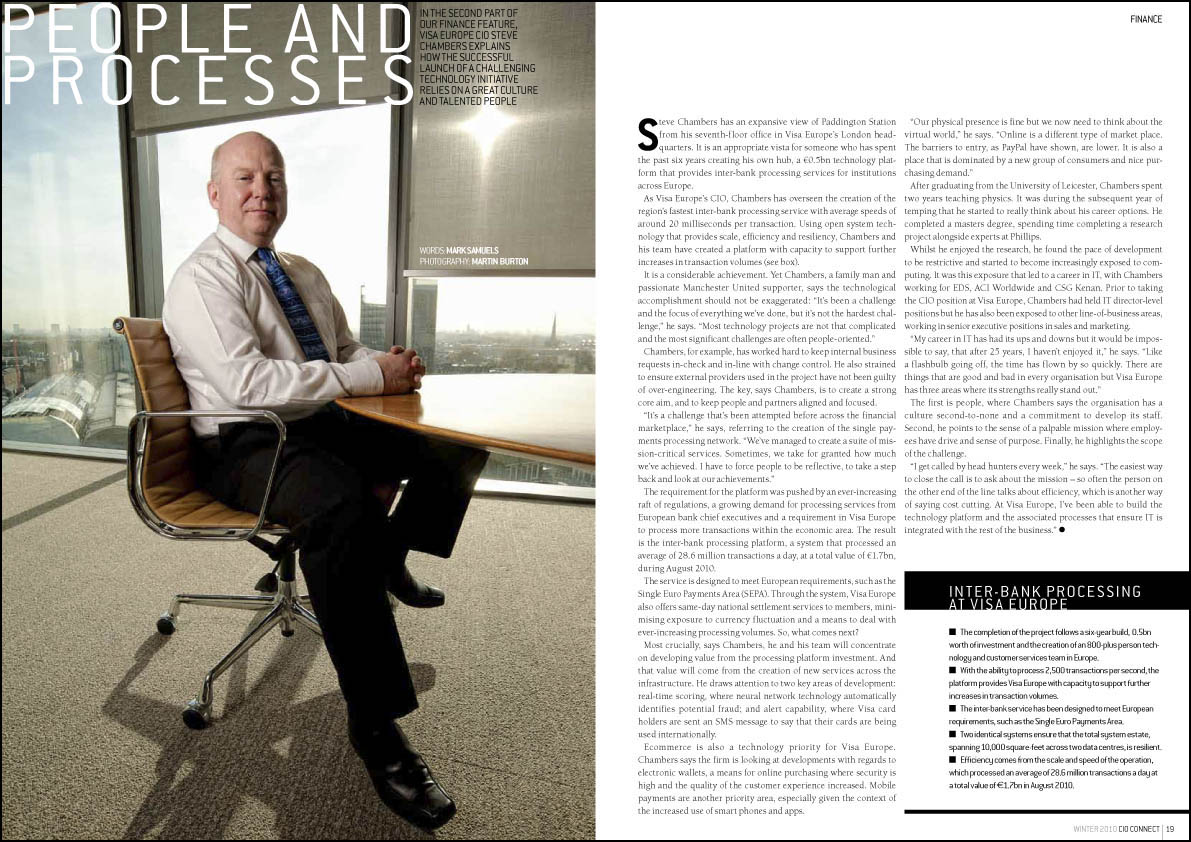
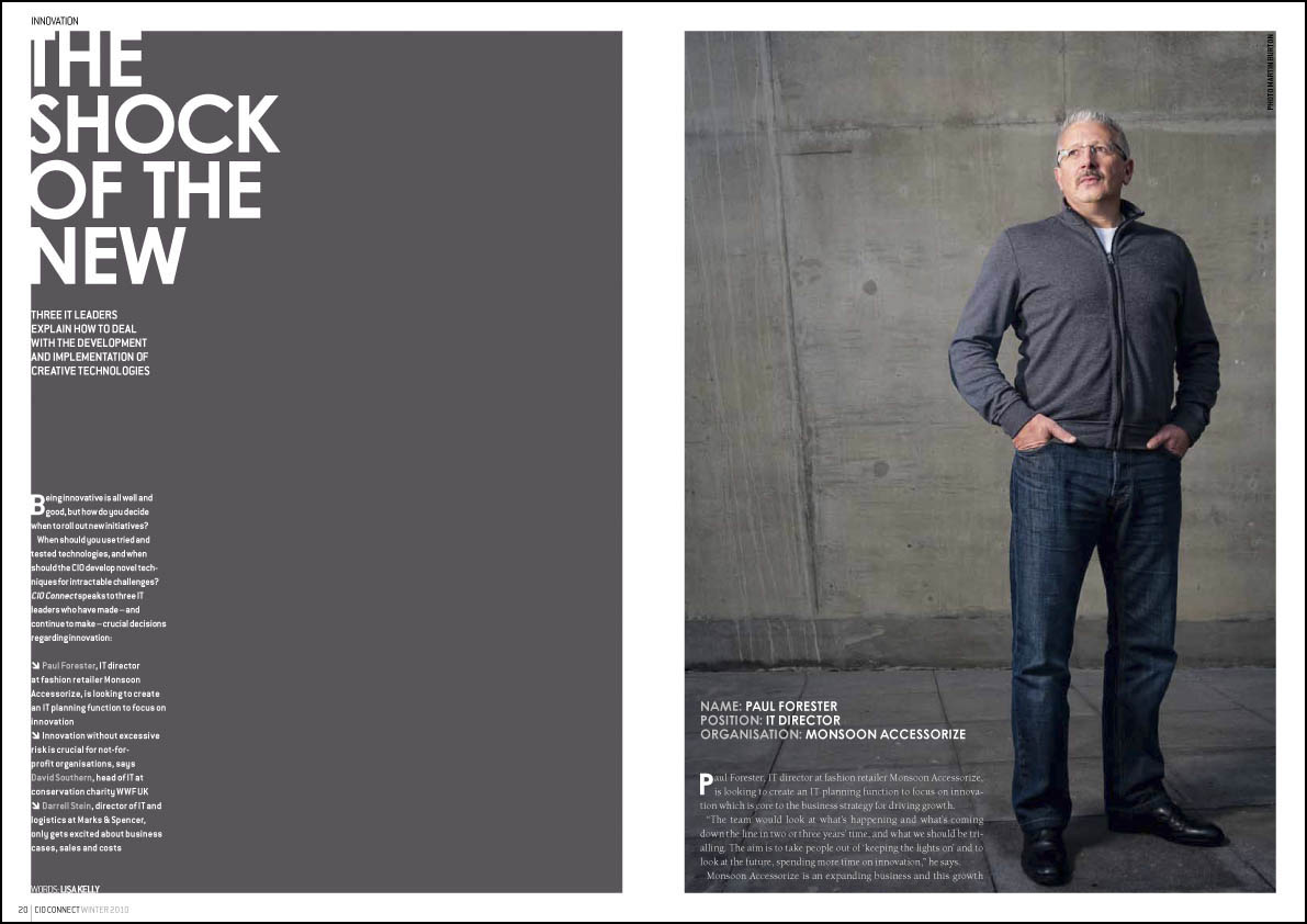
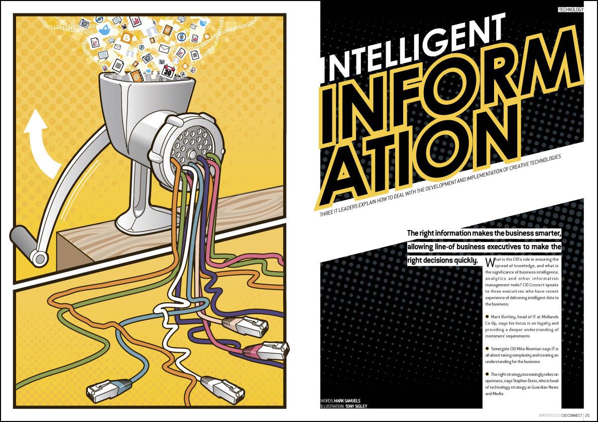
So, I’m going to try and update you with some of the work I’ve been doing lately. For starters, here’s the most recent issue of CIO Connect magazine. Lovely editor Mark Samuels has asked me to do a bit more illustration for the publication. You can see sections of illustrations for the up-and-coming Autumn issue on my Facebook page now (just to tease you). I’ve been able to take a bit more time with those ones; I had very little time to do the illustrations below – I like them, but I think the ones for next issue are a bit better developed!
Click on any image for a bigger view.
by Frank | Mar 28, 2012 | branding, CIO Connect, graphic design, illustration
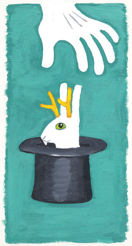
CIO Connect has been a loyal client since 2003 and I’ve been designing the branding for their annual conference for top IT types for, hmm, three or four years now. Looking back on the way we came to this year’s final image, I thought it might be a great illustration of how I work together with my clients to create an image that works.
This October’s conference theme is “Embracing the Unexpected”; so late last year (they are organised types at CIO C) they asked me to come up with some ideas around the theme.
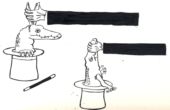
I came up with the following rough ideas:


CIO Connect said that they liked the Jackalope (being a ferocious antlered version of a rabbit) coming out of the magician’s hat, but they thought it might not be obvious enough. Perhaps something more overtly ferocious might work? So I created some rough inkings of crocodiles (text was to go across the black arm of the magician). At first I struggled with the idea of what the magician was to grasp, & so gave the croc some bunny ears. Then the jaw-holding idea came to me. I sent both ideas to the client, despite thinking the latter a lot stronger. Normally I wouldn’t do this (David Carson said once never to show the client something you don’t like as that’s what they’ll choose) but I trusted the people at CIO C to pick the better one – and also, sometimes great ideas are born from humble beginnings. Thus:

We like the second one, they said. Can you develop it?
Well, I redrew and I inked and I scanned and I coloured and dear reader, I made this, the final design, with lettering and brand colours:

The response: “I love it!! …thank you so much it’s fab and so different from our usual!”
by Frank | Jan 18, 2012 | CIO Connect, graphic design, magazine design

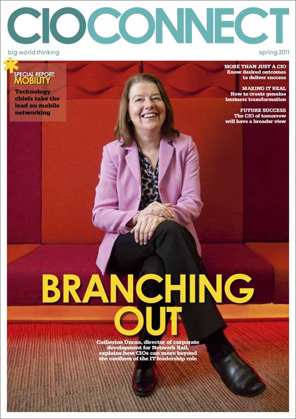
CIO Connect magazine cover design
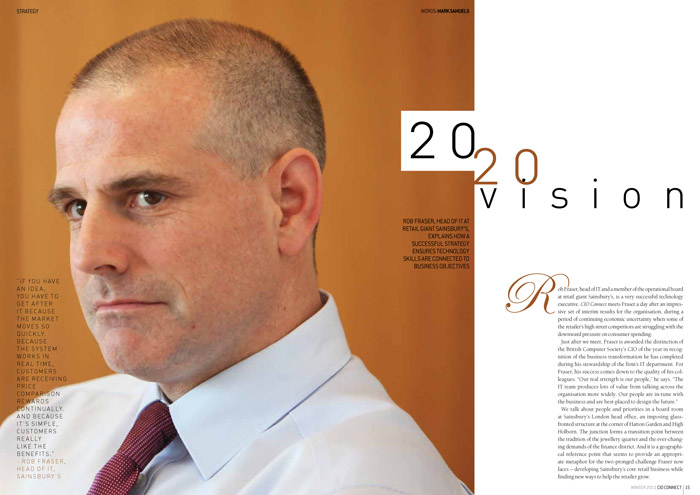
Here’s a quick look at the Winter issue of CIO Connect. It’s a quarterly magazine for Chief Information Officers (top IT bods to you and me).
Normally the cover feature photos are taken by the talented Mr Martin Burton. Unfortunately this issue the interviewee didn’t have time for a photoshoot so we had to use supplied PR shots which, although passable, were not nearly as beautiful as Martin’s work.

cover feature
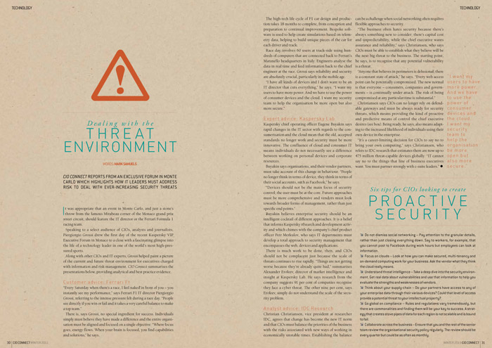
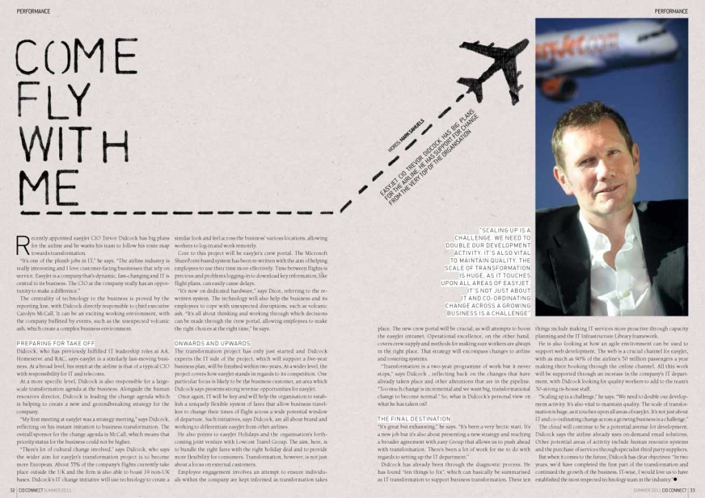
Usually we have a couple of features on the same subject that warrant being linked by a design device while still appearing to be part of the magazine as a whole. The background texture, use of road-sign symbols and similar layouts mark the features below as separate from the others, but the fonts, layout grid and page furniture are the same throughout the magazine.

security feature design

...and again
I learn something new from every project I work on and, though I’ve designed CIO Connect magazine for eight years, I’m still trying to up my game & improve on the previous issue. It’s one of the most satisfying parts of the job and I really enjoy it.
by Frank | Jul 18, 2011 | CIO Connect, graphic design, magazine design
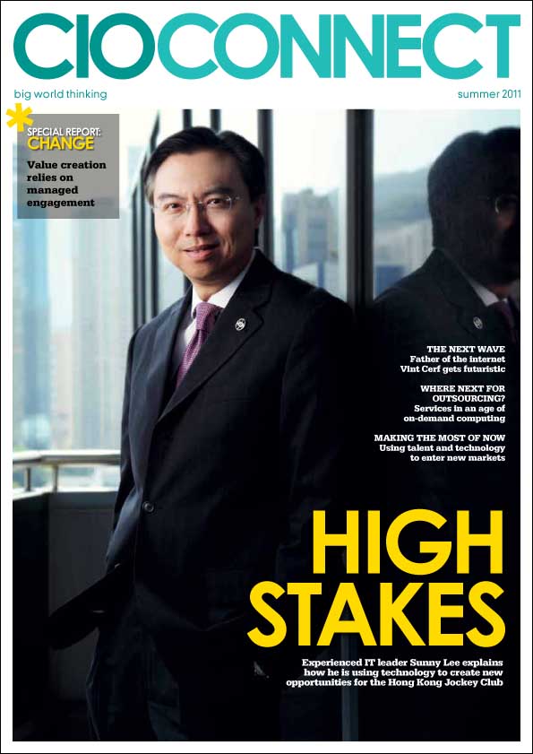
Just a quick post to show you the latest issue of CIO Connect magazine which I’ve been designing now for eight years – ever since I went freelance full-time.
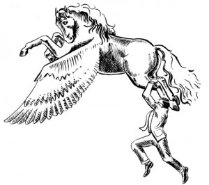
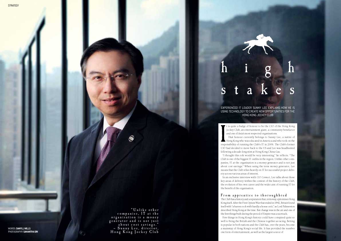
The cover star is Sunny Lee of the Hong Kong Jockey Club, so I made a little racehorse for his feature. Neat, huh?


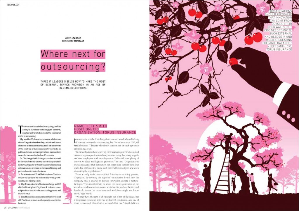
Here are a couple of other spreads from the magazine, including a lovely artwork from illustrator Tony Sigley:


That’s it for now – will be adding a few more bits of work this week, and blogging more fully about my site redesign too.
by Frank | Mar 14, 2011 | CIO Connect, graphic design, magazine design

Yes, I do. It’s possibly my favourite thing to do. It’s all about retaining a united look for the whole publication, but differentiating articles from each other. Tis a fine balance. My general rules of thumb would be:
• choose a few key fonts. I’ve cut down the amount I use for each publication over the years; at present I probably use three font families with CIO Connect magazine, and two with Pulse. Body fonts, header fonts, subheads, captions and general page-furniture should all fit nicely together. Contrast the old with the new; pay attention to the rhythm and shapes of combinations of typefaces.
• restrict the palette of colours used for each article. Echo or juxtapose with the main imagery.
• and while we talk about imagery – the better this is, the better your publication will look. It’s not impossible, but it is time-consuming, frustrating and demoralising to polish a turd. If you’re relying on other people to send photos to you, get them your specs early and remind them often. Request professional photography. Nevertheless, you will be sent blurred dark low-resolution images. It’s a fact of life, like aging and Jimmy Carr.
• never underestimate how much structure – and therefore beauty – one can add with clever page furniture. Page numbers and kickers might seem like dull must-haves but, if done well and used with elegant column and margin proportions, they really lift and frame a page. They are like the eyebrows of the magazine, if you like.
As ever, click on the pics for bigger versions. And if you’d like me to design your magazine to look this good, get in touch!


by Frank | Jan 4, 2011 | CIO Connect, graphic design, illustration, magazine design

I never get bored with designing CIO Connect magazine. I’ve been doing it since 2003, the year I went freelance, and every time I start a new one I try to improve on the issue before. There’s a real knack to magazine design, I find, and once you’ve got the hang of it it’s one of the most satisfying design jobs out there.
You’re creating something that has to have a coherent look and feel and, in this case, complement the branding of CIO Connect the organisation. But each article must stand out in its own right as a unit separate from the rest. It’s getting this balance right that’s the difficult, and fun part. My aims are to keep the magazine looking fresh, elegant and dynamic, and to have the design reflect both the tone of the text and the various photography and illustration we use.


I’m particularly proud of this issue. It’s my favourite so far. I don’t feel I can claim too much credit though – I find the photography of Martin Burton and the illustrations of Tony Sigley very inspiring – they (to me) make it obvious how the rest of the article should look.


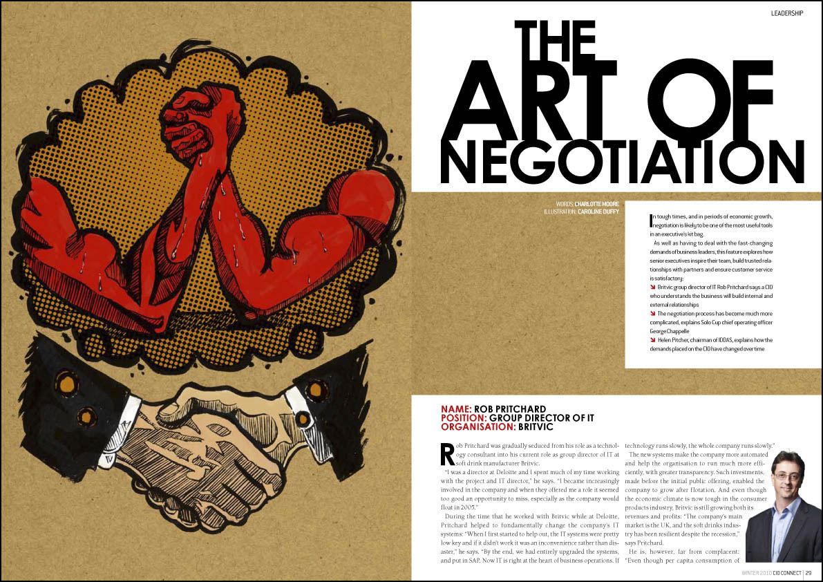
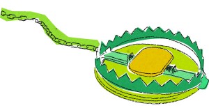
One thing that I image is a headache for all art editors is getting a consistent quality of photography from all contributors. Unless your Vogue magazine or some such, it’s often logistically impossible, for budgetary or distance reasons or whatever, to get a good photographer to the subject, so we have to rely on photos supplied by the interviewee or their PR. Some PRs seem to understand that if they send an amazing photo through, their client is more likely to be given priority in a spread. Unfortunately, most have yet to grasp this sacred truth, so the majority of photos I’m sent are low-resolution atrocities taken by amateurs, or at best, wooden head and shoulders shots taken in front of one of those terrible backgrounds photographers usually reserve for school photos. Puh-leeeze! I’ve been sent a passport photo in the past. No word of a lie. Anyway, for one particular spread we didn’t have many decent photos, so I did an illustration, and used the photos small. I’ve done illustrations for CIO Connect before, but only smooth glassy “brand” type ones of the marbles they have in their logo. This was my first splotchy ink-and-brush affair for them, on the subject of negotiation, and I’m rather happy with it. By the way, you can click on any of the images to see a bigger version.
