by Frank | May 28, 2014 | illustration, slider
A sort of how-to. Tools used: indian ink, ProArte Prolene 101 brush size 1, scanner, Photoshop.
I thought I’d share with y’all how I put together the surfing illustration for the Spring 2014 issue of CIO Connect magazine. I love learning about how other illustrators put things together and I’ve had a few people ask how I work, so…
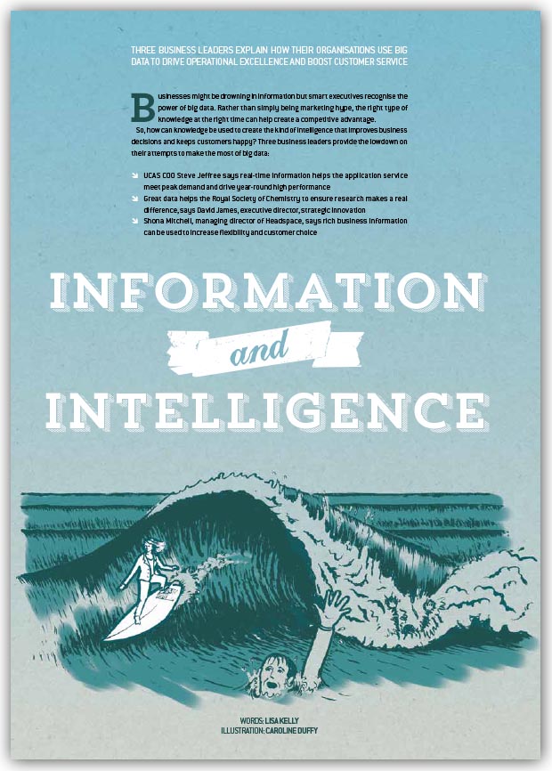
Firstly, the idea for the article’s illustration came from the concept that a lot of IT leaders have too much data to be able to work with it – hence they ‘drown’ in it, but some smart ones find a way to make all this data work for them, so I guess they surf it, surfing being all about using the power of the water. Illustration ideas are just a form of metaphor creation for me!
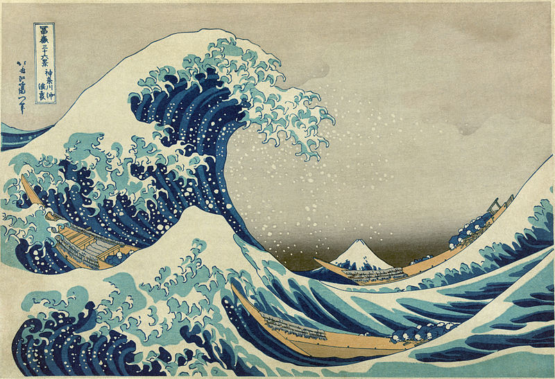
The Great Wave off Kanagawa by Hokusai; image from Wikimedia
The inspiration from the style came from two sources, one probably influenced by the other. The first was The Great Wave Off Kanagawa by Hokusai; the second is this Nike advertisement postcard found in a surf magazine a few years back and stuck on my office wall along with all of the other things I find that I like and may reference later.
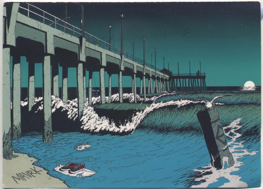
A postcard that fell out of a surfing mag way back when; I stuck it on my wall with all the other things I like. Pretty sure it references an early scene in Dog Town and the Z boys which is an excellent movie if you are into skating and surfing and such
I drew the whole scene in pencil from the inside of my head and memories of surfing, without reference to photos (sometimes I use photos to accurately capture a particular object, or person’s position, or something).
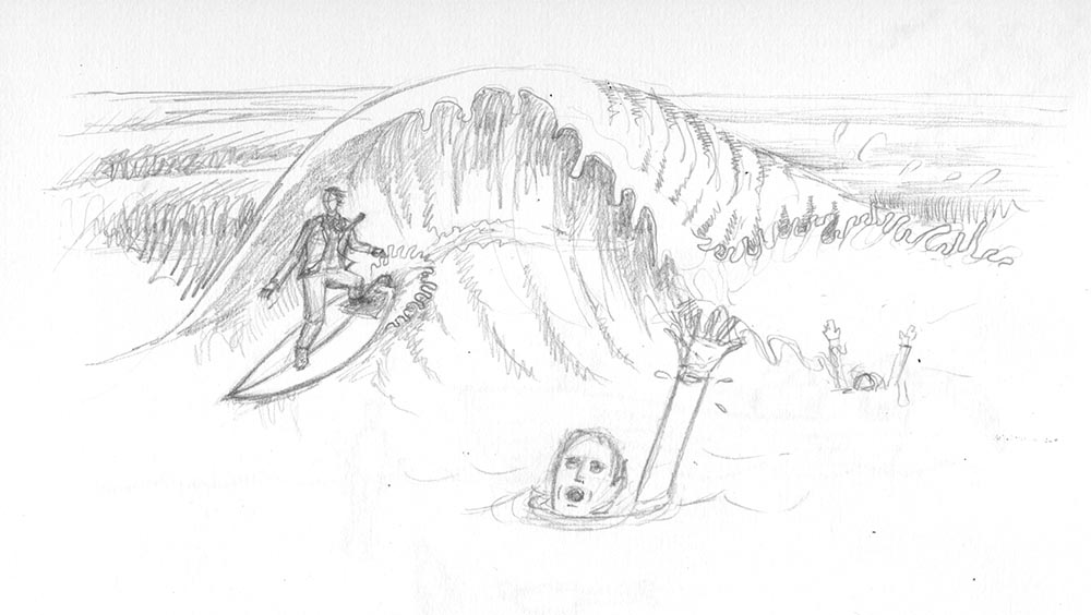
initial pencil rough of illustration. The purpose of this is just to show the editor what’s in my head and give them some idea about final composition
My editor Mark Samuels approved it with the one condition that I changed the gender of the surfer (yay!)- IT is a rather male-dominated industry and we try to rebalance that at the magazine as much as possible – and so I inked up the drawing using a brush and black Indian ink, paying close attention to the way Hokusai and the Nike advert had depicted the waves. Anything that is constantly moving, like fire and water, is very hard to draw, and so I make no apologies for nicking the way someone else has successfully managed to get it right!
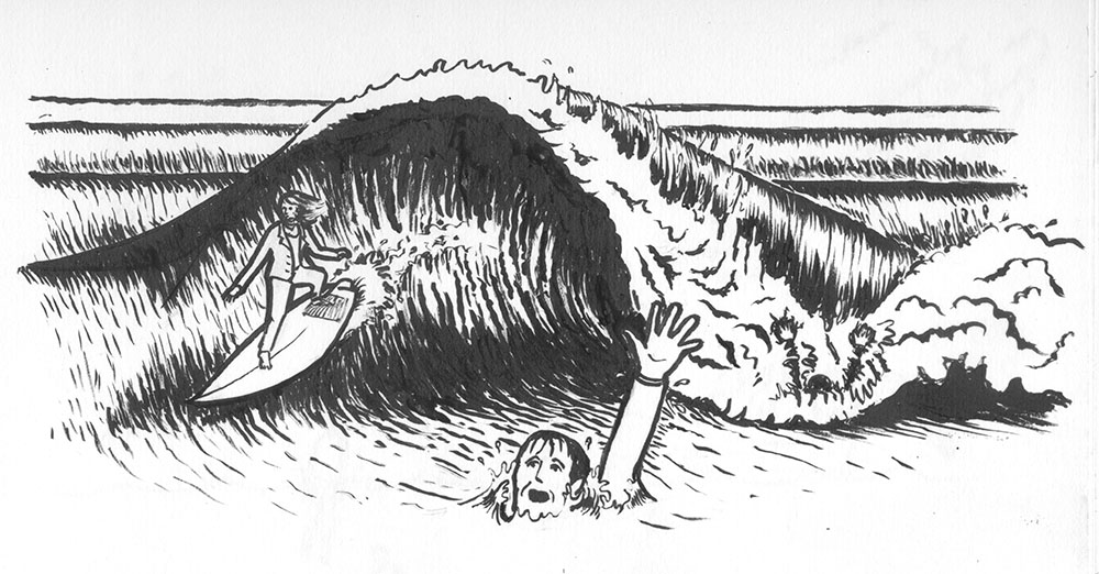
The illustration, redrawn carefully and then inked up using Indian ink and a watercolour brush
I then scanned the inked-up version into photoshop and cleaned it up, and then changed the black to sea green. I often use a cardboard base for my illustrations – it lends a nice texture and prevents the illustration becoming too “clean”. I have a pre-scanned piece I use all the time; I placed this into the background, changing the inked layer’s blending mode to “multiply” so as to hide the white.
I put a sky-blue gradient layer effect onto the cardboard layer, and then all that was required was to add detail colour to the scene using photoshop’s brush tools and a graphics tablet, making sure to highlight the surfer.
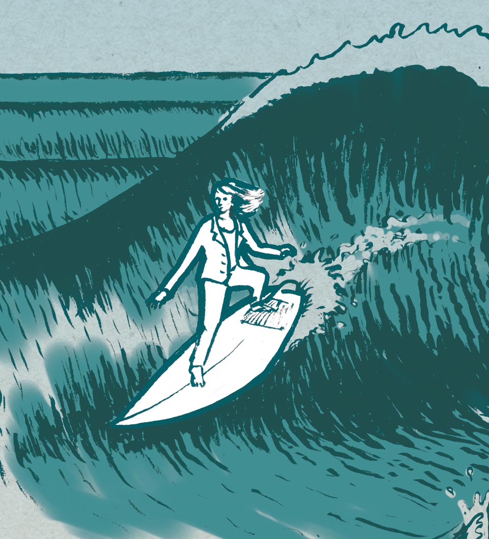
Close up of the surfer – giving her a white background when everything else has a turnquoisey cardboard feel makes her stand out more
The final page design divides the page up into thirds. I usually work with the Rule of Thirds or the Golden Section because it makes creating powerful visual hierarchies so much easier.
And there we have it! Hope you enjoyed this post 🙂
by Frank | Apr 16, 2014 | ethics, illustration
Lovely client Naturally Kind Food is giving away ten of the Ts I designed for him!
You may have read all about the Ed Hardy/Sailor Jerry tattoo-style illustration I did for Andrew Norton of Naturally Kind Food – well, the t-shirts have arrived and they look lush! What’s more, Andrew’s giving ten of them away for free. Check out this post on his Facebook page for more info on how you can get your mitts on one. Hooray!
Edit: March 2017: NK’s tees are no longer available so I’ve created a new design and you can buy on t-shirts, hoodies, mugs and all sorts at Redbubble here
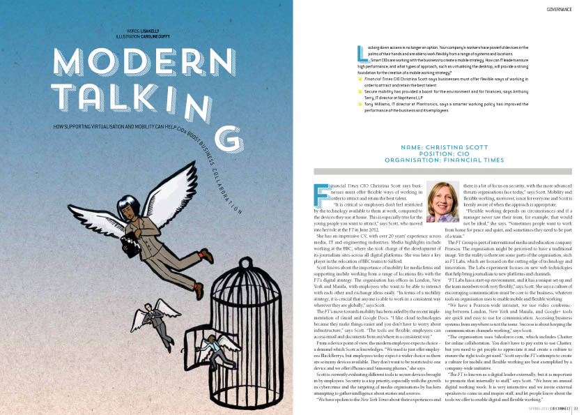
by Frank | Feb 3, 2014 | CIO Connect, graphic design, illustration, magazine design
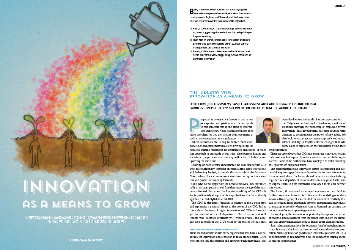
 This issue of CIO Connect magazine seems to be quite focused on growth. The economy (we are told) is improving, apparently, so a couple of the articles are about how to get the best out of that growth. Thus, two of my illustrations feature plants – a big tree with speech bubbles for leaves (showing how growth can be made more solid when everyone’s opinions are taken on board) and a watering can nourishing seedling employees and helping them be more creative.
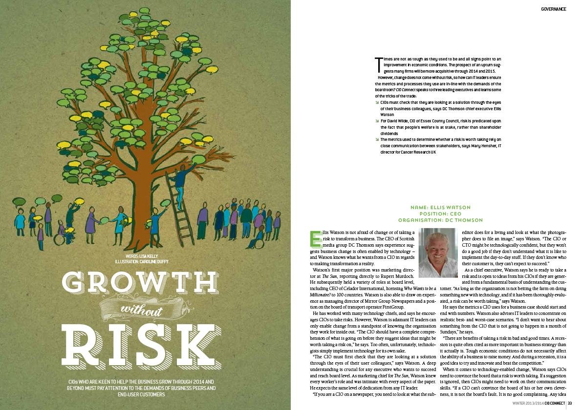
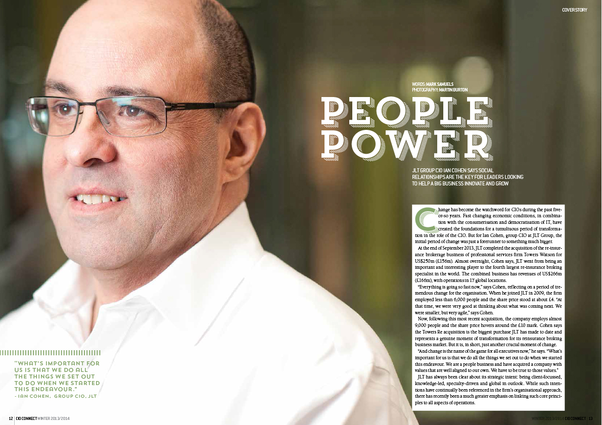
As ever there is some stunning photography from Martin Burton who makes my job so much easier.
You can view the whole issue digitally here
by Frank | Dec 11, 2013 | doodles
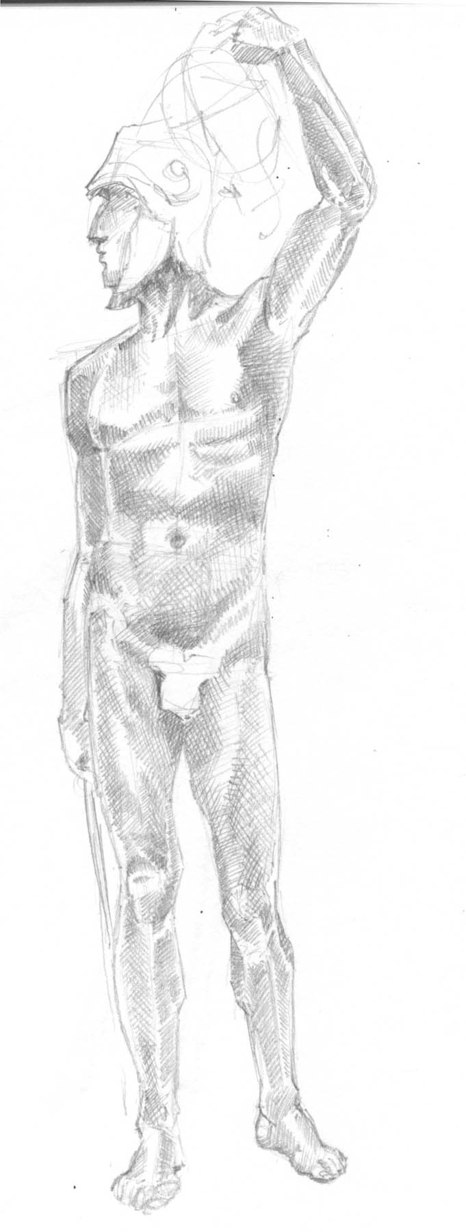
When I was in art college I remember weeks on end of basically just sitting in front of naked people with an easel working out how best to get that conglomeration of skeleton, flesh, skin and hair onto a two-dimensional bit of paper. What I forget every time I decide that I need to exercise my drawing muscles from life is how exhausting it can be. Learning to draw should properly be called learning to see.
Having realised yesterday that I had a day free and also that I had missed all of the life-drawing sessions I could find out about in Cardiff before Christmas, I did the next best thing and stomped over to National Museum Wales to draw nudey sculptures. Sculptures have the advantage of being a) free to look at and b) unmoving; however life models are better because the poses within a session are often time-limited and there is nothing that sharpens up your observational skills than trying to get a realistic human shape on to paper in 120 seconds in the full knowledge that what you are looking at will no longer exist after that time allotment is used up.
So I went to the museum and I drew Perseus by Frederick Pomeroy with its ridiculous overly-modest figleaf (which the ubiquitous-to-museums sixth-form students evidently found as funny as I did). I guess it took about 45 min to an hour.
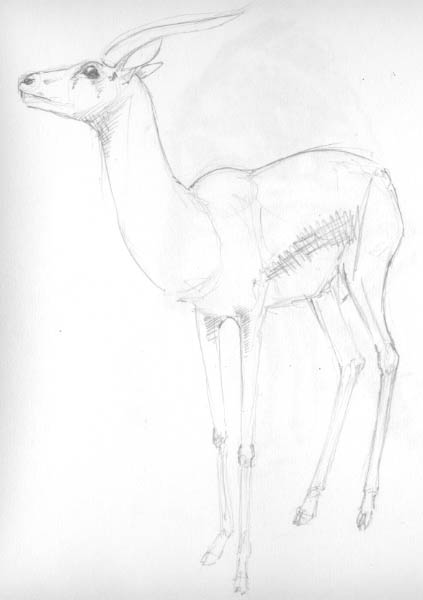
and a Thompson’s Gazelle (10 min)
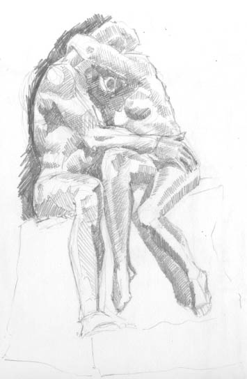
And Rodin’s The Kiss (an hour or so) (you can see I was getting tired here and it’s sort of a mess but I want to go back and draw it again from fresh)
I’ve also been studying anatomy books – if I can understand the structure of something I find it easier to draw. I guess I’m sort of teaching myself the things I wish I’d learned in college. Looking at the bones, muscles and tendons beneath the skin appeals very much to the technician in me and I’m loving learning how bones rotate and ligaments slide and basically how amazing we are. If you’ve seen Leonardo Da Vinci’s sketches of all the dead bodies he ‘acquired’, took apart and drew you can appreciate how obsessive this understanding-how-things-work can become. Not that I’ve robbed any graves lately or anything *ahem*
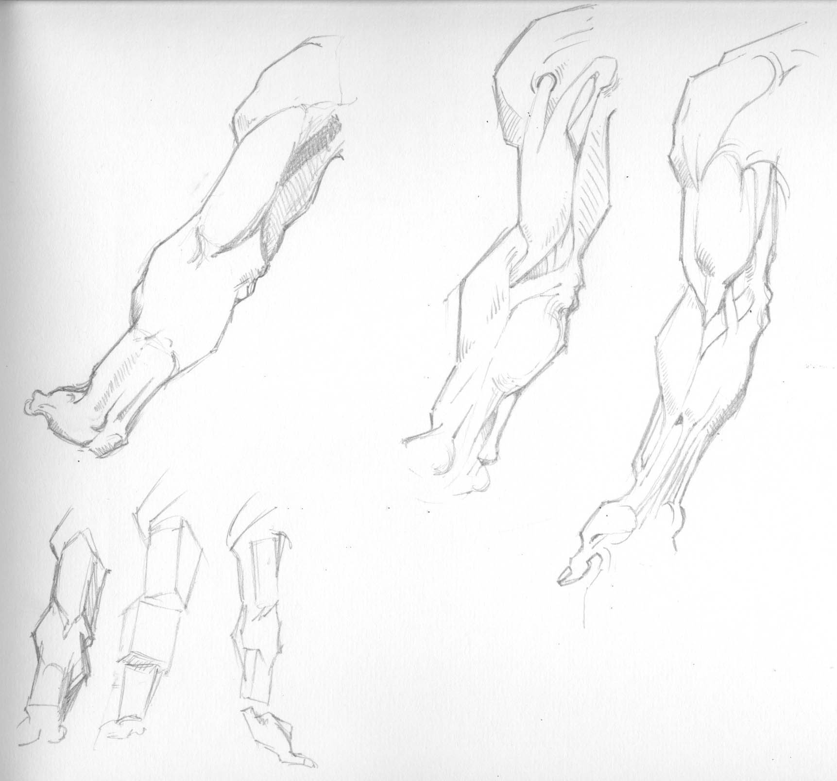
NB this is the anatomy book I’m studying. It’s excellent, if you can overlook the occasional moment of 1920s racism :/
by Frank | Nov 26, 2013 | ethics
Well, it’s been two and a half months, and have I managed to avoid supermarkets altogether? No. But I’ve only been once, and that was for some Emergency Frozen Peas (little things that are difficult to get down the farmers’ market). Mostly it’s been easy – I buy non-fresh groceries like beans and nuts, tofu, rice, chocolate soy milk, espresso coffee, washing up liquid and toothpaste in bulk every three months from Suma, a radical workers’ co-operative based in Leeds. (There’s a £250 minimum spend hence the buying in bulk). I buy local organic fresh fruit and veg mostly from the Riverside Farmers’ Market on Fitzhammon Embankment in Cardiff City Centre every Sunday, and more exotic stuff like ginger and lemons and avocados from the greengrocer over the road from me – Laura’s on Cowbridge Road East.
I’ve had to be a bit canny with certain things – dishwashing sponges and washing up gloves from pound shops, crisps from the local newsagents etc. But mostly it’s been piss-easy.
I did it because I was popping over the road to Tesco at least once a day and was annoyed with myself for it. Tesco is ethically verboten for so many reasons, scoring a pathetic 2.5 points out of a possible 20 in the Ethical Consumer index. What tipped the balance for me was their unquestioning support of the badger cull. If I don’t like a company I don’t give them my money – Nestle, Nike, Esso and Coca-Cola are all on my no-buy list, to think of a few.
So it’s been ace, not giving my hard-earned pennies to the big shops, but I know I’m privileged to be able to do this for a few reasons:
- I work from home, so am able to pop to smaller independent retailers like greengrocers in the daytime when they’re open
- For the same reason, I’m able to wait in all morning for my Suma delivery
- I have my own house, so enough storage to keep 3 months’ worth of non-perishables
- I am able to save enough money to buy £250-worth of groceries at once
- I live within walking distance of the Farmers’ Market and also some great little independent shops
And then I done set up a wholesale food collective sort of by accident
After a friend asked me if she could buy some stuff alongside me on my next order, I got to thinking how maybe more people would like to buy healthy organic food from a radical workers’ co-operative at trade prices and that maybe they couldn’t because of not having £250/storage space/not being at home to receive the delivery. Maybe if I asked other people they would also want to order alongside me and my friend, and between us we could order £250-worth every month, thus not needing to save up for an order or store kilos of kidney beans. People could then collect their order from me in the evening when they were back from work, or I could deliver it in my lovely camper van. If they wanted delivery I would request a £5 donation which would be used to buy more food from Suma and donate said food to Cardiff Food Bank, for local people who are struggling to buy food.
So far nine of my friends have expressed an interest and more catalogues are winging their way to me from Suma to pass on. Which is ace! I may open it up to more people depending on how much hassle it is – wouldn’t it be great if everyone had the opportunity to buy cheap, healthy, ethical food?
by Frank | Jun 12, 2013 | ethics, thoughts
…or rather, how to print in a way that is less damaging to the environment.
Printing consumes resources – power, water, wood fibre, pigments, solvents. I spent a few hours with David Pealing of Severnprint in Gloucester, one of the UK’s leading environmental printers, finding out how we can print things so that they have the lowest possible impact on our planet.
In the small but airy meeting room adjoining Severnprint’s entrance foyer there are various framed examples of their work, just like in there are in every other printers. What’s different about Severnprint is that alongside the promotional magazines and greetings cards and what-not on the walls there is a certificate from the Gloucestershire Wildlife Trust confirming the company’s Platinum Corporate Membership for this year, and on the other side of the room a winning trophy for Environmental Excellence from the British Printing Industries Federation. There’s even a suggestions box where customers can recommend ways in which the printer can improve its ethics.
I first came to Severnprint 10 years ago as a newbie freelancer touting my wares. I was impressed then with the company’s environmental awareness and could tell that this really wasn’t some corporate sales gimmick – the company walks its talk – so when I rebranded as a designer and illustrator specialising in ethical practices they were the obvious people to go to expand my knowledge about doing my job in the best possible way. A huge thank you to David and everyone I met yesterday!
Many printers will claim environmental credentials; in David’s opinion there are fewer than a dozen in the UK who are as green as Severnprint and almost all of them have EMAS accreditation (The European Council’s Eco-Management and Audit Scheme). So look for this mark and beware the greenwash!
David says that there are several things that designers and their clients should consider if they want their publications be low-impact. They are:
Paper/Stock
There was a rumour started years ago by mills producing paper from trees that recycling paper uses more energy than paper made from virgin pulp. This is simply not true. Our recycling systems are so efficient that your first choice should always be recycled paper, and the second choice paper from virgin pulp. Always make sure the latter is from 100% FSC certified pulp, otherwise you have no idea what kind of forest was decimated to produce your fancy promotional brochure.
Also if you go for paper from virgin pulp, check whether the fibres have been chlorine bleached. This is a bad thing.
Different kinds of recycled
“Mill broke” is paper created from off-cuts at paper mills. This is the kind of paper that we are not talking about when we mention post consumer waste. Mills have always created paper from mill broke and labelling it as recycled could be viewed as a bit of a cynical ploy by people who are prone to that sort of cynicism (me).
There are big paper recycling bins in many big offices in places like the City of London. The paper from these bins has so little ink on it that it goes into making new paper, usually for office stationery (letterheads and what-not) and requires very little processing.
Then there is the kind of paper that you put in to your box or green bag for household recycling every week. This goes to make paper like Cyclus, which David reckons is one of the greenest papers available. It has a lovely unbleached organic feel and I would use it in every single job if my clients let me.
If you want to be überspecialextragreenylovely then you should consider buying your paper from Paperback who are just the nicest people (and you can get Cyclus from them too!). They are a workers’ co-operative and their range of 100% recycled paper and card is muchos sexy.
Paper weight
It’s important to consider the weight of the paper you really require. The lighter the paper the less resources are used to create it, though paper that is too light will be difficult to print and may cause wastage. Talk to your printer about an appropriate weight of stock for the job. Your brochure may feel wonderful at 130gsm but would 90gsm be better? Recycled papers tend to be fluffier and bulkier than their counterparts created from virgin pulp, so show-through, where you can see the ink on the other side of the page, is less of an issue. Also, thinner paper will save you money on postage.
Ink
David says that a lot of designers focus on ink when ink is just such a tiny part of the whole process that paper ought to be considered first.
Litho printing ink is oil-based – about 35% oil. It used to be mineral-oil based (ie, that black stuff that comes out of the ground that George W Bush likes so much) but now it’s mostly vegetable-oil based – even Pantone (special) inks. American inks tend to be based on soy bean oil because of soy industry lobbying over there; in Europe it makes more environmental sense for us to use linseed-oil inks because linseed is grown locally.
Consider carefully before deciding to use a Pantone special colour. Anything other than/more than CMYK process inks requires a wash-down of the printing presses which inevitably costs water and ink.
Most ink these days is created from organic dyes rather than the old heavy-metal pigments like cadmium and what-not. This is obviously a good thing.
Avoid metallic and fluorescent inks. Fluorescent inks are always mineral-oil based and metallic inks contain heavy metal pigments.
Coatings
Avoid laminates, which are plastic coatings added at the end of printing to give a matt or gloss effect – this makes recycling difficult. The same goes for spot varnishes – varnishes added to give a shiny appearance to only some of the printed area. Severnprint discourage their use, even though they have a range of laminates that is made from cellulose which is more sustainable and also biodegradable.
Foil-blocking effects don’t present this problem.
Printing method
Check for alcohol-free printing
Most printers use alcohol in the litho printing process to prevent the beading of water (litho printing works on the premise that water and oil repel each other, but when water meets oil it beads, so to avoid this you need to add a solvent to the mix and that solvent is alcohol – more on how litho printing works here). The alcohol is a volatile organic compound (VOC) which evaporates forming low-level pollution. Bad. Severnprint worked for years to reduce the alcohol used in their process to just a few percent of what your average printer uses, and even then they were using five or six tonnes of alcohol a year. Now they use no alcohol at all in the water, relying on a much kinder solvent.
Separately, in 2007 they switched to processing the plates on the press instead of a separate processing machine which used a lot of water, cutting their water usage by 40% – 400,000 litres!
An alternative – waterless printing
There is another kind of printing that uses no water at all. Instead of water on the plates they use a silicon coating (like the really shiny slippery backing that you peel away from labels). The print image is etched away from the silicone and reproduced that way. The problem with this method is when the friction caused by the printing heats everything up, the ink bleeds across the image. Thus the machines must be kept to a certain temperature, and this uses energy-intensive localised cooling.
Digital printing
More and more people are using digital printing for short runs because the quality of the finished product is now very high and the set-up costs are lower. Digital printing uses powder inks that are applied directly to the surface of the paper. It’s basically posh colour photocopying. It’s an important consideration because a) there are far fewer consumables – no aluminium plates, no water, etc and b) you only print what you need, whether that’s 10 copies or 1,000.
The downside of digital printing is that the kinds of paper that can be used are annoyingly limited, and there are very few recycled stocks that printers will use. Heavier-weight papers are a problem – it’s unusual to find a digital printer that will print anything heavier than 300gsm in my experience.
Binding method
Do you need any binding? I’ve seen some stunning promotional materials from Triodos Bank that use their loose-leaf design as a feature.
If you do need a binding, saddles-stitching (staples to the lay person) is the best option because it uses no glues and it easy to recycle.
Perfect or PUR binding (both of which result in pages glued to a flat spine – if you look at a heavy magazine like Vogue or GQ you’ll see what I mean) makes items less easy to recycle. However, if the item you’re designing is to last a long time, then these types of binding are more durable and thus actually better for the environment.
Obviously, the kind of binding you choose will largely be dictated by the number of pages you’re to be printing.
Size of publication
To make sure that waste is kept to a minimum in the making of your glorious design, check what sizes your chosen paper comes in and ask your printer’s advice about what document dimensions will get the most use out of every page. Most papers come in SRA sizes – SRA1, SRA2, etc – and are designed to work with the standard European A sizes – A4, A3, etc.
If you design a document without bleed (so you have a nice white margin around every page of at least 5mm – any less makes for difficult printing) you’ll save paper – sometimes significant amounts. Ask your printer’s advice on this.
Display boards and banners
Foam board is made from PVC. This is a bad thing. It is not sustainable, difficult to recycle and doesn’t biodegrade very well. When it does degrade it makes chlorine and other nasties.
You can get foam board that is partly recycled, but if you can, you should consider using aluminium for outdoor signs, which is fully recycled and recyclable. It’s hard to believe that a metal is better for the environment than foam board but there you go.
For indoor displays, instead of foam board consider using Ultraboard which has a similar rigidity created by using a honeycombed cardboard inner. It’s available in huge sizes and lots of different thicknesses.
Banners are also usually made from nasty PVC. You can get banners printed on HDPE which, although it is still made from petrol, is easily and widely recycled.
Even better, it is possible to get gorgeous banners printed on jute with a latex base – completely sustainable. Hooray!
Transport
Consider the transportation cost. I know a lot of large businesses go abroad for cheap printing, often to China. This is crazy, IMHO. Print as locally as possible, assuming you have an environmentally-aware printer near you, and ask about their delivery vehicles and things like cycle-to-work schemes for employees.
Aargh!
After all this, you may consider that printing is utterly evil and that we should host everything on the internets. Not so. When you consider the power it takes to run and cool the huge servers where stuff is hosted on the web, and the fact that a lot of people print web-based things (like bills) off at home, you’ll realise it’s a finely-balanced thing. Consideration is needed for each particular job at hand.
See also
FYI there is more technical info here from David Shorto, print buyer for Friends of the Earth and Greenpeace.
Severnprint has a guide for businesses and designers here
NB I’ve tried to make this as comprehensive as possible, but if you have any further info or advice on this matter I’d love to hear it!
In conclusion
The more we designers ask for evidence of sustainable practice the more seriously printers will take this issue. This is one area where individual choices really can make a difference. When you consider how much is manufactured on designers’ say-so you realise what a powerful voice we have. Let’s use it.
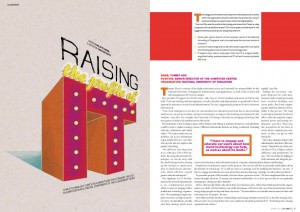
by Frank | May 14, 2013 | CIO Connect, graphic design, magazine design

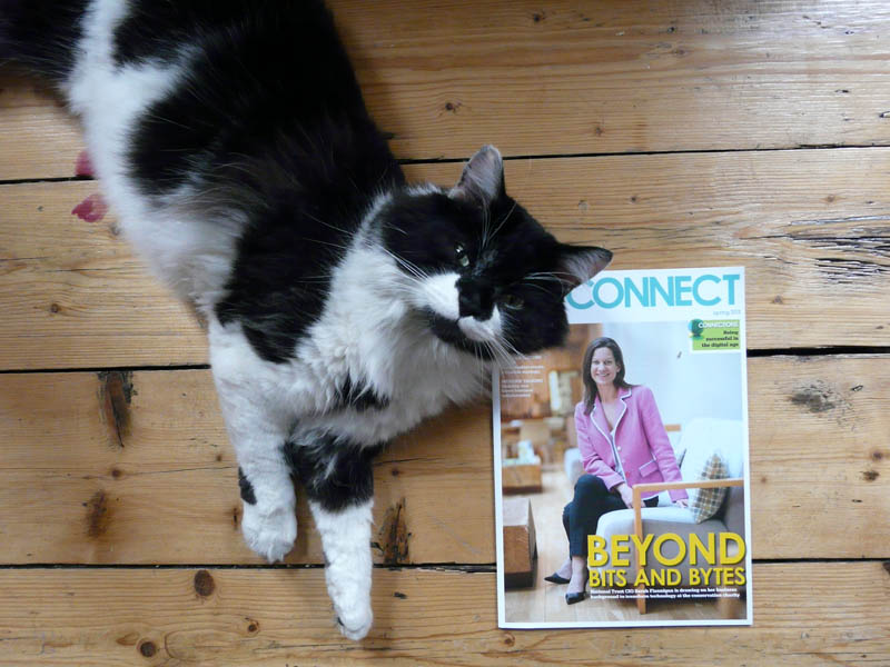
Henry the cat presents the latest issue of CIO Connect magazine
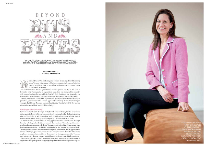
Well hello my lovelies! Now that it’s summer *looks out of window* I mean, now that it’s MAY, the latest issue of CIO Connect magazine is dropping on to doormats and desks across the world. And I designed it! Here is a picture of the magazine, with a cat.
I guess some people might think that designing a magazine about IT would be boring. It’s quite the opposite. It’s about IT leaders and how they solve problems (solving problems being one of my favourite things to do) and the editor Mark Samuels lets me have a bit of a free rein with the design. We want to keep it fresh and interesting and have the personalities of the people interviewed jump out at you. Because I’ve been designing it for so long I feel I know their readership quite well, so I have a lot of fun creating illustrations and spreads for the magazine.
I guess my best advice for those thinking of publishing a magazine is to invest as heavily in images as in copy – good photography and illustration make the world of difference. They bring life to the page and really draw the eye in. You can go the other extreme and have a periodical with few photos at all – and still have wonderful design – but bad photography is really worse than none.
More spreads below for your viewing pleasure (click on anything to make it bigger), and the full issue of the magazine can be read online here!


by Frank | Apr 18, 2013 | branding, graphic design, illustration
I’ve heard a few people recently devaluing the work of graphic designers. One of these people, unbelievably, is a designer herself. Instead of defending what it is that we do, I’m instead going to show you the process I’ve been through with my most recent branding exercise.
The client-designer relationship
I’ve been working for CIO Connect pretty much since I became a full-time freelancer nearly 10 years ago. Their magazine editor Mark Samuels jokes that I am their longest serving employee. In meetings with them I will often tell them things they didn’t know about the company – like the fact that the magazine used to be bimonthly instead of quarterly, or that I didn’t do their original company branding (I’ve been working for them so long everyone just assumes that I did!). I’ve been doing their conference branding for five years (last year I did this for them). So, I know them pretty well, I know their audience and I’m used to working with them – all things that are rare in logo design. Usually the company and its designer are new to each other at this point. So, I should be able to bash something out in half an hour, right? Hmm.
The brief
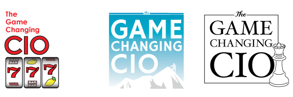
Emma at CIO Connect commissioned me to brand their 2013 conference, to be entitled “the Game-Changing CIO”, along with a brief description of what that meant, and I went to work a-scribbling.
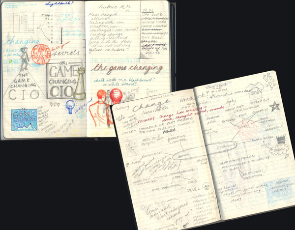
scribbles, or, the frightening things inside my head
Initial concepts
I came back with these three rough ideas based on three aspects around the idea of game-changing – risk-taking, leading and pioneering.
initial rough ideas
Second concepts
Thanks, said CIO Connect, but could we have something that looks like an app logo, such as you get with the iPad, etc? I went back to my drawing board and came back with these little squares in CIO Connect’s brand colours:
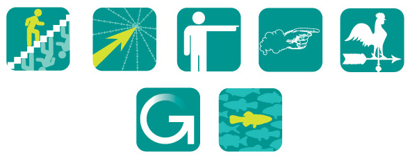
app-style ideas in the rough
You have to be fairly clear and clean and simple with an app logo – it’s expected to work very small. Hence the stylised nature of these ideas.
Developments on second concepts
We like the stairs and the pointy hand – can you develop, said they. So I did.

Here are four developments – all fancied up, said I. One of the stairs and three various colour-ways of the pointy hand, which I had spent a long time drawing and inking in before scanning and tracing in Illustrator and of which I am very proud.
Third concepts
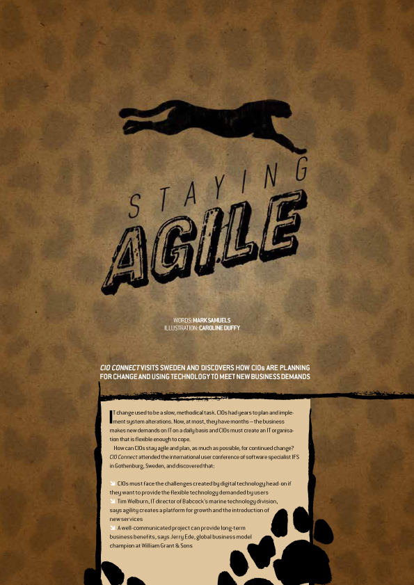
Hmm, we’re not sure about the app thing, said they. Can you go back to the drawing board again, said they? Think about someone who changes the nature of things. And also can we look at the stairs again but with different colours? So I did, and I sketched up these roughs. The second is a chameleon changing his colours and the third is a leopard changing his spots.
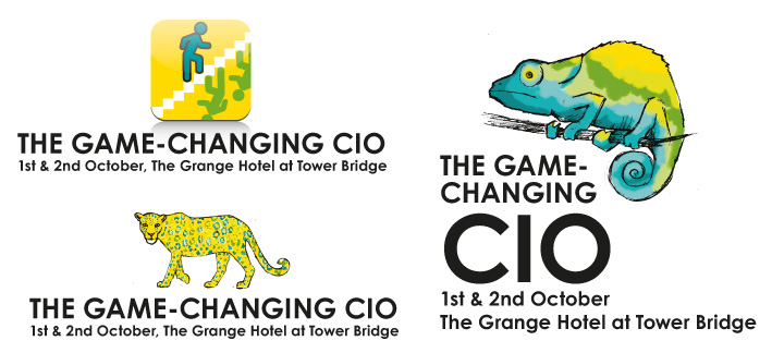
more scribbled concepts
Fourth concepts
Well, we sort of like the leopard, they said, but we’d really rather go back to the app idea, and look at images of actual people standing out from the crowd and maybe with our logo ball involved, they said.
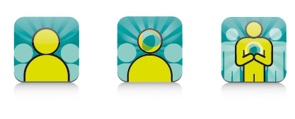
Standing out from the crowd concepts
Yes! they said. Number three, they said.
Phew, I said. And here it is:
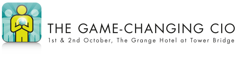
the finished logo
Of course, there was a little bit of back and forth about the font and the text position too, but I think I’ve made my points: that these things can take weeks to get right, that even the clients most experienced in briefing designers can change their minds, and that having even the closest of client-designer relationships does not mean the designer can get it right first time.
In conclusion
Some might infer that the client company needed to clarify its intentions – that confusion as to aims was why the process took quite a long time despite us knowing each other well. In its defence it is a reasonably-sized organisation with a several people making the final decision. Also, it’s common that a client will request that I work on one particular idea only to realise that it doesn’t work for them in the flesh, so to speak. I would say that I could perhaps have asked more questions at the initial briefing – my relationship with them made me a bit complacent about being able to hit the sweet spot straight away – and in future I will be interrogating them much more forcefully for a more detailed brief, with a big bright lamp and maybe some waterboarding too*, to make sure I have all the information I need.
In truth the process above, as drawn out as it seems, is not dissimilar to the process we designers go through for a lot of logos. It is work that is specialised. It is work that requires intuition, lateral thinking, a knowledge of what works graphically across various formats from websites to twitter avatars to twenty-foot banners, software skills and of course drawing skills. It requires time (obviously), expensive hardware and expensive software, not to mention years of training and experience. And this is why I won’t do logos for £50. Designer Renato Pequito sums it up beautifully from a different angle here with a blog post about public misunderstanding surrounding the cost of branding a government entity, while I finish with a (perhaps apocryphal) story which illustrates this wonderfully:
Pablo Picasso was in a park when a woman approached him and asked him to draw a portrait of her. He agreed, and quickly sketched her. When he handed her the finished work she was pleased with the likeness and asked how much money she owed him. “$5,000” said he. The woman screamed, “but it took you only five minutes!” The artist replied, “No, Madam, it took me all of my life.”
*Joke, of course. I actually only torture the clients who don’t pay.
by Frank | Feb 18, 2013 | CIO Connect, illustration, magazine design, slider
Illustrations from the last two issues of CIO Connect magazine:
by Frank | Feb 11, 2013 | illustration
This pair of illustrations are to go on signs (which I will show you when they are signed off for verily I am very happy with them!) for the Clore Discovery Centre at National Museum Cardiff. The first is about putting things back where you found them and the second illustrates handling with care.
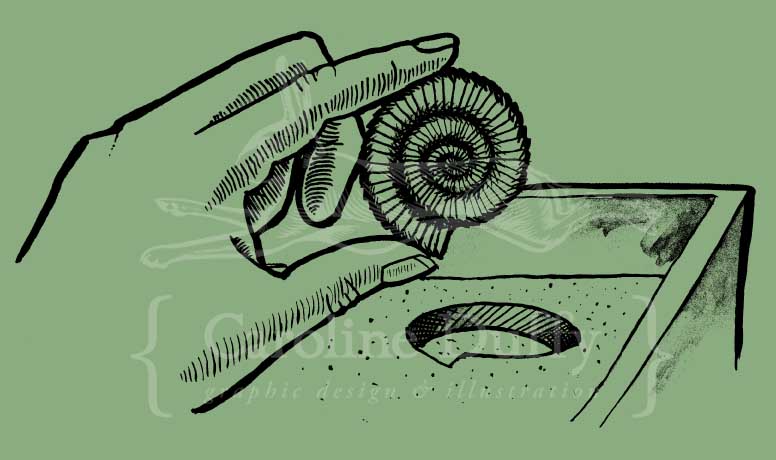
hand holding ammonite
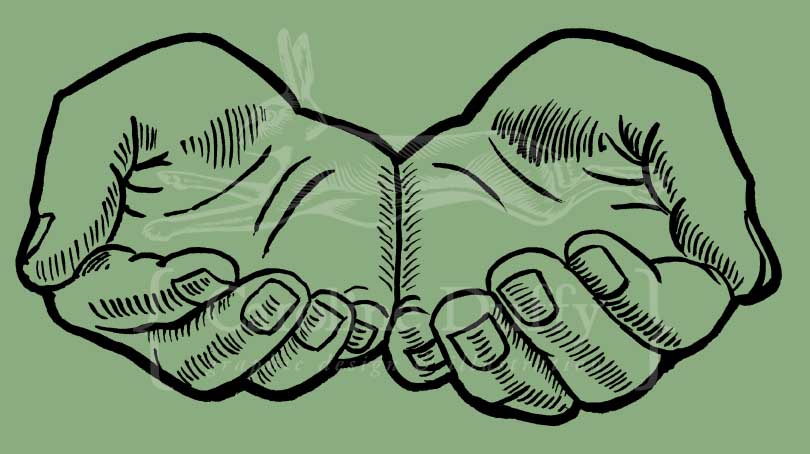
cupped hands