by Frank | Jul 22, 2015 | illustration
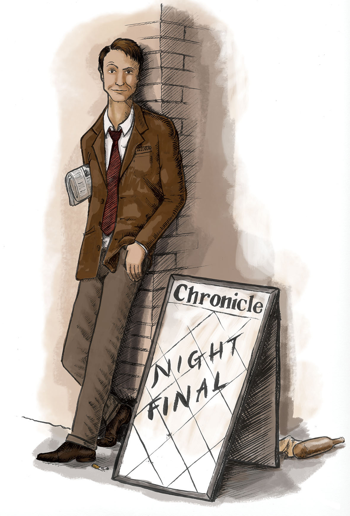
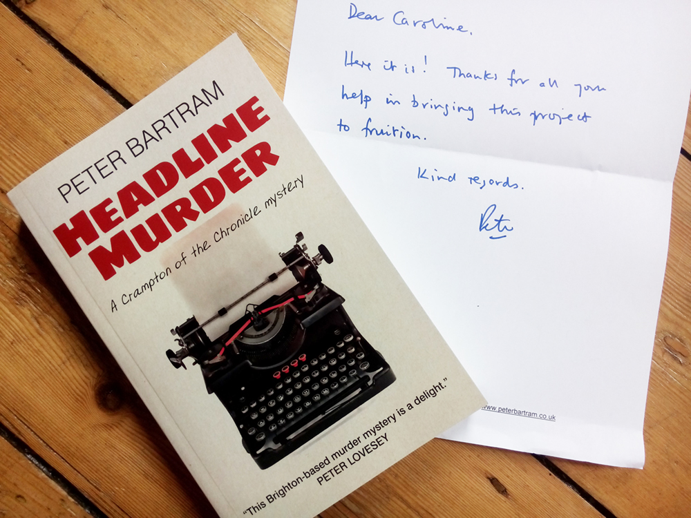
I’m delighted that the book illustration I created for writer Peter Bartram’s series of stories about crime-solving Brighton journalist Colin Crampton is finally here with me in the flesh!
Peter originally asked me to create a series of four illustrations for his stories, and this one of Colin himself is by far my favourite. I am very proud to have been involved.
You can buy Peter’s book here
by Frank | Jul 16, 2015 | illustration
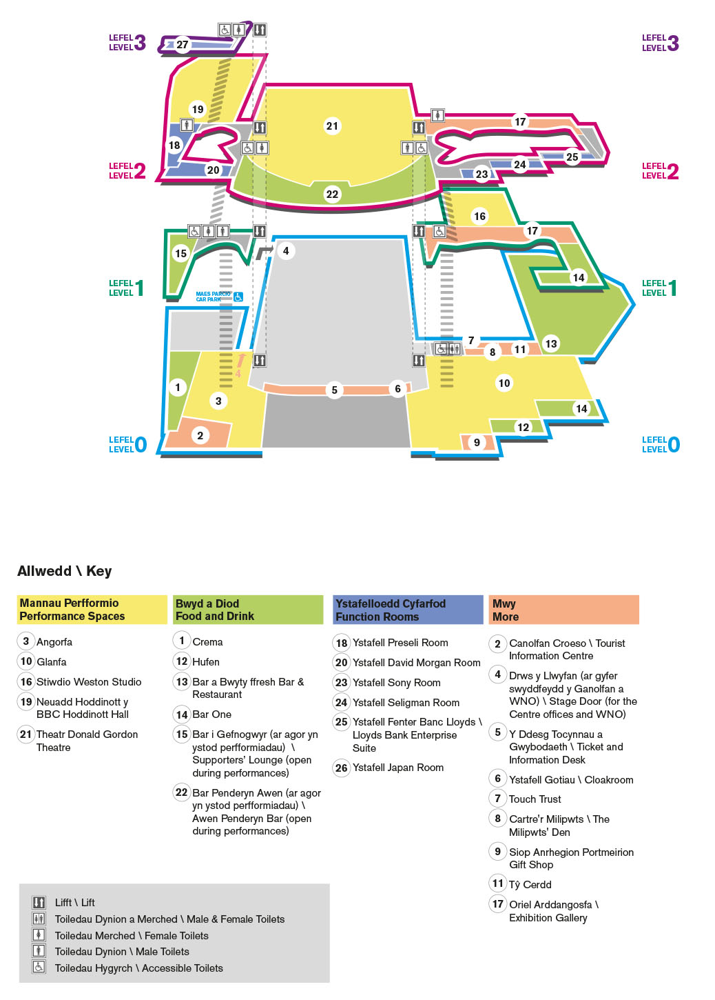 This map illustration is one of those strange jobs that I was asked to do purely out of luck and happenstance. And aren’t those the best ones?
After creating the Women of the World art zine for Melissa Hinkin and Wales Millennium Centre, I went in to meet the lovely communications people at WMC to show them the range of work I’d done for other people and to ask if there was anything else I could help them with. I happened to mention that later that week I was off to a client meeting in North Wales and was planning to climb Snowdon while there; thus I happened to mention while chatting about said climbing of Snowdon that I’d bought two Ordnance Survey maps – one of Snowdonia and one for Anglesey, where I’d be staying, so I could have a good explore – and confessed that I have a bit of a thing about maps. I LOVE maps. I can spend hours pouring over an OS map, looking at all the Roman forts and Neolithic burial chambers and sacred wells and shake holes and such like. I consider them to be works of art in their own right: indicators of what we find worthy of recording in a landscape – a kind of social record, the beauty of which comes from their functionality. Plus some of the older maps have just the best graphic design.
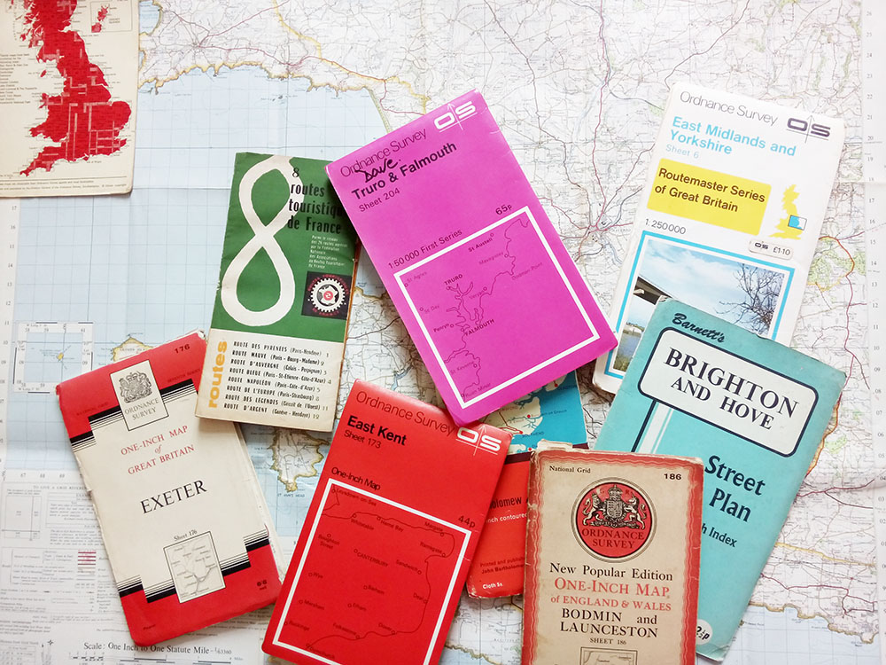
Glorious!
Anyway, enough about OS maps. On the way home from this meeting I got an email from Ceri at WMC who said that she’d bumped into a colleague and mentioned me and my (somewhat weird) obsession with maps. His immediate response was that the Centre desperately needed a new visitor map: the one they had was confusing. I had a look at it and I had to agree: as someone who is (obviously) well used to maps and who has rather good special awareness, I could make neither head nor tail of their map. Thus, I began my research.
I looked at all manner of public buildings: The Royal Opera House in Covent Garden, the Natural History Museum, the Tate Modern, the Sydney Opera House, the Albert Hall, the Southbank Centre, etc etc. I downloaded their visitor maps and studied how they’d chosen to represent themselves spatially to their visitors. I decided that I liked the Natural History Museum’s approach best: all of the floors are on one graphic, you can see the shape of the building and locations of lifts, toilets, stairs etc are very clear, without the image being overloaded with architectural irrelevances.
I showed these maps to WMC and talked through why I liked the Natural History Museum’s solution best, and how I thought it could be adapted to their building. They agreed, and so we set a date and time for me to trace the architect’s plans and to wander around the place taking photographs.

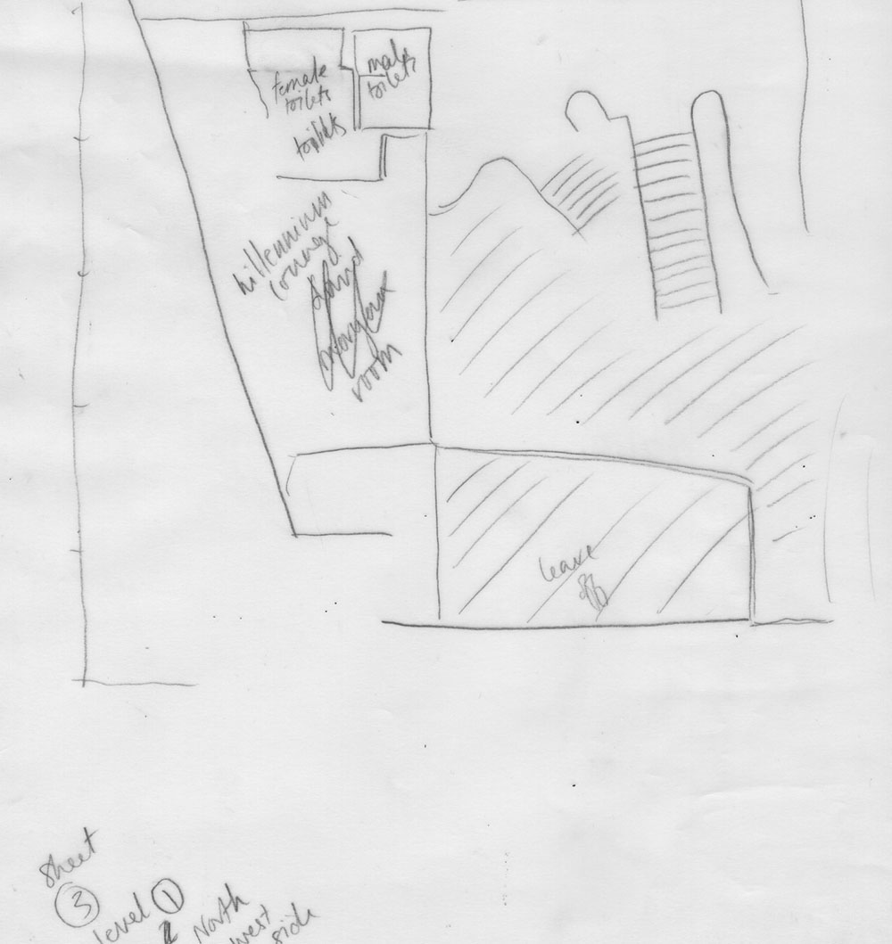
tracing of architects’ plans
I took the enormous sheets of tracing paper home and scanned them on my little A4 desk scanner, pieced the A4 scans back together in Photoshop, and traced them in Illustrator. I then had pretty accurate floor plans of the ground and first three floors of the Centre.
I then created a perspective grid in Illustrator and set about moving the building around until I got the most accessible view of it. What posed a real problem was a sort of “tail” part of the building out the back where various organisations – Urdd Gobaith Cymru, Hijinx Theatre etc – are based. Showing this tail and keeping the rest of the building easy to navigate was difficult, and on seeing my first draft Ceri decided that it wasn’t needed. (Later on she decided to include just the ground-floor plan from its original birds-eye view with the tail* to indicate to visitors where they could find these organisations in the building). So I went back to the original floorplans in Illustrator, removed the “tail” and set about redoing the perspective but this time from the front.

the first version of the map illustration with “tail” – the purple extension out the back
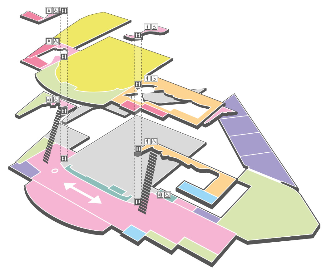
We decided on colour codes for each of the floor levels, and a separate colour code for the type of room (function room, performance space, food and drink etc). The toilets were clearly marked as were the stair and lift positions.
Lastly we added a key. We played around a bit with the various numbers and what would be easiest for people to understand and came up with numbers from starting north and moving south, ground floor to third floor, and then grouped the numbers by their colour-coded sections.
Thus we ended up with something that is as simple as it can be while still clearly showing the locations of all the various rooms and areas. Orientation is helped by the fact that the shape of the building can be discerned from the map, and by linking together the floors with the stairs and lift. You can easily find all the bars, the performance spaces, the function rooms, and it’s simple to discover what floor level you’re on.
As maps go it’s very different from what the Ordnance Survey produce, but I think it does the job pretty well!
*Of course you all already know this, dear reader, but always save altered files under a new name – when clients want to go back to versions you’ve altered (such as the previous floorplan that was drawn from above and has a tail) you can just open up the old file rather than having to redo lots of painstaking work.
by Frank | Jul 2, 2015 | graphic design, illustration, interpretation
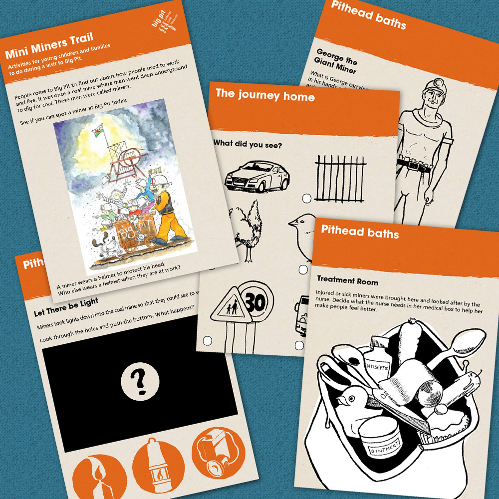
Big Pit National Coal Museum commissioned me to do the design & illustration of a trail booklet that families could follow as they made their way around the site. It’s now gone to press – I can’t wait to see it in the flesh!
by Frank | Jun 24, 2015 | ethics
Owing to council cuts, Grassroots on Charles Street in Cardiff, which has helped thousands of young people in crisis, is trying to raise money to maintain its services.
They have a crowdfunder here – they’ve raised £10,000 and are trying for £50,000. (more…)
by Frank | Jun 24, 2015 | thoughts
Musings on creativity, doing things differently and public parks involving Virginia Woolf quotes
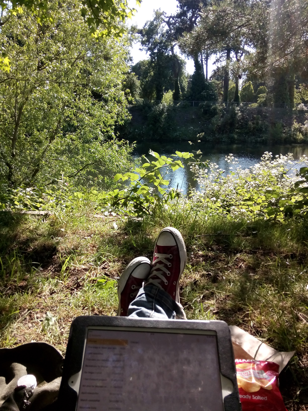
I’m sat in Cardiff’s glorious Bute Park next to Thomas Martin who’s composing some incidental music for a mutual client and the sun is shining and the pine tree over us whispers with the breeze and we’ve just eaten some giant vegan jaffa cakes and are drinking coffee and all is right with the world.
These are not things that we do very often (the Welsh weather sees to that) but they are probably things we should do more often. Tom has been stuck for ideas about his guitar piece and I have been scratching my head about ways to radically update the design of an educational brochure. Lo and behold, sit thee by a river in a park in summer and the eureka moments they will come.
Tom hears a car beep in the distance at the same time as a picking a particular chord and realises in a flash that the track needs some plaintive Scandinavian horns in the background. I observe the colours of the sky, the pine, the river and the magenta of someone’s coat on the other side of the Taff and that’s my colour palette sorted. I think of ways to replicate that feel of sunlight filtered through branches and remember distant walks through pine forests to a beach in the South of France when I was small, and I wonder how to bring that child-like sense of wonder, sense of awareness into this educational brochure.
Here is Virginia Woolf describing the experience of her character Peter Walsh in Regent’s Park, from Mrs Dalloway:
By conviction an atheist perhaps, he is taken by surprise with moments of extraordinary exaltation. Nothing exists outside us except a state of mind, he thinks; a desire for solace, for relief, for something outside these miserable pigmies, these feeble, these ugly, these craven men and women. But if he can conceive of her, then in some sort she exists, he thinks, and advancing down the path with his eyes upon sky and branches he rapidly endows them with womanhood; sees with amazement how grave they become; how majestically, as the breeze stirs them, they dispense with a dark flutter of the leaves charity, comprehension, absolution, and then, flinging themselves suddenly aloft, confound the piety of their aspect with a wild carouse.
I think a lot of us office-types are conditioned to feel bad about time spent away from our desks, but our desks are rarely the places where the inspiration is. In my one-and-only proper 9-5 job my boss couldn’t really understand my urge to go and stand outside, or go for a walk, or stare at the fishtank for 20 minutes in order to get an idea. I think he thought I was skiving. Isn’t it weird that we should be made to feel guilty about one of the most pleasurable parts of our job – the eureka moment?
 The Awen, the Muse, they are a flighty and tentative creature, more at home under trees and beside streams; while bramble-picking and beach-walking, in canvas tents and under a canopy of stars. I’ve had some of my best ideas while out surfing. I’ve been freelancing 12 years next month and still I feel guilty about this part of the process, this work which is not work, these conditions which are necessary for the most original and stirring creativity to occur.
I am continuously overawed by the beauty and wonder of it all, and in these spaces of just being, that buddhist no-mind where there is nothing but the breeze ruffling the fine hairs of my arms, the warmth of the sun on my shoulders and the crunch of copper leaves underfoot, those spaces where I am no longer my name or occupation or species or anything at all in particular, those are the spaces into which the ideas come tumbling.
And I wonder how many other kinds of occupations could be made more creative, more efficient, more innovative, by half an hour in a park with a coffee and, perhaps, a giant vegan jaffa cake. I am thinking of the news that some public parks will “have” to be privatised because of council cuts and how arse-backwards that is – that we need these parks, we, as a whole, as a society, need them in a very real and tangible way, and that like the libraries which we’re also losing, they need to be freely available to all. I am thinking of how Woolf wrote about parks in Mrs Dalloway, as places where all kinds of people met and saw and crossed over and interacted and how they are spaces where boundaries are blurred and strange things can happen. Places of meditation, interaction, of peace and of noise, of crowds and of solitude, and how spaces like that could be important to all of us.
Septimus, the WW1 veteran haunted by shell-shock experiences Regents Park in Mrs Dalloway:
Happily Rezia put her hand with a tremendous weight on his knee so that he was weighted down, transfixed, or the excitement of the elm trees rising and falling, rising and falling with all their leaves alight and the colour thinning and thickening from blue to the green of a hollow wave, like plumes on horses’ heads, feathers on ladies’ so proudly they rose and fell, so superbly, would have sent him mad. But he would not go mad. He would shut his eyes; he would see no more.
But they beckoned; leaves were alive; trees were alive. And the leaves being connected by millions of fibres with his own body, there on the seat, fanned it up and down; when the branch stretched he, too, made that statement. The sparrows fluttering, rising, and falling in jagged fountains were part of the pattern; the white and blue, barred with black branches. Sounds made harmonies with premeditation; the spaces between them were as significant as the sounds. A child cried. Rightly far away a horn sounded. All taken together meant the birth of a new religion–
Google throws up plenty of academic studies into the benefits of public parks. The Design Council says that quality public space is important for economic reasons, for mental and physical wellbeing, for biodiversity, for traffic reduction, for children and young people’s development and for the reduction of crime. That’s pretty serious stuff. Any government that wanted to reduce the availability of green space to its citizens should expect to be fought tooth and nail. Just being in Bute Park has eased me through periods of grief, depression and uncertainty, never mind the number of times it has filled me with inspiration and enthusiasm, and I regard it, and spaces like it, as vital to my work and my wellbeing.
by Frank | Jun 24, 2015 | Uncategorized
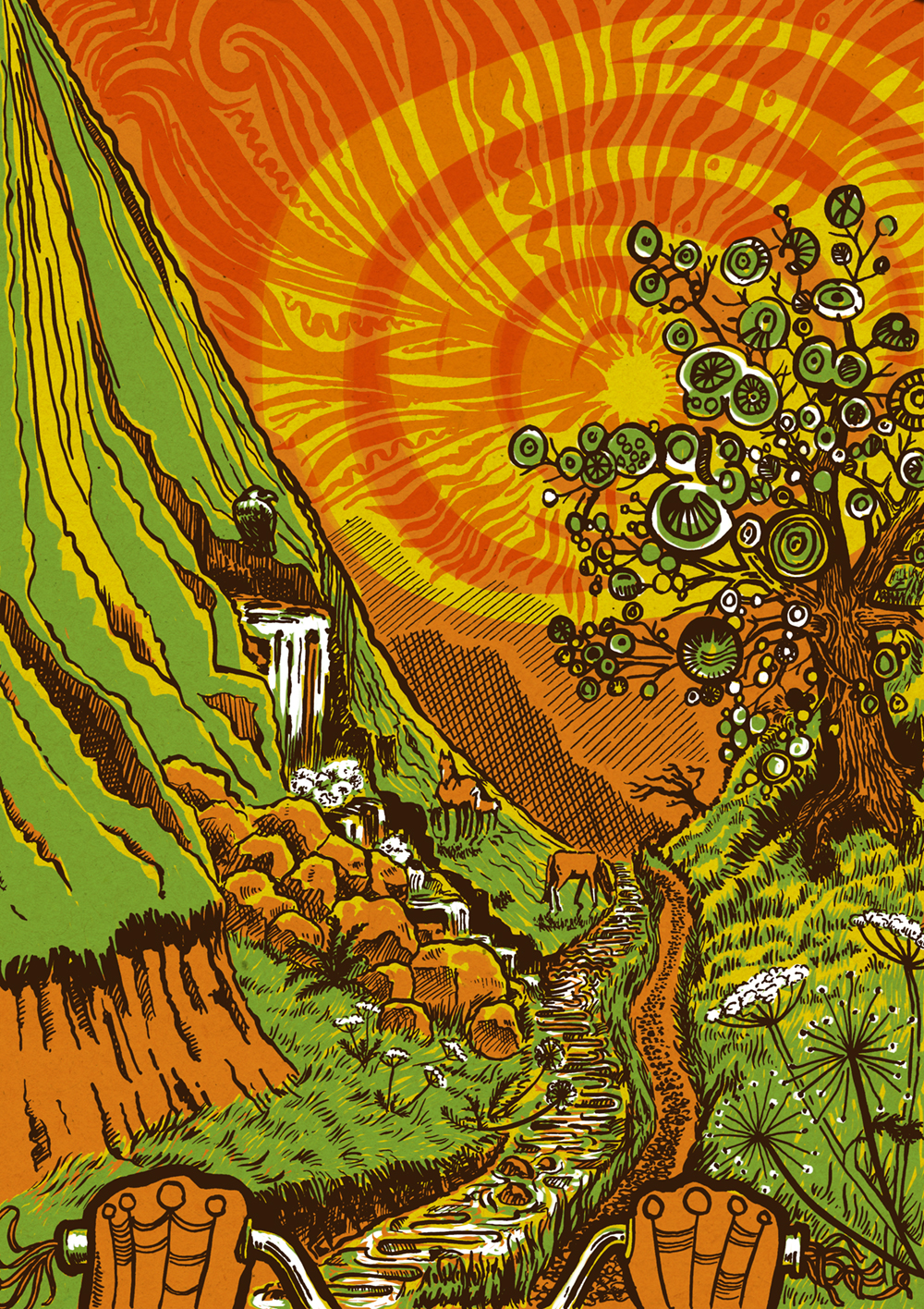 The Printhaus in Canton have a regular market where their artist members have stalls and sell their wares. Every market has a theme (this one is bikes), and for the last few markets there has been a zine. Heather at The Printhaus asked me if I’d be interesting in creating a cycling illustration for the next market on Sunday 28th June to go in the zine.
It’ll be single-colour in the zine but here it is in its full acid-drop glory! The feeling I was trying to create was the freedom of being out cycling on your own in strange countryside on a hot day when you’re maybe 12 years old. That’s what was going on in my head, anyway.
It’s pencil-sketched, inked and then coloured up in Photoshop. There’s a cardboard background too, for a little more interest.
by Frank | Jun 22, 2015 | branding, graphic design, thoughts
Okay, so I wrote a whole 24-page thingumy about how to write graphic design briefs and you can download it here (all you have to do is subscribe to my monthly-ish newsletter in return) but what this post specifically addresses is ways to communicate your style likes and dislikes with a designer.
Design briefs in brief
A design brief is a document you create in order to tell your chosen designer(s) the specifics of what you need from them, how you need it, your target audience, your budget, etc etc.
The part of this I’ve really seen clients struggle with is the bit where you try and communicate the kind of style that you’d like them to use. Of course, by describing your target audience well, your designer will already have some styles in mind and could suggest a few. If you’d like to cut some time out of the conceptual part of the design (and therefore potentially save yourself some money), the more specific you are about what you’re looking for the easier it’ll be for everyone.
I know what I want
Andrew Norton of Naturally Kind Foods was clear about wanting his t-shirt illustration created in the style of Sailor Jerry / Ed Hardy tattoos, and so that’s what I gave him…
I don’t have the words for what I want
But you might not be so clear about what you want, and you and your designer might not share the same vocabulary to describe a particular look. The word “vintage” might mean one thing to me and another to you.
So here are a few ideas you might consider in order to get your message across:
- pinterest boards – objects, adverts (particularly of a chosen era – 1950s, 1980s etc), drawings, logos, typefaces. These are invaluable.
- colour swatch ideas like designseeds
- magazines also aimed at your target audience. Even if the magazine isn’t designed quite the way you’d want, flick through and have a look at the adverts
- choose an actual object that sums up your business to you and show it to the designer. In the flesh. Is it a enamelled galvanised steel gardening bucket? A greasy spanner? You’d be surprised how effective this is.
- a mood board – cut out clippings of this and that. This can be more useful than pinterest as you can have it next to your desk and gaze at it and have Wonderful Moments of Inspiration
But also
Sometimes it is best to consider alternatives to what you have in your head – designers have been thinking visually a long time and will often have some great ideas about how to give you what you want. I recently read that a good percentage of design agencies who’d won tenders had ignored the brief in some way – often by pushing ideas further than the client had ever imagined they create something spectacular. So do be ready to keep an open mind!
I’d be interested in hearing how others have showed their preferences within or alongside a design brief – the weirder the better!
by Frank | Jun 8, 2015 | doodles, illustration
Following on from last week’s blog post about trying new illustration media, here are two lunchtime doodles with the fineliner I used to hate. Working out how to get the best of it is fun!
Pulling things out of my head – the pen can do clean lines and fine shading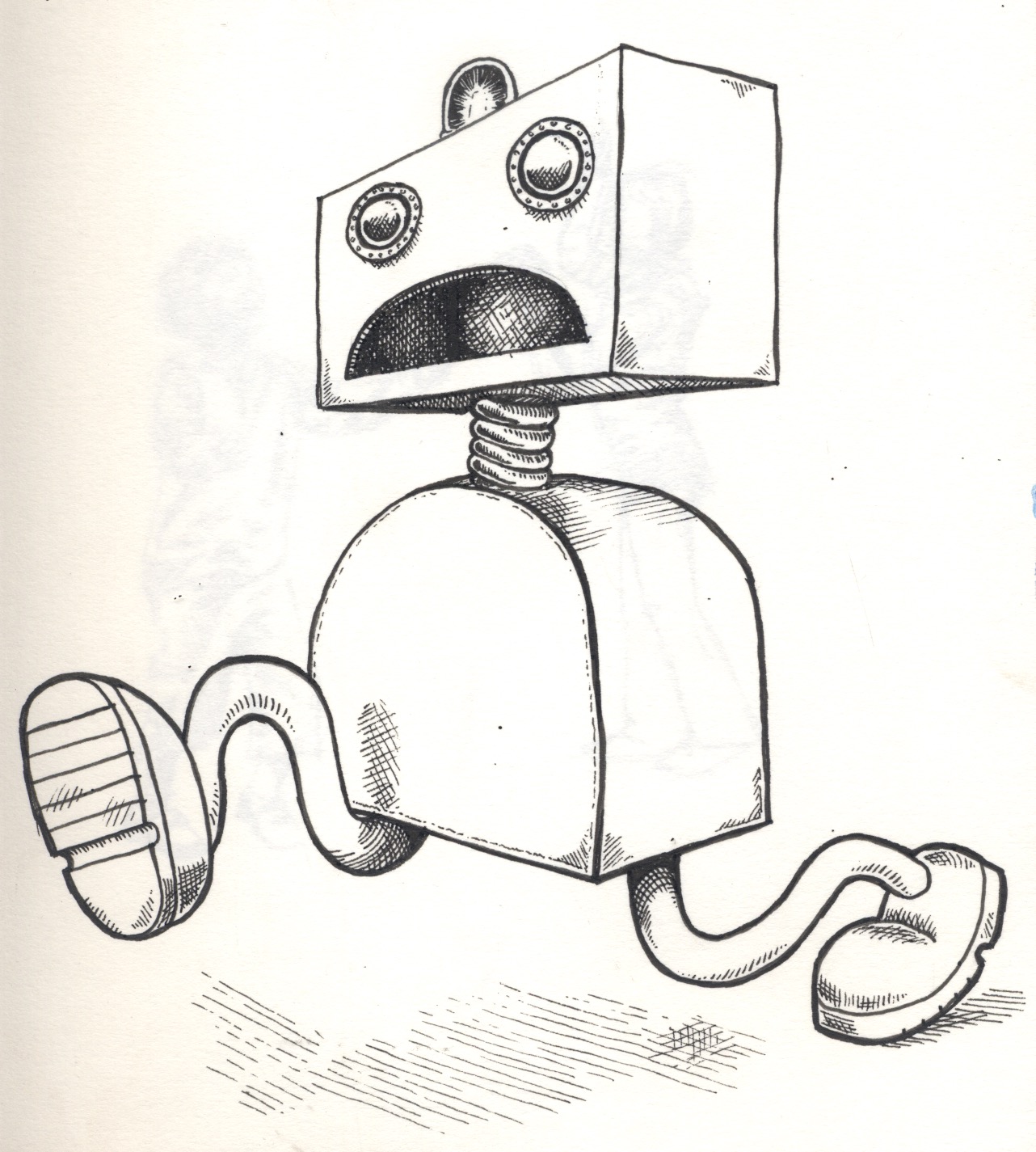
but it’s nice for creating loose rough sketches too, with plenty of energy and movement (these are some children from an ad in a magazine):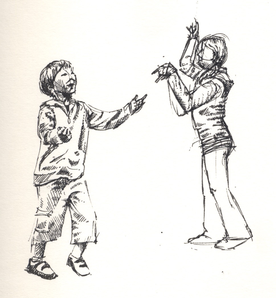
by Frank | Jun 5, 2015 | doodles, illustration, thoughts
I’m a bit conservative when it comes to trying new methods. My job is often limited by time so I tend to do the things that work. But that gets boring after a while.
When I was in art college I tried lots of different things but my butterfly brain would not persist with any of them – “can’t do that – too hard” *throws toys out of pram*
Now, with a little age and experience under my belt, I’m looking at new ways of doing things – ways I’d rejected before but remained curious about.
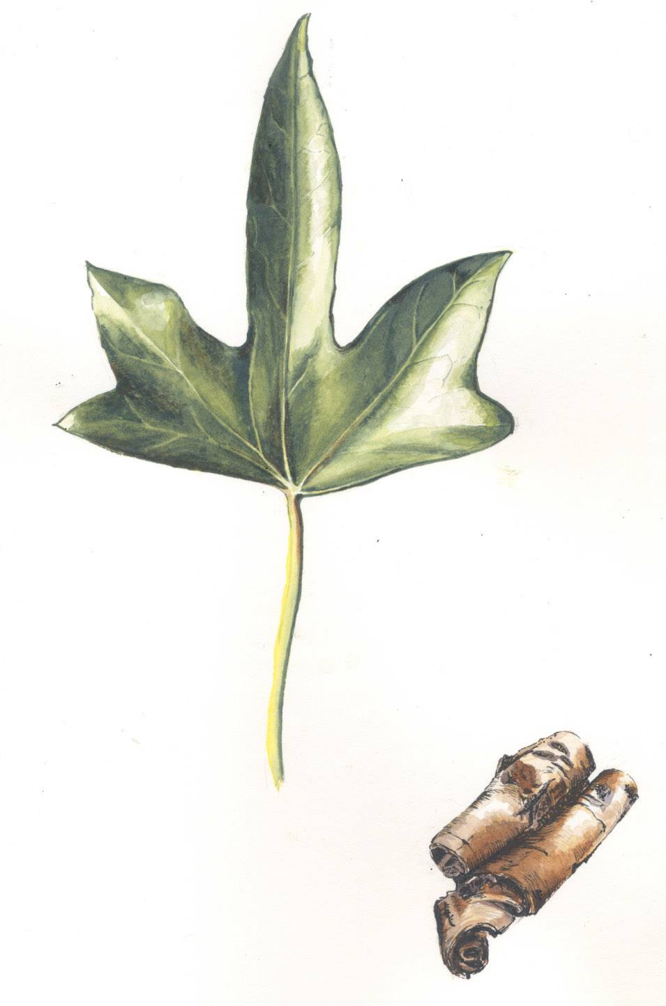
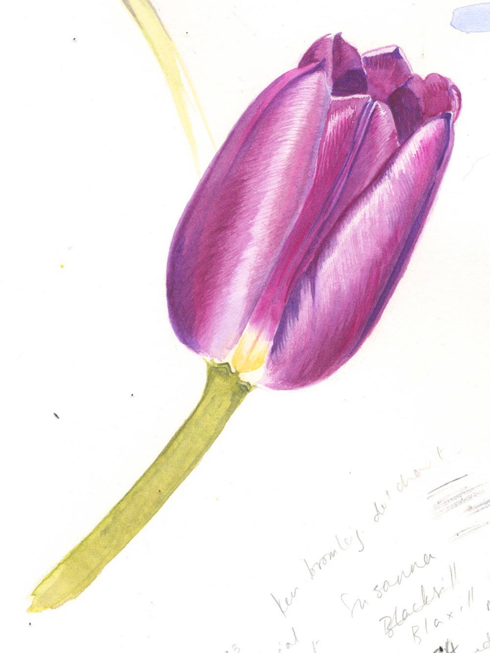
Last winter I signed up for a botanical illustration course – hoping to apply some discipline to my splishy-splashy style, and also to learn how to paint with watercolours, one of the most difficult mediums to master.
The Very Precise Style isn’t really me, but I’m enjoying it anyhow…
 ...and learning about watercolour has enabled me to use those skills to work out how to represent things in a more expressive way…
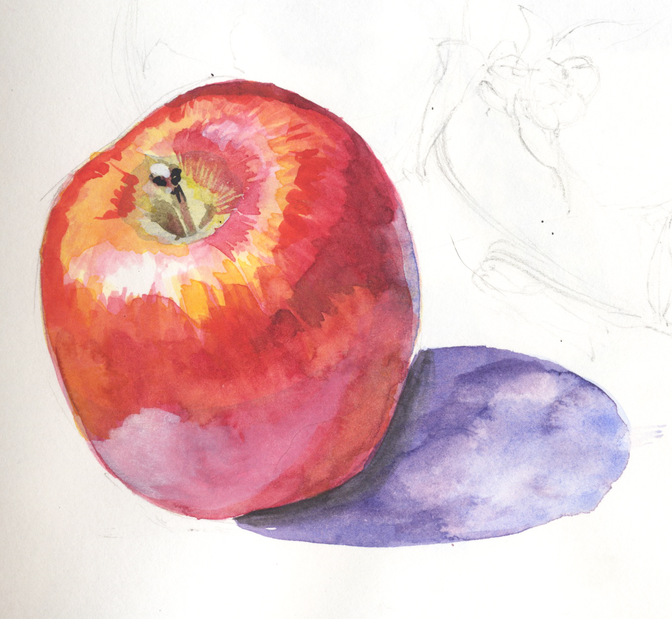
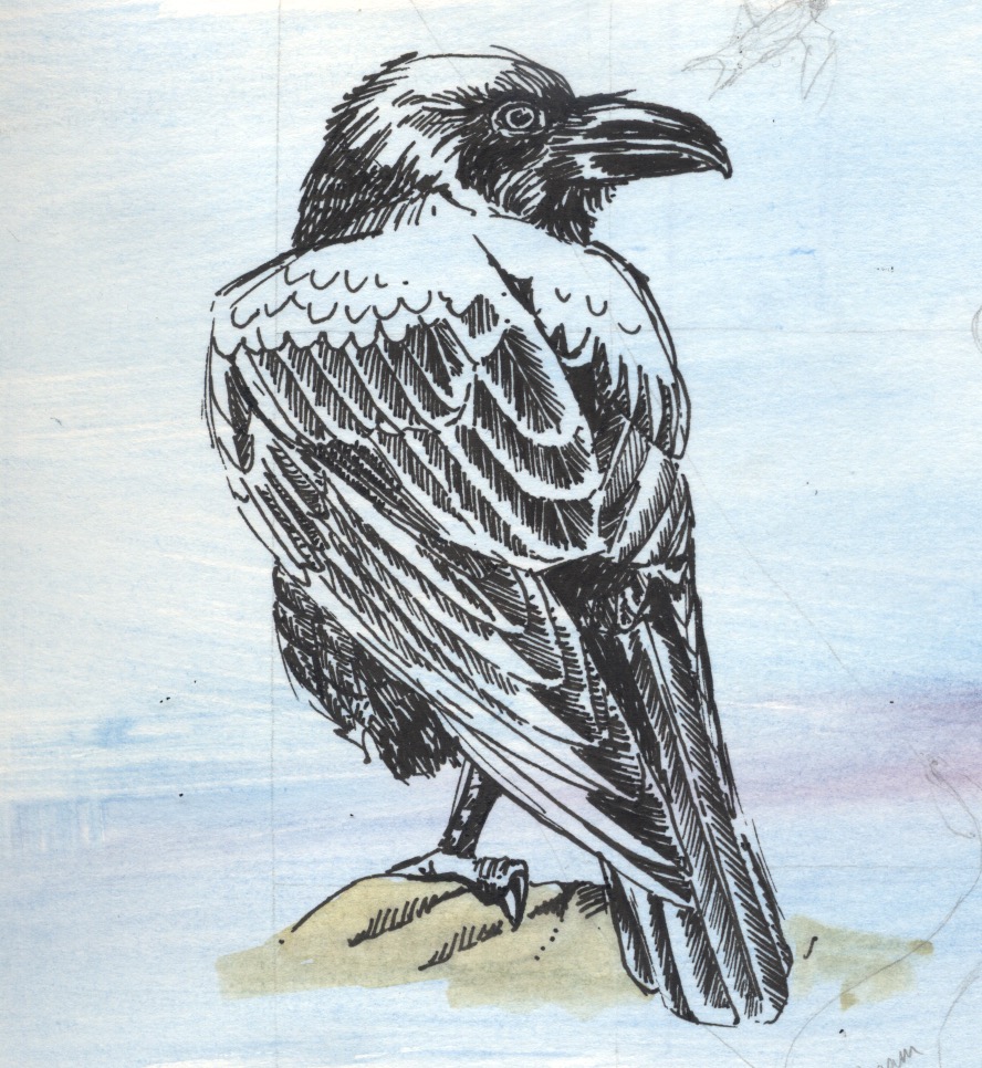
All this has prompted me to try other new ways of doing things. One of the materials we were asked to buy for the botanical course was a black fineliner artists’ pen. I have never liked such things, finding them clumsy and limited and difficult to use with subtlety, preferring a Bic fine biro for such tasks *cue singing of hosts of heavenly angels – best pen ever*
However, I’ve been using it more and more, and just now I created this raven. I would have been able to create something very accurate with a Bic pen – shaded and shiny and the filaments of all the feathers present and correct. However, the fineliner adds a character, an expressiveness, that I might not have been able to capture if I’d used a more subtle pen. There’s a solidity about her – her hulking form, her strength, the shine of her feathers. I’ve had to think much more carefully about how to represent her to get around the limitations of the pen, and it’s taught me a lot. I remember reading about a champion surfer who’d learned to ride waves on her brother’s broken board – if you can make something special out of whatever materials you have to hand then you’re on your way.
by Frank | May 29, 2015 | illustration
Peter Bartram has written some rather lovely things about our work together last year for his Colin Crampton books. He asked me to write a few lines about how I created the illustration of Colin’s girlfriend Shirley, and the result was this facebook post:
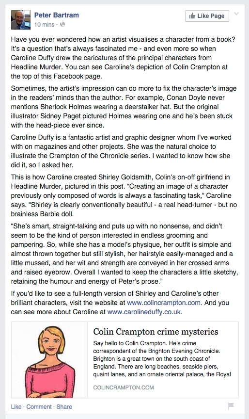
You can see the other illustrations I created for Peter at the Colin Crampton website here, and read more about his Brighton-based humorous crime fiction tales too.