by Frank | May 23, 2016 | illustration
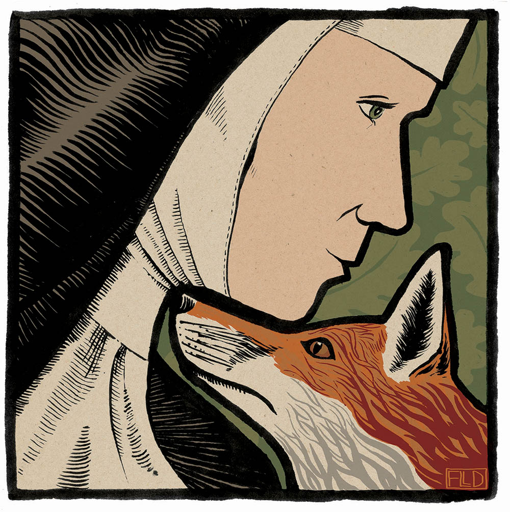
The finished work
Jane Russ is author of the upcoming Selkie story and thus commissioner of the book illustration work I’m currently beavering away on. She’s written a companion piece to The Hare Book (Graffeg, 2015) which will be published later this year and will be called The Fox Book.
She asked me to create an illustration for the new book based on the old folk tale of St Bridget and the Fox. The story is about how the canny animal-loving nun and a fox work together to save a condemned man’s life.
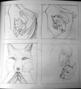
scribbled ideas for book illustration
Book illustration process
I came up with some rough scribbles – some of the fox performing tricks, as he does in the story, one of the fox praying and another of the faces of both. Jane and I decided that working on the fox and the nun together would make a powerful image.
I played with different ideas of having them together, initially positioning them in a rather mischievous “madonna and fox” pose, but let that go and worked out something a lot more interesting.
Red in tooth and claw
The commission came at an interesting time – just the day before, a young dog fox had killed half of our chickens in broad daylight. Naturally I found the deaths upsetting but still, part of the natural order of things. If we as a community wish to keep chickens then the risk of predation is one we must take and we have been very lucky – the last fox incident was four years ago. The chickens are well locked up at night and so it seems that May is the month when hungry young foxes take the easier, if riskier, option of plump free-range hens from a house with 16 humans and four dogs to contend with.
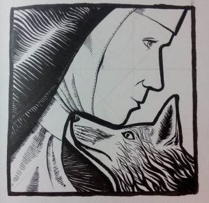
Inked-up version of book illustration
I have always loved nature and foxes have fascinated me since I was very small, but this incident reinforced my belief that to make these animals uniformly cute or cuddly is to deny their essential nature – yes, they are beautiful, intelligent, playful and adorable to our eyes and yes, they are killers. I wanted to show intelligence but also wildness in the fox – an uncompromising potential for ferocity. Here, the kindness and quiet wisdom of Bridget is poised with the fiery nature of the fox – both self-possessed and determined in their own ways and both capable of working together to an end; yet each is a very different animal from the other. Anthropomorphising animals does them no favours – nor us.
Thus, am very happy with this book illustration. Jane’s husband thought it “very Eric Gill” which is a compliment of the highest order!
- The Fox Book, by Jane Russ, published by Graffeg, will be published in October 2016.
by Frank | May 18, 2016 | illustration, interpretation
National Museum Wales asked me to create exhibition illustrations for their family-friendly Wriggle! event. They are designed to engage younger children and aid education and interpretation of the exhibition.

inking of Science Worm, replete with white coat and magnifying glass
Exhibition illustrations: the process
I’ll share a longer post about the actual creation of the illustrations on the opening of the exhibition – watch this space!
Suffice it to say that the curators at the museum gave me an excellent, well-thought through brief where they described their worm character, how old it was, what it liked to do and the impression they wanted it to give.
I came up with four different worm characters and we edited until we had one that worked. They then gave me the six poses they wanted the worm to be drawn as – superworm, scientist worm, old worm, swimming worm, awesome worm (on a skateboard, of course) and digging worm. I managed to create an image of a cartoon worm, with no limbs, digging with a garden spade. I am rather chuffed about that.
Once the worms were drawn in pencil, I inked them up using a Japanese brush pen. They needed to be fairly big, so they were created on A3 paper. They were then scanned, and then cleaned up and coloured in Photoshop.
Because the exhibition illustrations were to be huge, I then took the coloured-up worms into Illustrator. I live-traced them into highly-detailed vector images, meaning that they can now be used as big as the Museum needs them with no deterioration of quality.
The worms will appear on mugs and t-shirts and billboards across Cardiff. The exhibition will run from the 18th June to the 30th September 2016 and will be at National Museum Cardiff in Cathays Park in the city centre. I can’t wait to see it!
by Frank | May 5, 2016 | graphic design, illustration, interpretation
Interpretation is the name given for the content produced by museums, galleries and so forth which helps to explain what they have on display and why.
I’m currently working on an interpretation tender submission for a wonderful project which will involve creating a map-based family trail for a national heritage site.
I love educational interpretation!
 I’ve created a lot of interpretation-based work, especially for children and families, and my work is used to help engage with, inform and inspire younger people. I have a deep love for this educational work – nothing makes me happier than provoking curiosity and excitement in others, especially children, and encouraging them to learn, find out more, imagine. I am happiest when learning and it is a joy to have a job that encourages others to feel the same!
So anyway, as part of this tender submission I thought I’d ask one of my most important clients, Grace Todd who is Senior Learning, Participation and Interpretation Officer at National Museum Cardiff, whether she’d be able to write me a sentence or two as a recommendation for this tender.
I was blown away by what she wrote. Here it is in full:
“Frank has been contributing to the work of the Learning, Participation and Interpretation department at the National Museum Wales for several years on a range of projects. Frank is professional, efficient, and has an ability to understand and design what we require. Frank listens, and understands that our remit is engagement and thus their illustrations have to be engaging, they have to hook the reader in.
One of the most demanding projects that Frank worked on was developing illustrations for a children’s story book that we published about a dinosaur. Having written the story I had strong ideas about how the characters should look on the page. The story was an intrinsic part of one of our school’s workshops for 4-7 year olds, and as such needed to encourage engagement, and a sense of exploration and discovery for the pupils. Frank’s illustrations encourage children to go back to different pictures and to discover new things. They help children read characters’ emotions and interactions.
Recently Frank’s designed and illustrated learning and activity resources for a new high profile exhibition on archaeology. In keeping with the brief these were designed to increase the enjoyment and engagement of young visitors and their families. Frank’s playful, lively hand-inked drawings have really encouraged children to be creative, imaginative and spontaneous. They’ve also helped make big themes and topics conveyed in the exhibition accessible and easy to relate to for our younger visitors. Parents, teachers, and children have all embraced these resources, the feedback has been tremendously positive. The illustrations have encouraged visitors to look more closely at what’s being shown, prompted observation, discussion, curiosity and speculation. One of the archaeology curators said she’d never seen archaeology conveyed in such a fun way!
Frank has also contributed to a lot of ‘one off’ projects for the department over the years. Our audience is varied: families, school groups across the ages, adults, toddlers, teenagers. In each instance Frank has demonstrated sound understanding of the audience and how to engage with them. We’re always asking Frank’s illustrations to work hard, they have to engage visitors, convey ‘big stories’, encourage imaginative, exploration and creativity, and help make the museum experience fun. Frank has demonstrated an ability to do this on every project.”
by Frank | May 5, 2016 | Uncategorized
I’ve been a bit quiet lately on the blogging front because I’ve been working on a few big projects in the background that for one reason or another I’m unable to talk about.
But I can talk about this one now – I’ve just had official confirmation that I have a place on the Illustration MA in Authorial Practice at the world-renowned Falmouth School of Art.
I’ve really enjoyed recent illustration projects & want to delve deeper
Illustration master’s – why?
You can read up about the course description here. Moving to a housing co-op in Devon enabled me to reorganise how I work. It’s a lot cheaper to rent here than to pay a mortgage in Cardiff and this means I don’t have to work full time. And it gives me time to think.
I started to think about how I’m really enjoying illustration but that I don’t think I’m pushing myself as hard as I can go, or exploring all the outer deeper reaches of subjects. I started to think about how I’d like some external supervision, some impartial advice, some signposting around where to go next. I thought about how I love to read theory, how I adore folk tales and their effect on our psyches and my fascination with psychoanalysis and symbols and mythology. And I wondered if there was a master’s in that.
A google of illustration masters’ degrees and Exeter (my nearest university) took me straight to Falmouth which has links to Exeter. Falmouth is where I did my first degree, graduating in June 2000, and I had an uneven time there (most of which wasn’t the fault of the town). I was deeply ambivalent about returning. But after speaking with a friend who’d done her MFA there my curiosity was piqued and I decided to apply.
After applying I was invited for an open day and also an interview. Going back after 16 years was emotional but I fell in love all over again with the location, the ethos and the facilities (not to mention that it’s about 10˚warmer there than everywhere else!) They’ve a huge screen printing room, a litho set-up, courses in metal and wood engraved printing, life drawing, a fabulous library and it’s all set in a tropical garden by the sea.
I was nervous about the interview and had genned up on a lot of theory, spent a day in Exeter University Library stealing an education and generally reminding myself of all the things and more that I’d learned at my undergrad degree all those years ago. But I needn’t have worried. The interviewer was passionate about environmental and animal rights and felt that illustrators had a duty to report what was going on in the world. Suffice it to say we had a lot in common. He offered me a place there and then (but I’ve waited until receiving the emailed official offer to announce it!). So yeah, exciting stuff!
Logistics
The course starts on September 18th 2016 and is two days a week. I plan on driving the two hours down to Falmouth first thing Tuesday mornings, spending the whole day working on the degree, sleeping in my camper van over night, working all of Wednesday and then driving back that evening. Hopefully I’ll be able to get all of the course work done over those two days, leaving me the rest of the week for paid work (because I’ll still need to pay the rent!), housing co-op work and other stuff.
Financially-speaking hopefully I won’t be out of pocket – this is the first academic year where you can get a student loan for a master’s degree. Over the two years of the course I can borrow £10,000 and this will pay the course fees and also the extra fuel involved in driving to the end of Cornwall and back once a week. Fabulous!
I can’t wait to get started. Who knows where my practice will lead me…
by Frank | Mar 2, 2016 | Uncategorized
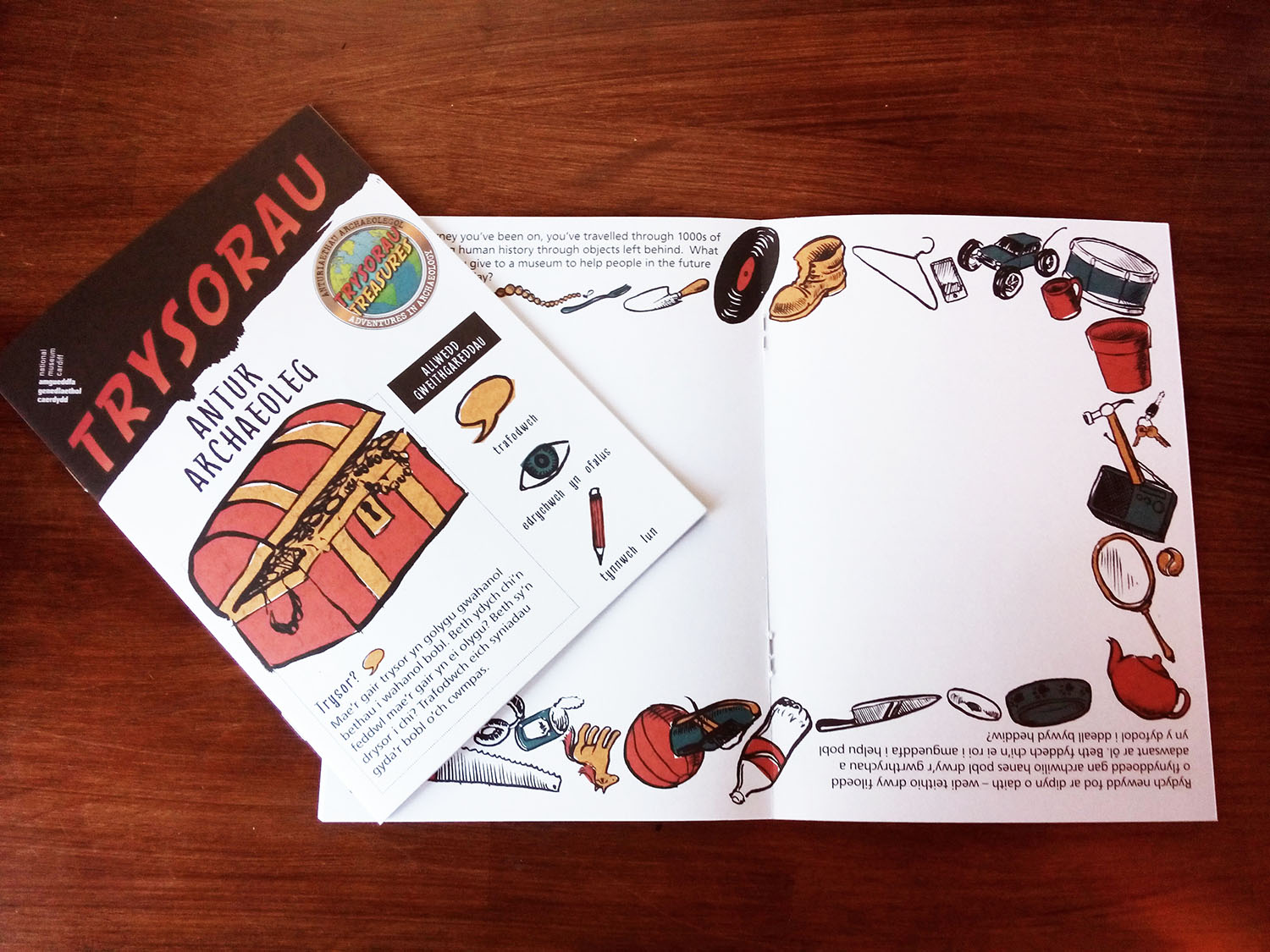 I was asked to design and illustrate two trails related to the National Museum Cardiff’s Treasures archaeology exhibition by the Learning Department – both designed to increase the enjoyment and engagement of young visitors and their families.
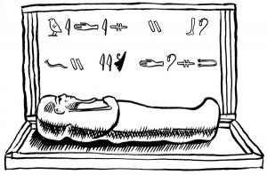 The first trail was to be a full colour 16 page coming-and-going (one side Welsh, the other English) A5 booklet called Treasures. It features photographs of some of the exhibits and drawings of hieroglyphs, roman tombstones and, naturally, Indiana Jones’ hat and whip (the star exhibits, which attracted a lot of media attention upon opening). I created loose and lively hand-inked drawings for children to colour in, add to, or whatever they feel like doing. The biggest piece was a border that ran all the way around the centre spread. I chose a simple colour palette based on the logo created for the exhibition and had fun with it.
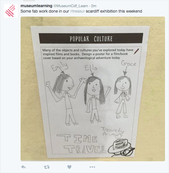
And this is what the children did!
Simple illustrations for learning
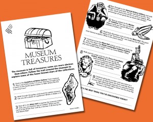
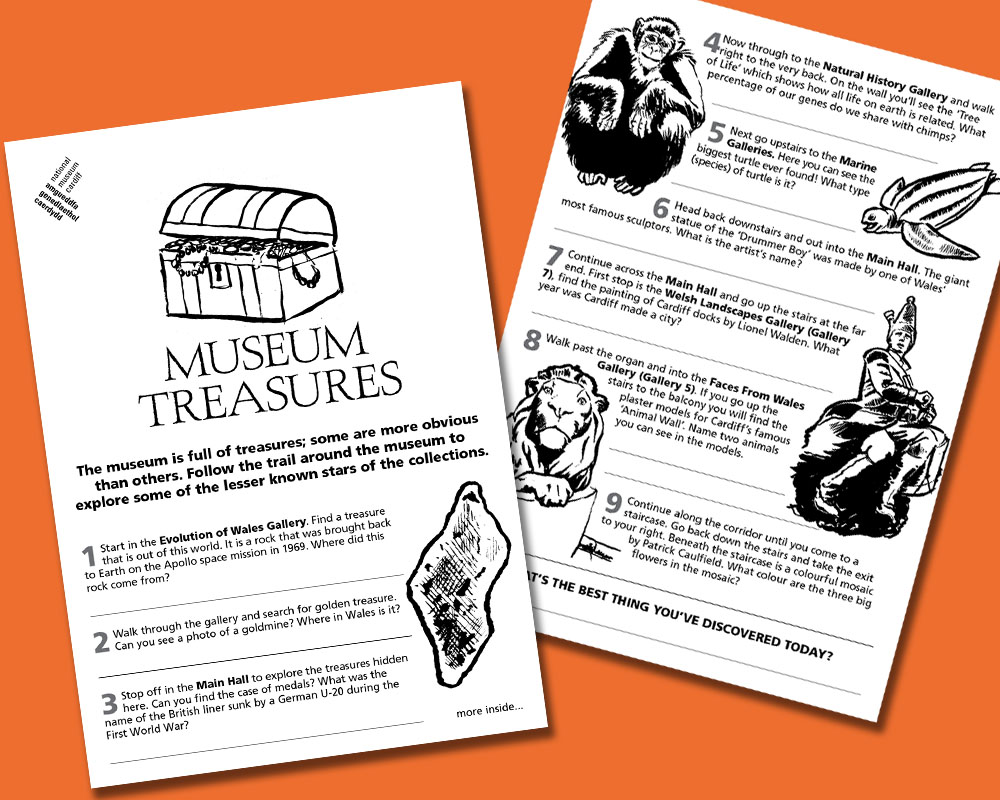 The second piece was a 4 page A4 coming-and-going which highlighted treasures in the museum that people might otherwise just walk past. There’s a quiz for young visitors to complete. Here once again I used hand drawn and inked illustrations but this time left them black and white.
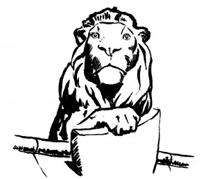
This fella is from William Burges’ famous animal wall by Cardiff castle!
The idea behind both trails is to encourage children and their families to look more closely at what’s being shown, to prompt observation, discussion, curiosity and speculation. We compare artefacts from different cultures and ask young visitors what they think they might be for, whether they can crack codes and what they think might be the relics of our civilisation. I wish such guides were available when I was visiting museums as a child. The best thing of all is seeing how children respond to the work I’ve done with excitement and imagination. It’s wonderfully rewarding work and I love doing it!
The exhibition runs until 30th October 2016.
by Frank | Nov 23, 2015 | graphic design, illustration
In the spring I created a poster for a groundbreaking couple of events – the first gigs to take place in an actual art gallery in National Museum Cardiff. In October the Museum reprised the events and I updated the poster with new colours.

by Frank | Nov 20, 2015 | illustration
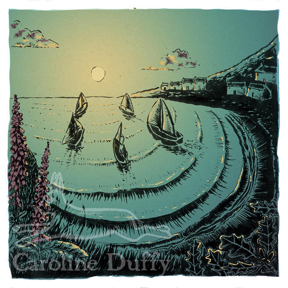
 Way back in July I had an email from someone who wanted to commission illustrations for a short story she had written inspired by the legend of the Selkie – a fairy that can transform from seal to human. I was initially circumspect – fellow illustrators are sure to nod their heads with understanding when I say that four out of five enquiries we get from members of the public (as opposed to publishers or agencies) who want illustrations for a book they have written tend to have no idea about the level of work involved and thus balk at the cost. Which tends to wear down one’s enthusiasm – getting all excited about a wonderful project and then being told that you’re basically urinating all over someone’s dream by wanting a hell of a lot more than the £30 per illustration that they thought you’d require.
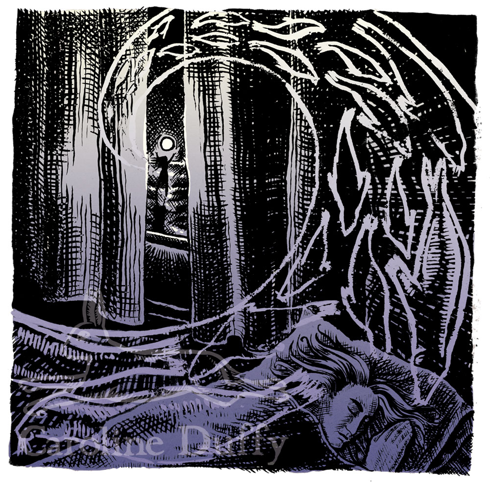
Jane Russ was different, however. A published writer who is married to a graphic designer, she appreciated exactly how much work was involved, and considered my quote fair. She had previously worked with a couple of other illustrators on the project but it hadn’t worked out. Her husband, on seeing my quote, remarked “at last, a professional!” which I took to be a compliment indeed. She decided to get in touch with me because a) my logo is a hare, and she is chairman of the Hare Preservation Trust, and b) the cover image of my website, the surfing one, shows I know the sea and how to draw it!
The project
The story – about a Selkie who bewitches a fisherman – is a short one: sixteen paragraphs of prose and an illustration for each paragraph. It’s traditionally a children’s story – do watch the wonderful Song of the Sea film that came out last year – but this story is more for adults. The aesthetic is somewhat based on the Eragny Press – little hardback books with woodcut-style images, subtly coloured, and bordered with stylised blocks and beautiful letterpress typesetting. Jane said she wished to create a “jewel” of a book. I got very excited about this, as you can imagine!
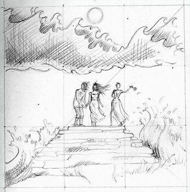
Pencil rough. You can see faint lines of the Rule of Thirds composition I’ve used for all the illustrations.
The schedule
With her previous illustrators Jane had worked a system where each illustration was developed to completion in turn, but that didn’t work for me. For the story to have a visual flow – spirit of continuity – I advised that we created the roughs all at the same time. We worked out a schedule together which balanced this need for continuity with Jane’s needs, which were that work was done – and payment made – in stages. She needed to have a small selection of these illustrations to submit the project to publishers, and also I was an unknown quantity so she wanted to make sure she liked my work and working with me before committing to paying me for the whole project. There are to be sixteen illustrations in all, so first of all we had a long chat on Skype and agreed that I was to draw roughs for the first 8 illustrations. I requested 50% payment in advance for these (it’s a really good idea to get payment upfront for new clients to make sure that someone is serious about the work and values your time and talent) and got to work.
Jane loved the first sketches. We made a few amends and then I went on to doing the rest of them. I then inked one up and then coloured and added texture in Photoshop. We then agreed that I would ink and colour two more illustrations, as well as creating edging blocks, before her husband Mick created the layout which they would then submit to various publishers.
What’s happening now
The three illustrations you see are being worked with the text by Mick (example spread below) and then will be submitted to suitable publishers. I’ll let you know of any future developments!

This is just the most exciting project I’ve ever had the good fortune to work on – it’s pushing my illustration skills further and enabling me to develop my visual storytelling. I can’t wait to see a published book!
by Frank | Nov 19, 2015 | graphic design, illustration, interpretation
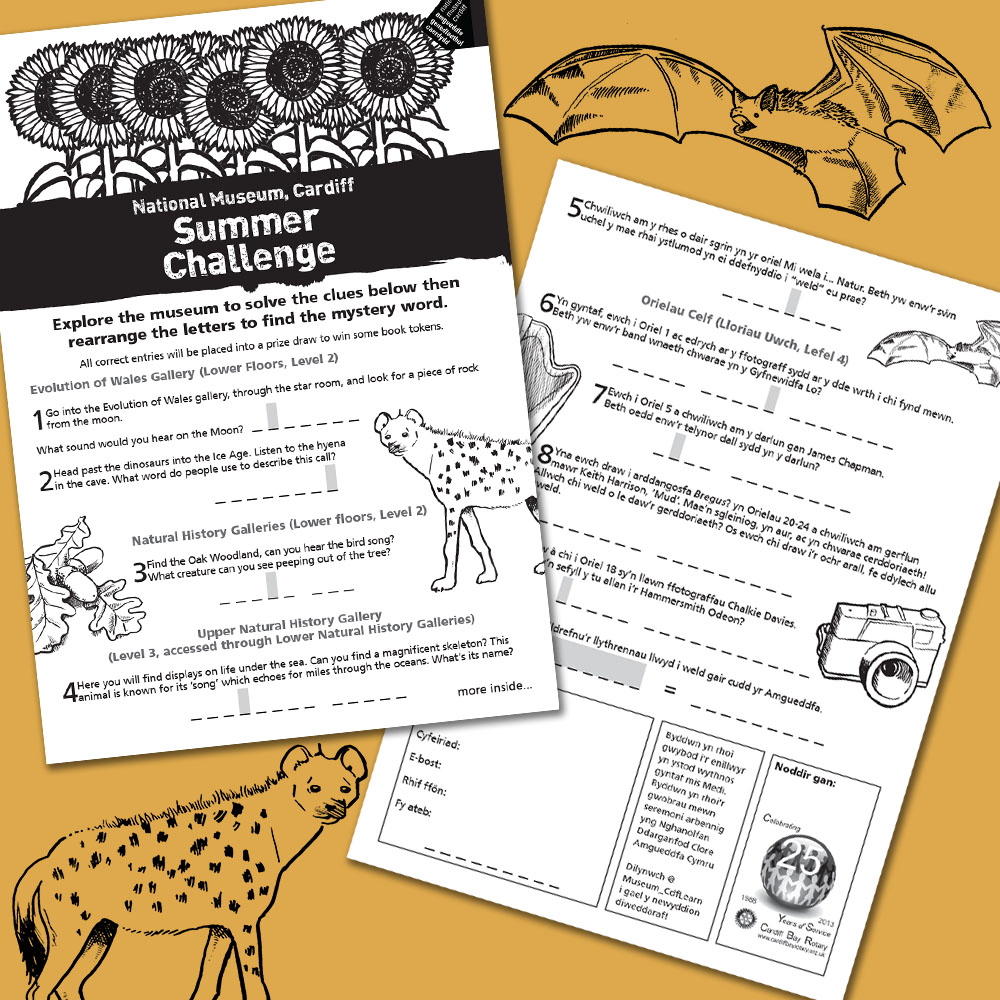 For the last few summers the Learning Department at National Museum Cardiff has run a Summer Challenge for children, the prize being some book tokens, and they’ve asked me to design and illustrate it. It’s just a simple black and white affair – 4 page A4 with Welsh one side and English the other. This year’s illustrations included a bat, a hyena and a harp!
by Frank | Nov 18, 2015 | illustration
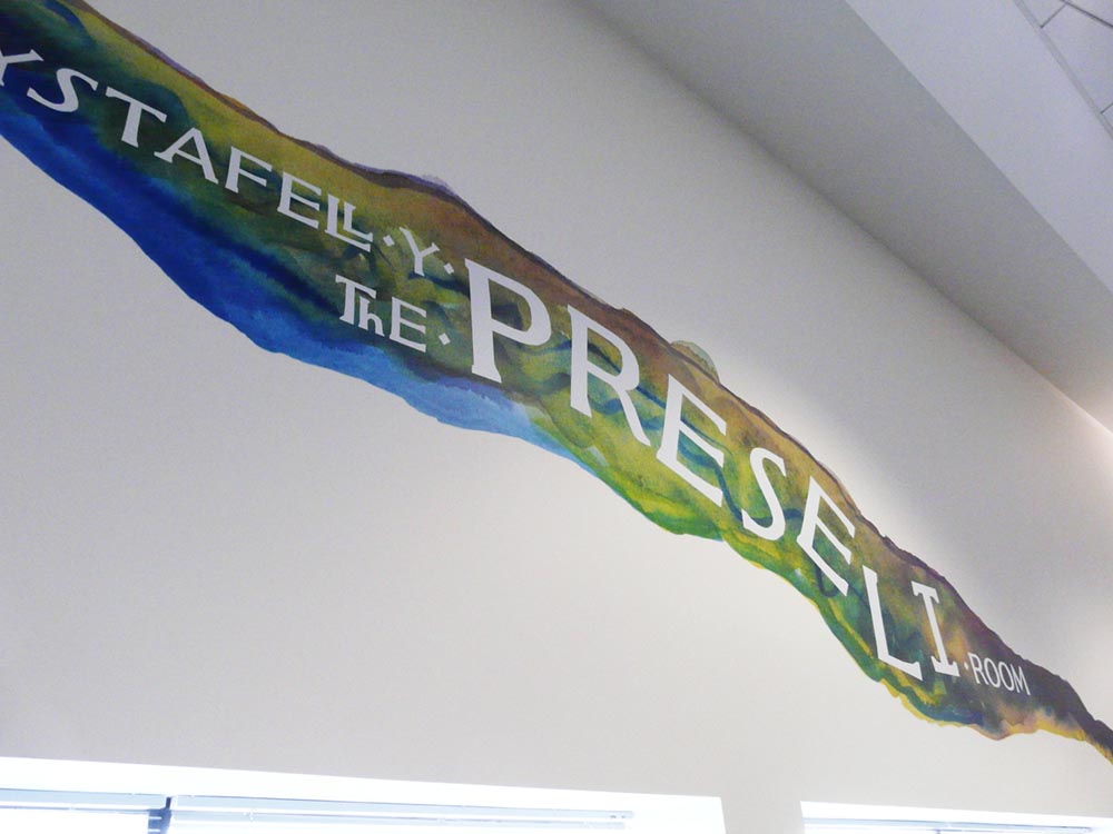 Wales Millennium Centre asked me to create illustrative signage, in the form of a large mural, to celebrate the support of Dyfrig and Heather John Charitable Trust for one of the arts centre’s important spaces.
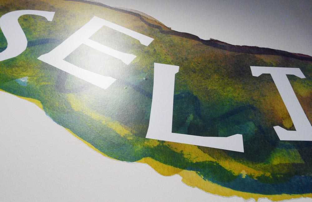
Dyfrig John has a love for the Preseli mountains, and so the room was renamed The Preseli Room / Ystafell y Preseli, and I was commissioned to create a large artwork that reflected the feel of the mountains. A wonderful project – but I had only a week to do it!
For me, the Preselis are colourful, rainy mountains, wild and natural and scattered with stone circles and burial chambers. They are the source of the huge blue dolmens from which Stonehenge was built. I wanted to capture this colour, this wilderness. I worked with watercolour paints, blending different colours together on variously textured papers, creating interesting effects as various pigments ran and clashed and feathered together.
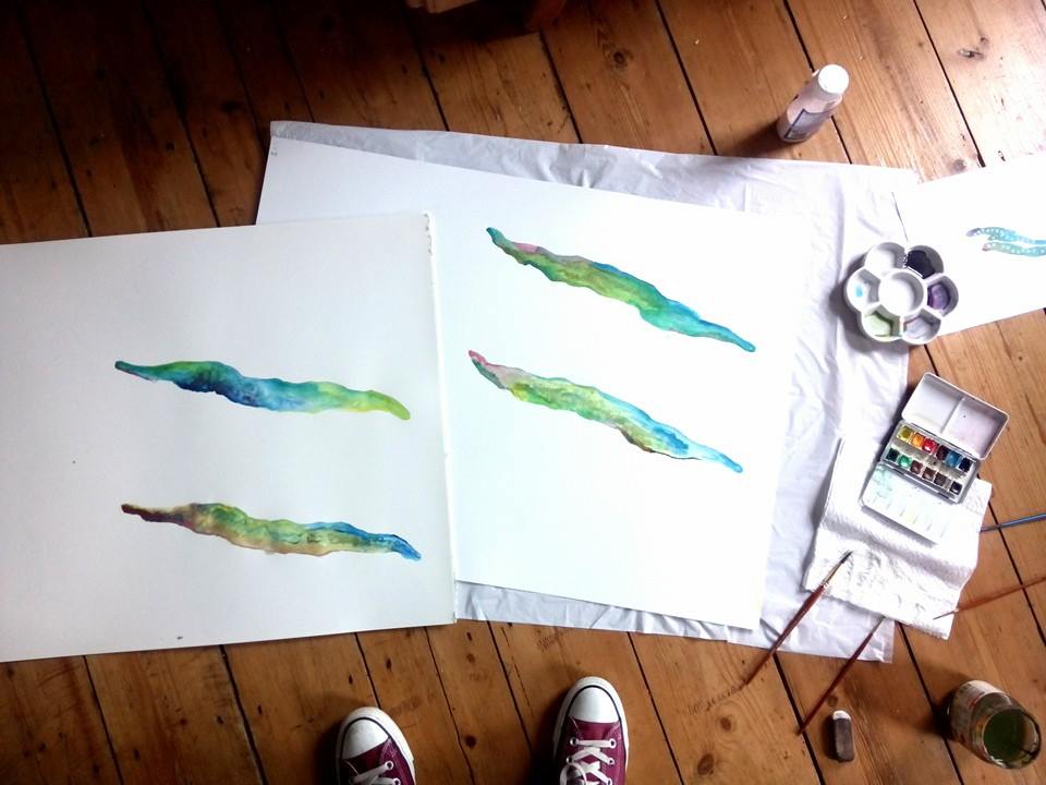
I sent over various options and using the Centre’s own font (famous for being on the frontage of the building) I played with different ways of displaying the name of the room bilingually. The Centre’s team chose their favourite and I scanned in the watercolour at 2000dpi. The artwork was printed and installed by Semaphore.
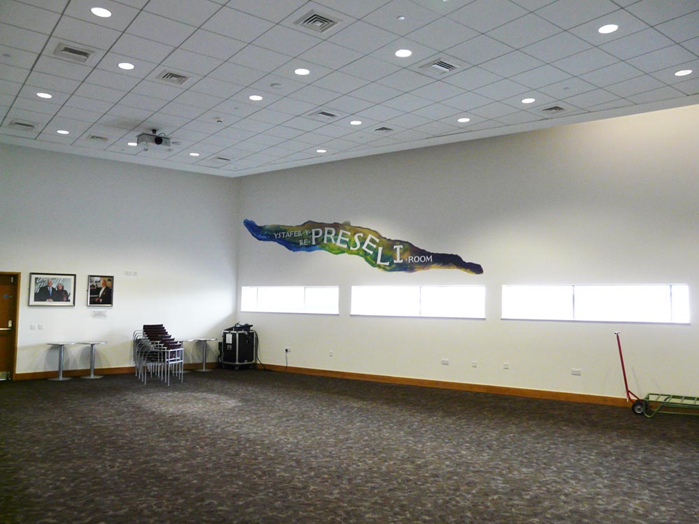
The Centre reported that Dyfrig and Heather John were thrilled with the mural and said it’s transformed the room from a bland space to something far more vibrant.
by Frank | Nov 10, 2015 | blog news, ethics
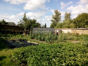
I’ve been quiet for a little while because of a holiday and lack of internet but am delighted to announce that I have moved to a wonderful eco housing co-operative in mid Devon!
Beech Hill is a 17th-ish century manor house and has been occupied as a housing co-op since the early 80s. There are around 6 acres here comprising of wildish areas, a camping paddock circled by magnificent beeches, two poly-tunnels, two cob-walled gardens, an orchard… and a swimming pool. It’s also an hour’s drive from one of Britain’s best surf breaks. Yep, I know. Heaven!
the first walled garden
The community has solar, wood-fire and biomass-heated water and central heating, a wind turbine, grows much of its own vegetables – all organically, buys other food also organically from a workers’ co-op, recycles as much as it can, hosts a local composting scheme… I could go on. It’s a wonderful place to live and, because living here is cheaper than in Cardiff, I can spend more time working in the garden, developing my illustration style and also getting involved in some volunteer work.
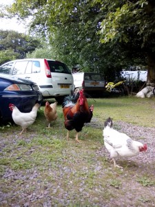
Of course there are chooks too
I’ve been working on some fascinating and really exciting projects in the meanwhile which I’ll start to share with you shortly. I’ll still be working with clients in Cardiff and all over the country, and intend to be back in South Wales every month or six weeks, so if you’re looking for an experienced and friendly graphic designer or illustrator wherever you are then do get in touch 🙂

