by Frank | Aug 31, 2016 | illustration
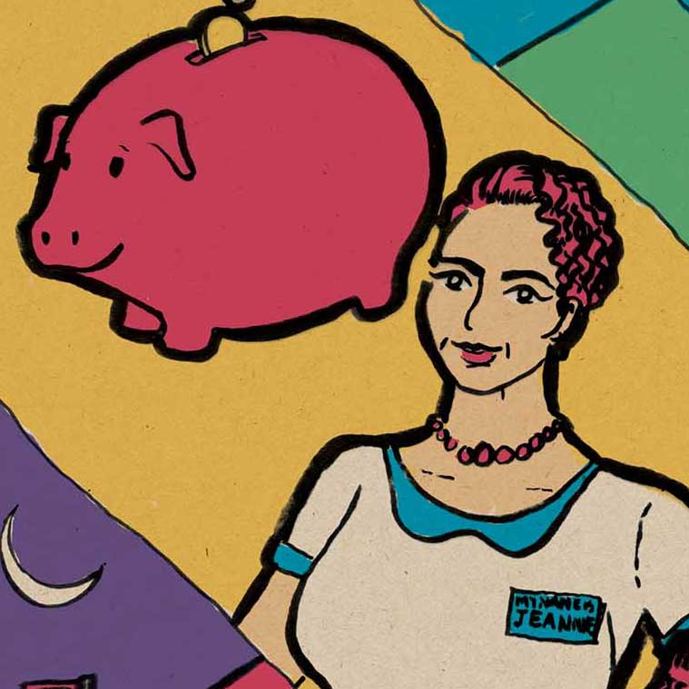
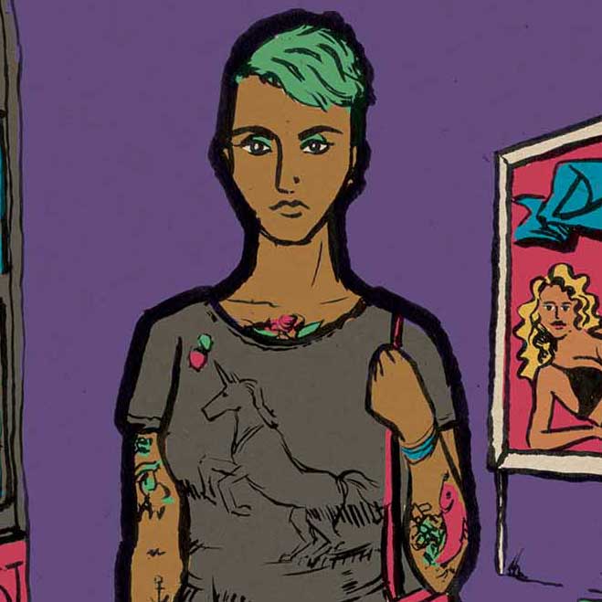
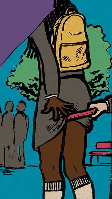
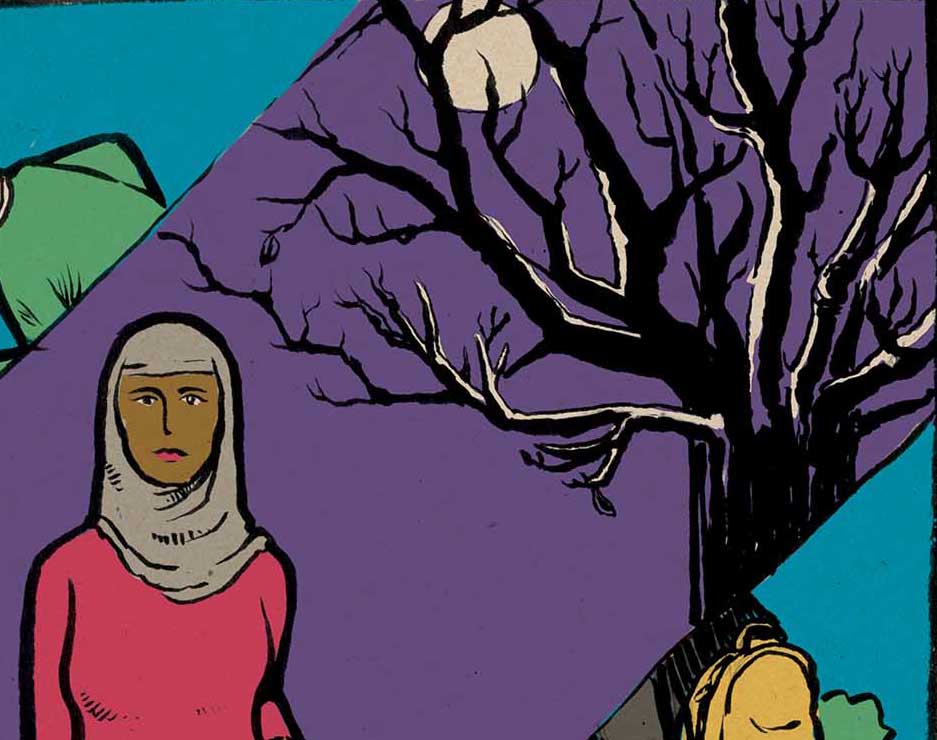
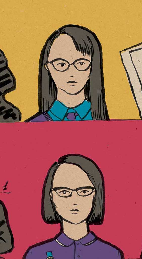
I thought I’d share snippets of some illustrations I’m working on for a non-profit organisation. They use a simple colour palette based on the client’s brand colours. The brief was to make them characterful and activisty.
by Frank | Aug 30, 2016 | prints
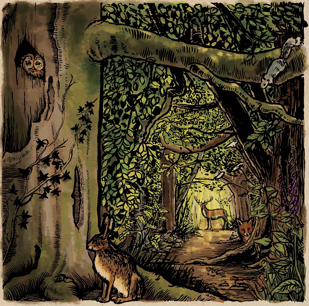
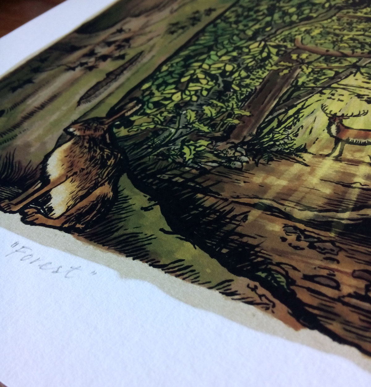 The first of only ten prints of this illustration has arrived – I’ve signed it and numbered it and will send it out now. It’s so richly coloured and is printed onto textured art paper. I’m really happy with it! Get your copy here!
by Frank | Aug 22, 2016 | blog news
I listed the things I’ve got on over the next four weeks and I thought I’d do a little blog post to share. My job isn’t and never has been just one thing, and I like to work on very different projects simultaneously, finding that they inform and inspire each other in rather lovely ways.
A List of Things
- A logo design for a vegan Cornish catering company
- A logo design for a newly-self-employed counsellor
- 5 x illustrations for WEN Wales along with a document design, with the possibility of an infographic too
- Album artwork for the delectable Marc Block
- Preparations for my upcoming art show in Aberystwyth with willow sculptor Woody Fox
- A website design
- And, er, starting my part-time Master’s (two days a week) in Falmouth School of Art at the end of September!
I have a few days clear between here and there so if you need something doing get in touch ASAP. I’m booking more substantial projects from the last week of September now.
by Frank | Aug 13, 2016 | blog news, painting, prints
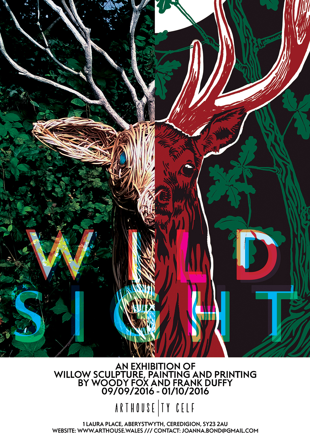 Exciting news – I’ll be showing some of my paintings and screen prints for the first time ever in a show with amazing willow sculptor Woody Fox at the Art House Gallery in Aberystwyth in September.
Wild Sight
The exhibition will be called Wild Sight and it will run from Friday 9th September to Saturday 1st October. I’m really very excited about it. I’m starting my two-year part-time Master’s in Illustration: Authorial Content at Falmouth in September so it feels like a real time of new beginnings and adventures and such for me.
About my work
The work I’ll be showing at the exhibition is personal rather than commissioned and reflects on themes of nature, power, death and innocence. Expect hares, stags and skulls. I’ve painted for many years but have only just started to work out what I want to explore with my personal work.
There’ll be prints and cards of my work for sale at the gallery. I do hope you can make it!
by Frank | Aug 10, 2016 | illustration
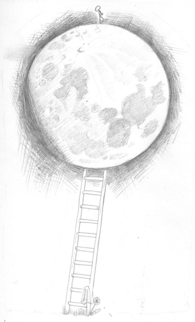 One of my followers on Twitter got in touch asking whether he could commission me for a tattoo design. He wanted the tattoo to honour a story told by his late grandmother about the waxing and waning of the moon, and had a very clear brief about what he wanted.
Initial pencil work
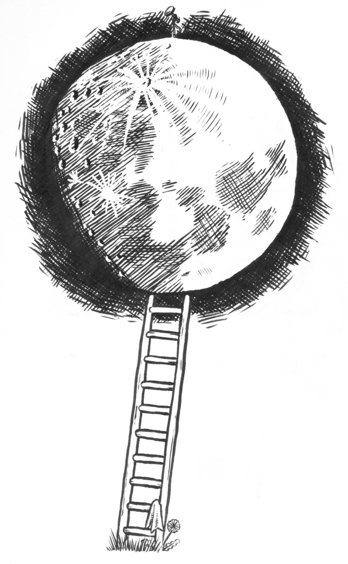
I created the work in pencil and sent it over. He requested a couple of small amends which I made for him, and once the drawing was approved I inked it. He wanted the drawing to be black and white inking, i.e. no shades of grey, so the craters of the moon had to be created with hatching.
Here’s the final ink work:
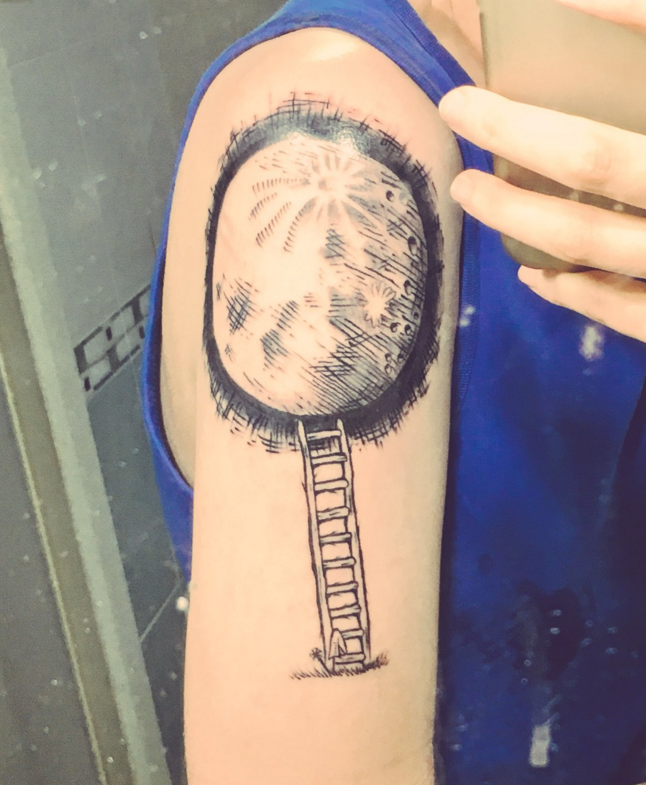
 And here is a photo (taken in a mirror) of the final tattoo. He’s going to send me another picture when it’s healed.
by Frank | Aug 9, 2016 | graphic design, illustration, interpretation
You may have seen me boasting about my beautiful new interpretation brochure on social media. Here’s a blog post sharing a bit more about it.
Showcasing interpretation work
Its aim is twofold – to showcase my work to potential clients and also to demonstrate what can be done when you decide to employ more unusual papers and printing techniques.
The brochure is printed on 100% recycled unbleached Cairn Kraft paper from Paperback. It’s been printed by Ashley House printers in Exeter using the HP Indigo – a fabulous new digital press that can print with white ink. WHITE INK. As any long-standing designer will tell you, the ability to print with white (other than through techniques like screen printing) has been something almost as long-desired and elusive as the Holy Grail so this new technology is very exciting indeed.
I used the white in three ways – to make my logo stand out, as white text on a coloured background, and as an underlayer for the regular cyan, magenta, yellow and black inks, to lift the colours as if they were printed on standard white stock. Where I used the coloured inks directly onto the stock the effect is subtle and muted and generally less in-your-face.
The brochure is 210mm square and also features white stitches.
It’s focused on interpretation – work that I love, that I feel I’m good at and that I’d like more of. Mostly it’s just the work with some rather lovely testimonials from clients. It features everything from a quick fluid line drawing of an ant to huge 2 metre high display boards about plesiosaurs; from a children’s workshop illustration of a dinosaur to an exploded vector map of Wales’ most prestigious arts venue.
I’m really grateful to have been able to work with such a creative and ecologically-minded printers like Ashley House, and for all their help and encouragement with this project.
It’s my first ever promotional brochure, so I’m over the moon to hear that they are going to be entering it into several competitions. How exciting!
I’m initially only printing 100 of these, so if you commission interpretation work, or you know someone who does, and you’d like a copy, get in touch tout-suite!
Buy the print of the cover!
 After several requests I’ve decided to release a very limited edition numbered and signed print of the cover illustration. Click here if you’re interested in purchasing one of these rare beauties. At time of writing there’s only nine left…
by Frank | Aug 8, 2016 | painting
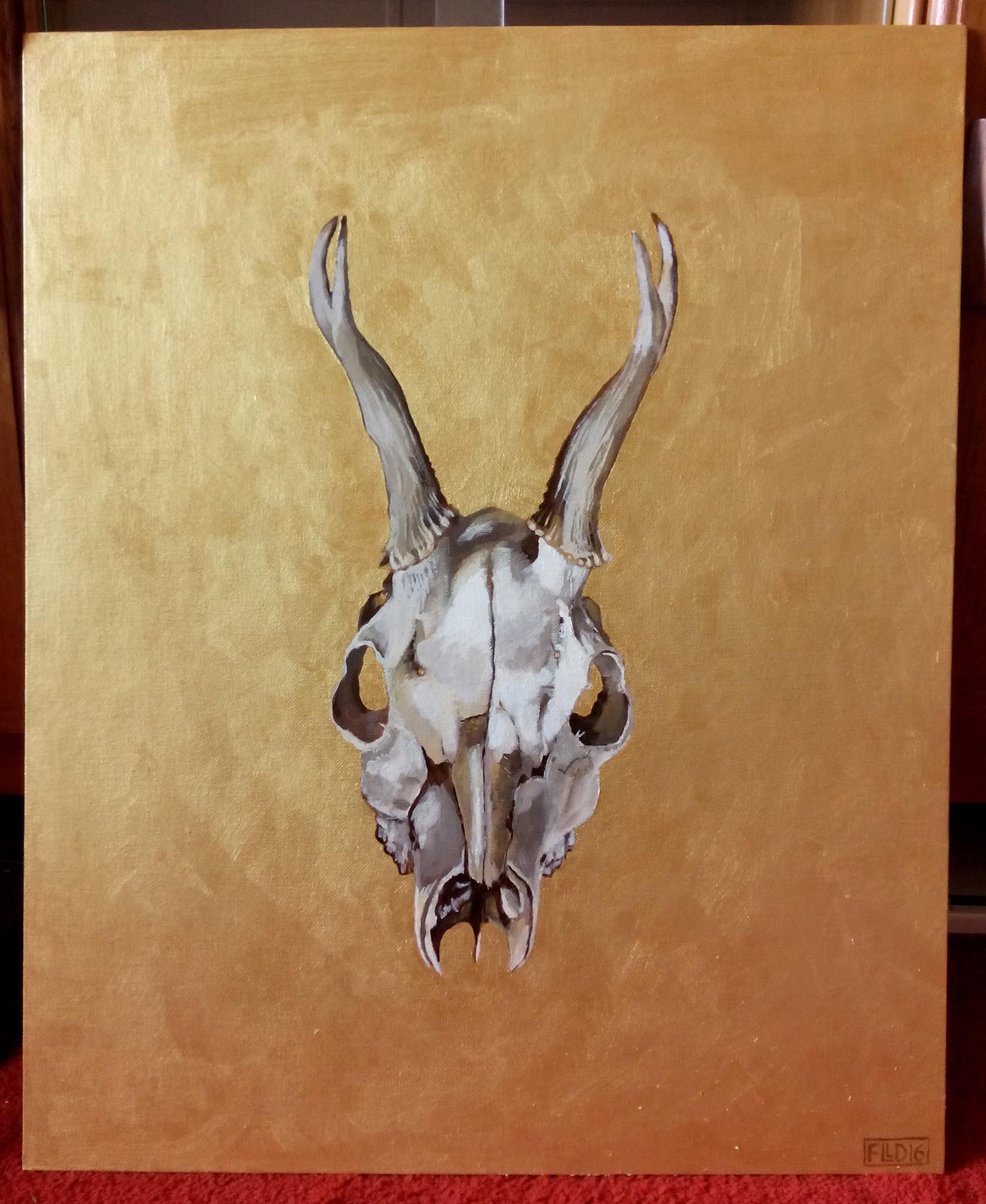 For the first time I’m selling an original painting via my prints microsite. It’s a large (22 x 18 inches) acrylic on canvas board. It’s a roe deer skull on a gold background.
Click here to buy!
There’ll be more to come…
by Frank | Jun 21, 2016 | illustration, interpretation
I’m writing this having just attended the opening of the family science exhibition Wriggle! at National Museum Cardiff. If you have small children this is a must-see – brilliantly curated, fantastic interpretation and a canny balance of information and fun. The centrepiece of the exhibition is the Wriggloo – a little room where you can learn what it feels like to be an earthworm!
You may well have seen this blog post I wrote a little while ago announcing that I’d been commissioned to create an earthworm character in a series of six poses, plus a Top Trumps-style activity, for the exhibition.
In this post I go into a little more detail about the process involved, which might shed a little light on an efficient and organised commissioning process.
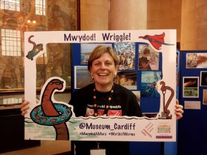
Kate Mortimer-Jones at the exhibition opening – she commissioned the illustrations
I was contacted by Katie Mortimer-Jones, worm expert and one of the curators of the exhibition. The team at Cardiff Museum had come up with a detailed and well-thought-through brief that described the personality of the worm character, including its likes and dislikes, its hobbies and its age.
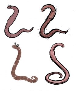
The four initial ideas
I find it useful to break down quotes into sections so clients have a good idea about what’s involved. In this case I quoted for the creation of the worm character, the pencil roughs of the poses, the inking, scanning and colouring, and the top trumps card design. I also provided a suggested timeframe that would give me enough time to complete the work well while meeting print deadlines for the exhibition opening. The quote and timeframe were accepted and we started straight away.
I drew four worm characters based on their brief with various features. We tweaked a little and came up with this one.
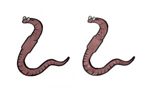 Then I was given six poses or situations in which to draw the worm. They were:
- old worm (has a walking stick)
- super worm (has a cape)
- science worm (has a magnifying glass and white coat)
- digging worm (has a spade)
- swimming worm (has a floatation ring)
- awesome worm (is skateboarding)
I drew these in pencil on A3 paper as they needed to be blown up very large for the exhibition. Once these were amended and approved I inked with brush pen, scanned in, cleaned up in photoshop, and then I coloured and added texture.
I then took these images into Illustrator and live traced them to turn them into vector images. This means that they could be enlarged to any size without a deterioration in image quality.
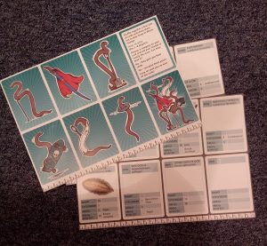 Top Trump Worms
Once the cartoons were signed off I created a series of Top Trump style cards (with the brand owner’s permission) for visitors to fill out and play together.
The final job was to cut out the Top Trumps very furry worm photos in photoshop so they sat well on a white background.
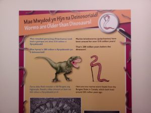
An example of my illustrations being used in the exhibition interpretation
It’s difficult to decide what the best part of this job was – being paid to draw cartoon worms or discovering that there is a creature called a Bone-Eating Snot Flower (like something out of Roald Dahl, no?). What I adore about the educational work I do is how much I learn!
I’ve given my permission for the cartoons to be used on promotional merchandise like mugs and t-shirts which look fantastic and I can’t wait to get my hands on some. The whole exhibition is a joy and if you’re in the area from June to late September, whether you have little ones or not, you should definitely check it out!
– The Wriggle! exhibition is at National Museum Cardiff, Cathays Park, is on until 30th September 2016 and is free to enter.
by Frank | Jun 20, 2016 | blog news, graphic design
New website design
Welcome to my new and improved website!
I had started to get frustrated with my old one – the theme just wasn’t flexible enough for my needs. This one is constructed with a fabulous premium theme called Ronneby, and I am delighted with its capabilities. One could design quite literally hundreds of websites with it and they could all look completely different.
I used to design themes myself but with responsive requirements that’s become beyond my ken as a simple CSS fiddler. And there’s no need when themes like this exist.
But just because there’s very little coding involved that doesn’t mean there’s no work involved – it’s taken me days to get this up and running and to the design I wanted. Now I know the theme better (they’re all constructed differently and take some getting used to) I can work more quickly around it. I anticipate doing a little more fiddling with it just to get it how I want it but I’m over the moon with it – I love the subtle animations (there’s loads to choose from), the functionality of the slider plugin (very much like After Effects), the ease of the page builder, the way the portfolio works and just the general elegance of the whole thing. I wouldn’t say it’s a theme for WordPress newbies (although there are templates you can download and install to upload your own content so maybe I’m wrong there) but it is very straight forward.
If it’s a theme you’d like to work with but you’re feeling a little intimidated about getting it up and running do get in touch and we can talk about how I can help you get something all lovely and handsome like this.
by Frank | Jun 13, 2016 | prints
I need to make some space in my little studio so I thought I’d offer a sale of my prints!
20% off throughout this month with the code JUNEBUG at checkout here frankduffy.co.uk/buy-art-prints/
Free postage too 🙂
I only post to the UK.